

Quick summary
Felix Gray leads the category with clinical lens positioning and a face-shape quiz that removes decision paralysis and lifts average order value. Ocushield is the standout trust play — MHRA medical device certification does more conversion work than any lifestyle copy could. Baxter Blue has the most commercially sophisticated loyalty model in eyewear, with a membership programme that creates ongoing purchase reasons without interrupting checkout. Zenni Optical proves that volume ecommerce in a complex prescription category is winnable with aggressive filtering and trivially priced blue light upgrades.
Blue light glasses sit at the intersection of health, tech, and fashion — a combination that creates real ecommerce complexity. The stores doing this well have figured out how to lead with product credibility, handle a sceptical customer who has read conflicting studies, and still convert at rates that make the business work. These are the ten stores worth studying.
1. Felix Gray
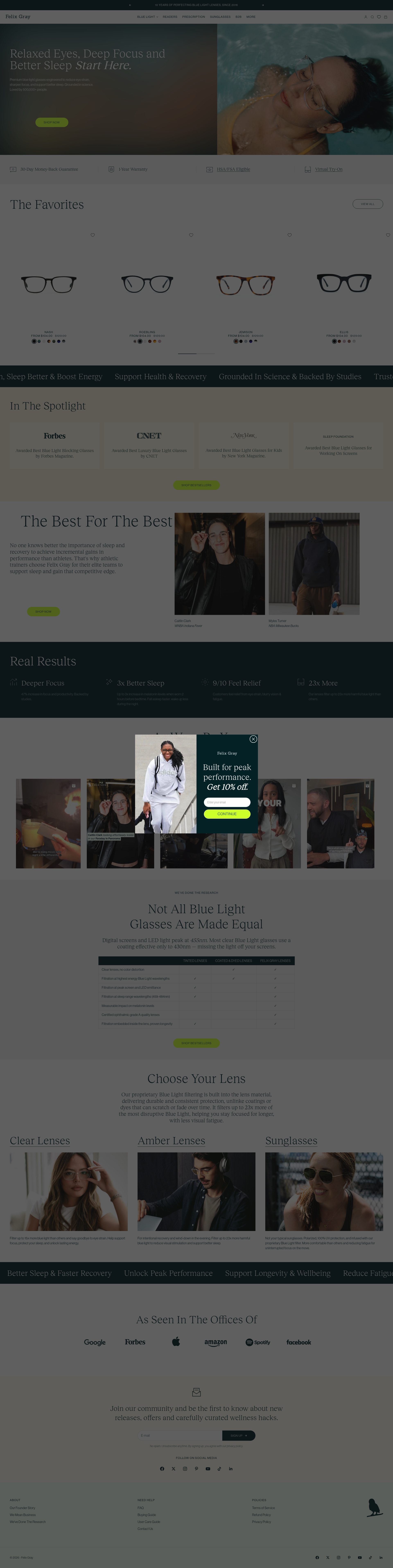
Felix Gray is one of the clearest examples of clinical positioning done well on Shopify. The homepage leads with lens technology rather than lifestyle imagery, which is a deliberate choice: it tells the visitor this is a product with a reason to exist, not just an accessory trend. The brand names their proprietary lens coating early and often, giving the product a technical identity that competitors cannot directly copy in customer comparisons.
The product detail page is structured around objections. Before any customer can wonder whether blue light glasses actually work, Felix Gray has already addressed it: there is a dedicated section explaining the science, citing studies, and naming the specific light wavelengths their lenses filter. This is not a footnote. It sits above the fold on the PDP and it does real conversion work.
Their quiz funnel is worth examining separately. Rather than dumping customers into a category page, Felix Gray routes visitors through a short quiz that surfaces frames by face shape and use case. The quiz output is personalised product recommendations, which reduces decision paralysis and increases average order value by steering customers toward lens upgrade options they would not have self-selected.
2. Ocushield
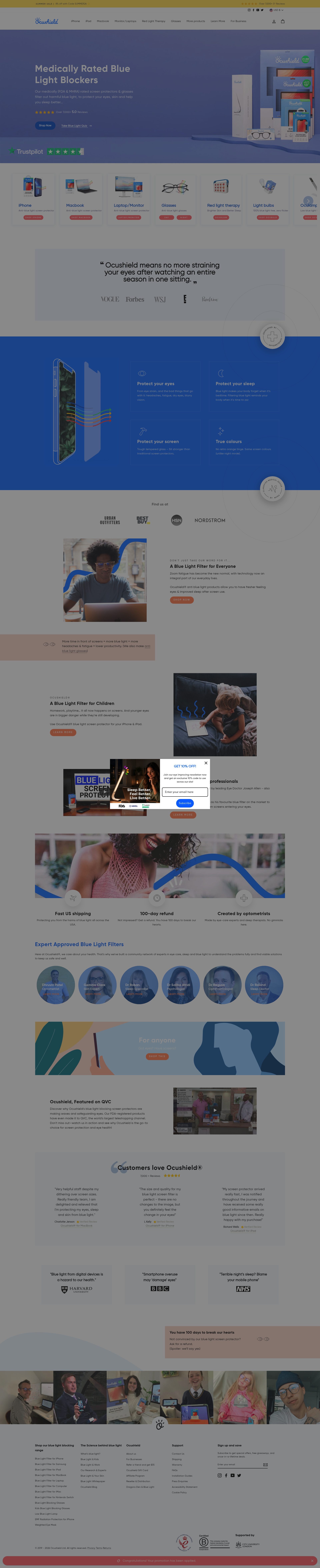
Ocushield is a UK brand and one of the few in this space that trades on regulatory certification rather than marketing claims. Their frames are marketed as a medical device rated by the Medicines and Healthcare products Regulatory Agency (MHRA), and that single fact is the centrepiece of every page. The conversion logic is straightforward: if you are uncertain whether blue light glasses work, a medically rated product removes the doubt.
The store's navigation is built around device type as much as product type. Alongside glasses, Ocushield sells screen protectors and phone filters, and the site architecture groups these by the device the customer uses (phone, tablet, monitor). This is a smart decision because it meets the customer at the problem, not at the product category. A customer searching for eye protection from their laptop lands on a page organised around laptops, not around lens technology.
Ocushield uses trust signals heavily but targets them precisely. The MHRA badge appears on every product page. Reviews are segmented by profession, with optometrists and NHS staff testimonials surfaced ahead of general customer reviews. This is not accidental. The brand is explicitly targeting customers who respond to professional endorsement, and the store layout reflects that.
3. Overnight Glasses
Overnight Glasses built their Shopify store around a single USP: prescription glasses delivered overnight. The headline promise is a logistics claim, not a product claim, which is an unusual angle in a category where most stores lead with lens technology or style. It works because speed of delivery is a genuine pain point. Prescription eyewear has historically meant two-week turnarounds and optician visits. Overnight Glasses positions itself against that experience.
The PDP reflects this commitment throughout. Delivery timing is stated explicitly at the point of purchase, not buried in the footer. The prescription upload flow is smooth and is integrated directly into the product page rather than handled post-purchase via email, which removes a common drop-off point in prescription eyewear ecommerce. Customers can upload a photo of their prescription or enter values manually, and the UI for this is clear enough that it does not require support intervention.
Their pricing structure is worth noting. There are no hidden lens upgrade fees. The price shown on the product card is the price paid, including basic lens coating, which reduces cart abandonment at checkout. Prescription eyewear stores that itemise lens costs at checkout see significant drop-off when customers realise the final price is substantially higher than the displayed frame price.
4. Bloobloom
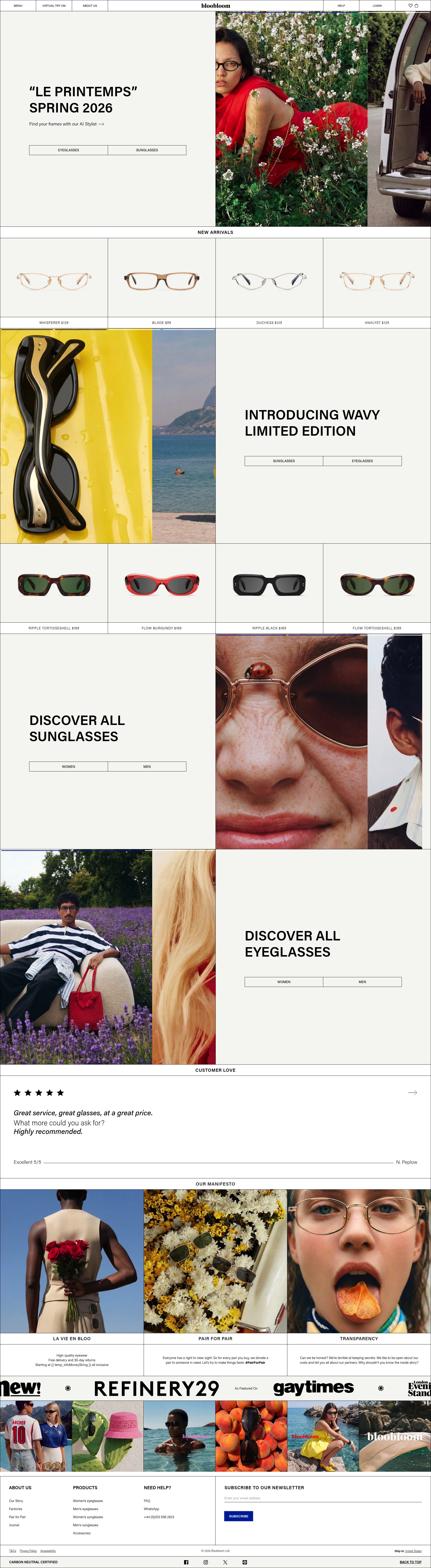
Bloobloom is a UK-based eyewear brand that has built one of the most visually considered Shopify stores in the accessories space. The site runs on a clean editorial aesthetic: full-bleed imagery, minimal navigation, and a colour palette that positions the brand somewhere between a premium fashion label and a design studio. This is deliberate. Bloobloom is competing with both fast fashion eyewear and premium optician brands, and the design communicates that it belongs in the latter category at accessible pricing.
The home try-on feature is the most commercially significant element of the store. Customers can select up to four frames to trial at home before committing, with a five-day window and free returns. This directly addresses the biggest friction point in online eyewear: customers cannot try frames on before buying. The try-on programme is surfaced early in the product browsing journey, not only at the point of purchase, which means it is doing acquisition work as well as conversion work.
On the product pages, Bloobloom uses a face shape guide that is integrated into the filter system rather than existing as a separate educational page. Customers can filter by their face shape and the results update in real time. This reduces returns and increases satisfaction, both of which matter for a product category with high return rates.
5. Quay Australia
Quay Australia is a strong case study for how a fashion-first eyewear brand adds blue light glasses to an existing product range without diluting the brand. Rather than creating a separate category or a clinical sub-brand, Quay treats blue light lenses as an upgrade option available across their fashion frames. The result is that the customer's entry point is a frame they like the look of, not a lens technology they are evaluating.
The Shopify store is built around influencer-driven social proof. Quay has a large Instagram following and the site architecture reflects that: product pages feature ugc imagery alongside studio photography, and there is a persistent feed of styled shots that links directly to the products worn. This is well-executed shoppable content rather than the loosely associated Instagram sections that many brands tack on as an afterthought.
Quay's bundle mechanic is worth examining. Buying multiple pairs is incentivised at the cart level with a tiered discount, and the upsell is presented alongside a comparison of the lens options. A customer who came in for one pair of sunglasses is shown the value of adding a blue light frame at the same time. The conversion rate on this upsell is supported by the fact that the customer is already in a buying frame of mind.
6. MVMT
MVMT started as a watch brand and expanded into eyewear, which means their Shopify Plus store has been engineered to handle a multi-category catalogue at volume. The eyewear section, including blue light glasses, sits within a broader accessories architecture rather than as a standalone product category. This creates a cross-selling opportunity that single-category eyewear brands do not have: a customer buying a watch is one click away from a complementary pair of frames.
The product pages for MVMT's blue light range use a simple but effective comparison structure. Rather than technical specification sheets, the lens options are presented in plain language: what each lens does, what it is for, and which type of customer it suits. This reduces the cognitive load on a customer who knows they want blue light protection but does not know which tier of product is appropriate for their usage.
MVMT also makes strong use of bundled collections. Curated sets combining watches and eyewear are merchandised on category pages and featured in email flows. For a brand with an existing customer base of watch buyers, this is a natural extension of the product relationship rather than a forced upsell.
7. Pixel Eyewear
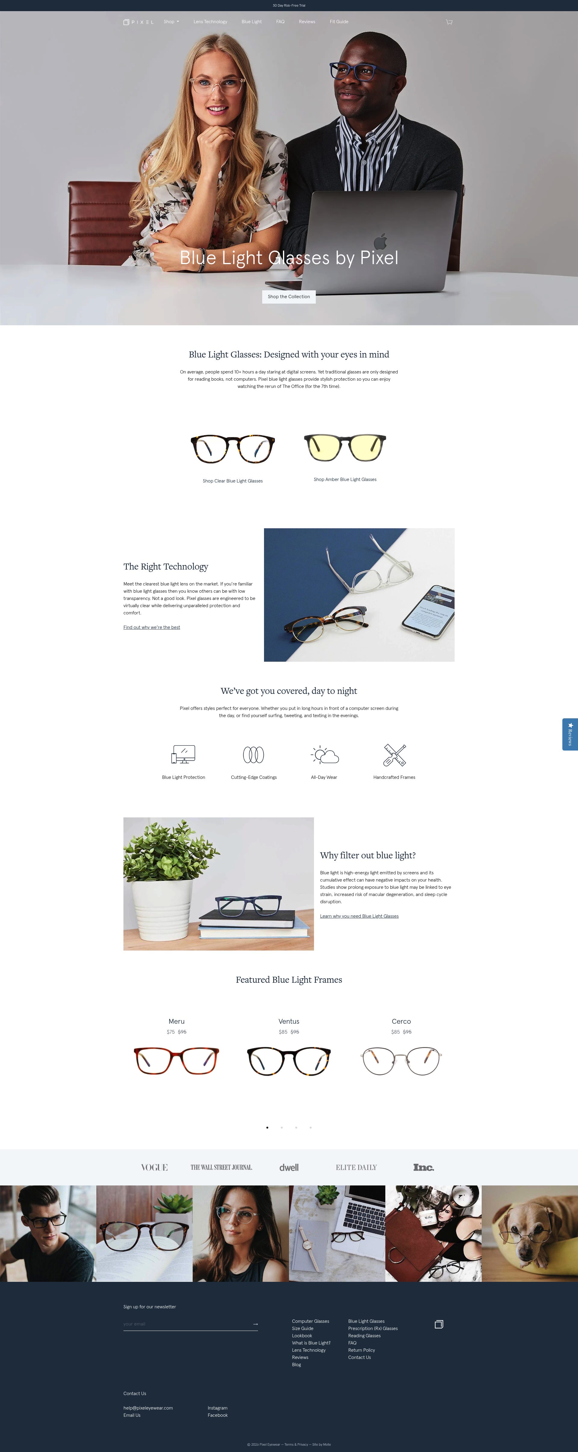
Pixel Eyewear is built around a very specific customer: people who spend long hours in front of screens for work. The positioning is professional rather than lifestyle-focused, and the product pages reflect this with copy aimed at remote workers, developers, and designers rather than general consumers. Every product description quantifies the benefit: how many hours of screen time the lens is designed for, what the amber lens does at night versus the clear daytime lens, and how this maps to different working patterns.
The subscription model is one of the more interesting commercial decisions in the category. Pixel offers a lens replacement subscription, which is unusual for eyewear. Rather than selling a new pair of glasses every few years, the subscription positions ongoing lens quality as a service. This shifts revenue from episodic purchase to recurring revenue, which has significant implications for customer lifetime value in a category where repeat purchases are otherwise rare.
The store's educational content is embedded within the product journey rather than separated into a blog. Before a customer selects a lens tier, they see a short breakdown of what each level of blue light filtering does and when it is appropriate. This is the right architecture for a technically differentiated product: the education happens at the decision point, not before the customer has arrived or after they have already purchased.
8. Ambr Eyewear

Ambr Eyewear is a UK DTC brand that has built a clean, conversion-focused Shopify store with strong emphasis on gifting. The gifting angle is commercially sensible: blue light glasses are a gift that has a clear purpose and a health narrative, which makes them easier to buy for someone else than purely decorative accessories. Ambr leans into this with dedicated gift guides, a gift packaging option at checkout, and messaging that frames the product as something you buy for the people you work with.
The product range is deliberately contained. Rather than trying to serve every customer segment, Ambr has a focused catalogue of frames across a small number of categories. This makes the site fast to navigate and the buying decision straightforward. The trade-off is that customers looking for a wide selection of styles will find the range limiting, but for customers who want to make a quick, confident purchase, the focused range is an asset rather than a constraint.
Ambr's checkout experience is notably clean. There are no aggressive upsells at the cart stage. The brand has opted for a post-purchase upsell flow instead, which preserves the checkout experience while still capturing additional revenue from confirmed buyers. This reflects an understanding of their customer: someone who has already overcome scepticism about blue light glasses does not want to be sold to again before the order is complete.
9. Baxter Blue
Baxter Blue is an Australian DTC brand on Shopify Plus with one of the stronger subscription programmes in the eyewear category. Their membership model, called the Blue Shield Club, offers members early access to new frames, discounted replacement lenses, and exclusive colourways. The membership is not a subscription to receive product on a schedule. It is a loyalty programme that creates ongoing reasons to return to the store.
The subscription programme is surfaced at multiple points in the customer journey without being intrusive. It appears on the homepage, within product pages, and in the post-purchase email flow, but it never interrupts the primary buying path. Customers who want to join can do so cleanly; customers who do not are not penalised. This is a better implementation than brands that gate discounts behind mandatory sign-up, which creates friction.
Baxter Blue's product photography is among the highest quality in the category. Each frame is shot across multiple colourways with consistent styling, and the lifestyle photography is specific enough to be useful: images show the frames being worn in work settings, not in abstract outdoor locations that communicate nothing about the product's actual use case. Accurate use-case imagery reduces returns.
10. Zenni Optical
Zenni Optical is one of the largest direct-to-consumer eyewear brands in the world and operates on a Shopify-based stack. The scale of their operation makes their store worth studying for volume ecommerce decisions rather than niche brand positioning. The catalogue runs to thousands of SKUs across prescription and non-prescription eyewear, and the site architecture has to handle this without overwhelming customers.
Zenni's answer to catalogue complexity is a combination of aggressive filtering and machine learning recommendations. The filter sidebar on category pages is comprehensive but structured in priority order: price, frame shape, material, and colour are surfaced before the more granular options. The recommendation engine surfaces similar frames as customers browse, which reduces bounce rate on product pages where the initial frame is not quite right.
Pricing is Zenni's primary conversion lever and it is executed without apology. Blue light lens upgrades are priced at a few pounds on top of already low base frame prices. This makes the upgrade decision trivial for most customers, which drives very high attachment rates. The commercial model is built around volume and lifetime value through repeat purchasing, not on high margin per unit.
If you sell eyewear, health tech, or any product category that requires trust and education before purchase, the Shopify store architecture decisions above are worth applying to your own store. SuttonCommerce works with UK Shopify merchants on Shopify design projects that convert browsers into buyers. Get in touch if you want to discuss your store.
Frequently asked questions
Do blue light glasses Shopify stores actually convert well?
Yes, when the store architecture handles the sceptical buyer correctly. The top performers — Felix Gray and Ocushield — lead with clinical evidence and named certifications above the fold rather than lifestyle imagery, which removes the most common objection (whether blue light glasses work at all) before it becomes a barrier. Stores that bury the science or rely solely on influencer endorsement convert poorly in this category.
What is the best blue light glasses brand for UK customers?
Ocushield is the strongest pick for UK buyers because it is one of the only blue light glasses brands with MHRA medical device certification, which is a regulatory body UK consumers recognise and trust. Ambr Eyewear and Bloobloom are also UK-based DTC brands with clean Shopify stores, competitive pricing, and strong gifting propositions.
Which blue light glasses brands offer prescription lenses online?
Zenni Optical and Overnight Glasses both handle prescription blue light lenses entirely online without requiring an optician visit. Overnight Glasses is notable for actual overnight delivery on prescription orders, with a prescription upload flow integrated directly into the product page rather than handled post-purchase. Zenni Optical handles much higher volume with thousands of frame SKUs and a low-cost lens upgrade model.
What Shopify features do the best eyewear stores use for conversion?
The most commercially significant features across these stores are quiz funnels for product matching (Felix Gray), home try-on programmes (Bloobloom), MHRA or clinical trust badges on every PDP (Ocushield), and post-purchase loyalty programmes rather than aggressive in-checkout upsells (Baxter Blue). Prescription upload integrated directly into the product page is the single biggest friction reducer for prescription eyewear ecommerce.
Are blue light glasses a good product to sell on Shopify?
Blue light glasses are commercially viable on Shopify but require more trust infrastructure than most accessories categories. The category has genuine scepticism — conflicting study coverage means customers arrive uncertain whether the product works. Stores that resolve this objection on the PDP with clinical evidence, certifications, or professional endorsements convert significantly better than those that rely on product aesthetics alone. Repeat purchase rates are low, which means subscription models (Pixel Eyewear's lens replacement, Baxter Blue's membership) are worth the implementation cost.