
Quick summary
Piglet in Bed is the strongest UK example: a tight linen range, lifestyle-only photography, and a native bedding subscription that converts repeat buyers efficiently. House of Hackney sets the standard for maximalist brands — their room visualiser and trade pricing tier are the two features most worth stealing. Ruggable wins on product clarity: a 15-second video explaining their washable rug system does more selling work than most home brands achieve in an entire product page. Parachute Home is the benchmark for guided selling, with a sleep-preference quiz that routes shoppers directly to the right product and cuts return rates by setting accurate expectations upfront.
Interior design is one of the toughest verticals to sell online. The product is tactile, the purchase is emotional, and the price points can run from a £12 candle to a £1,200 sofa cushion. Yet a crop of brands has cracked it, building Shopify stores that convert browsers into buyers through obsessive product photography, brutally clear navigation, and content that does real selling work.
This is not a list of the biggest home brands on the internet. It is a list of the best Shopify implementations in the category: stores where the platform has been pushed hard, the merchant has made deliberate UX decisions, and the result is a shopping experience that reflects the brand at its best. If you sell anything in the home and lifestyle space, these ten stores are worth a close look.
Piglet in Bed
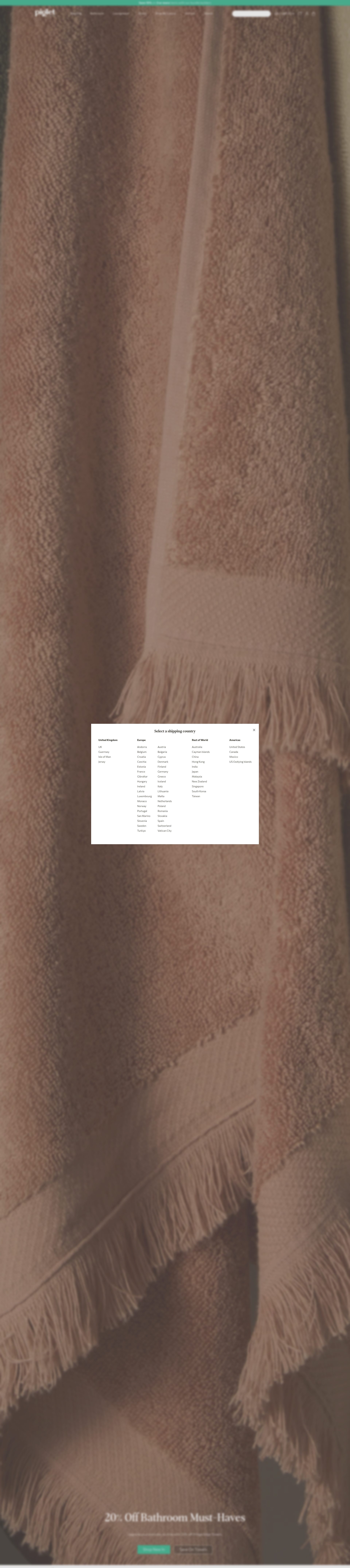
Piglet in Bed sells linen bedding and leisurewear from a distinctly British, understated perspective. The product range is tight, the colourway editing is disciplined, and the Shopify store reflects both of those qualities precisely.
What makes the store work is the photography system. Every product is shot in a made bed, in natural light, with a consistent warm tone that makes the linen look immediately desirable. Piglet does not waste a single image slot on a white-background pack shot. Every visual is a lifestyle shot, and the cumulative effect across product pages is a consistent brand world that shoppers want to buy into. Colour variant selection is handled through swatches that show the actual fabric rather than a colour block, which reduces purchase anxiety on a high-ticket soft furnishing buy.
The subscription offering for bedding refreshes is built natively into Shopify using a third-party subscription app, and the checkout is fast with Shop Pay enabled by default. The post-purchase experience includes practical care instruction content, which reduces returns and builds long-term loyalty. Piglet in Bed is a masterclass in restraint: less SKU range, more confidence in what they stock.
House of Hackney
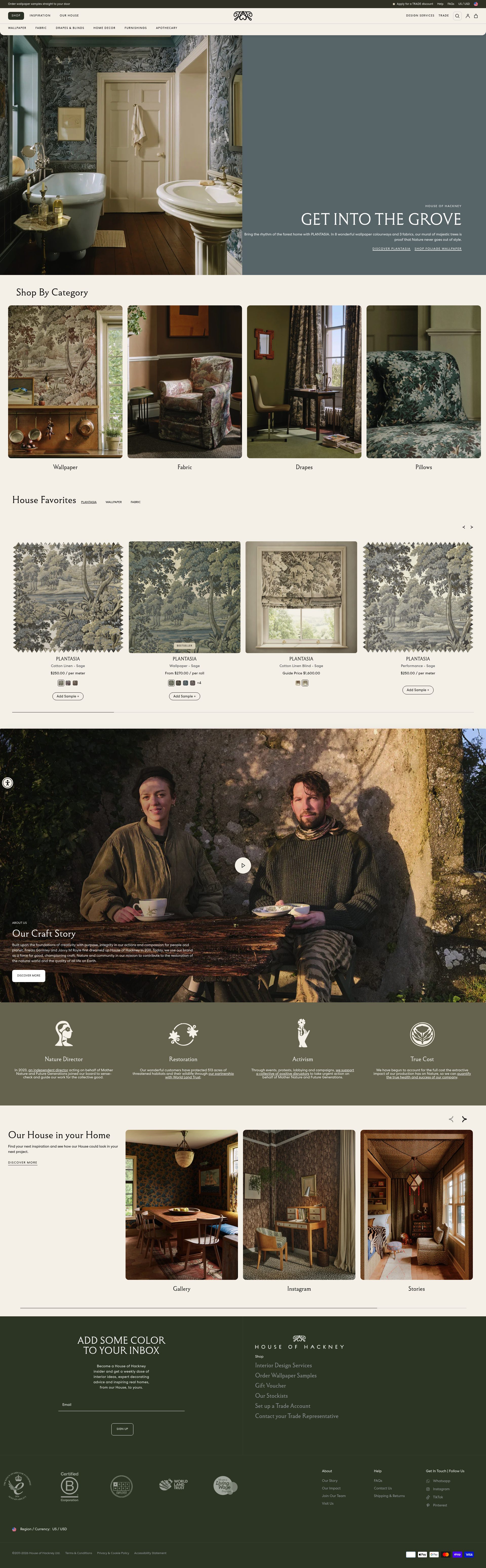
House of Hackney is the antithesis of restraint, and that is exactly the point. The East London brand sells maximalist wallpaper, fabric, and home accessories built around bold botanical and retro-inspired prints. The Shopify store leans fully into the visual identity: dark backgrounds, rich colour blocking, and editorial-scale imagery that treats the homepage like the front cover of a high-end interiors magazine.
The product discovery journey is well thought through. Rather than pushing visitors straight to a category grid, House of Hackney leads with curated room sets that show multiple products working together. This lifts average order value because shoppers see a coordinated scheme rather than individual products. The room visualiser capability, integrated into their Shopify setup, lets customers preview wallpapers at scale before committing, which is a critical conversion tool for a product that is terrifying to buy without seeing it in context.
Wishlist functionality, integrated with Klaviyo for abandoned wishlist flows, means that even browsing sessions generate marketing-qualified data. House of Hackney also runs a trade programme for interior designers, handled through a gated section of the Shopify store with separate trade pricing. That B2B layer, built on top of a standard Shopify plan using a metafield-driven approach, is smart commercial architecture.
Rockett St George
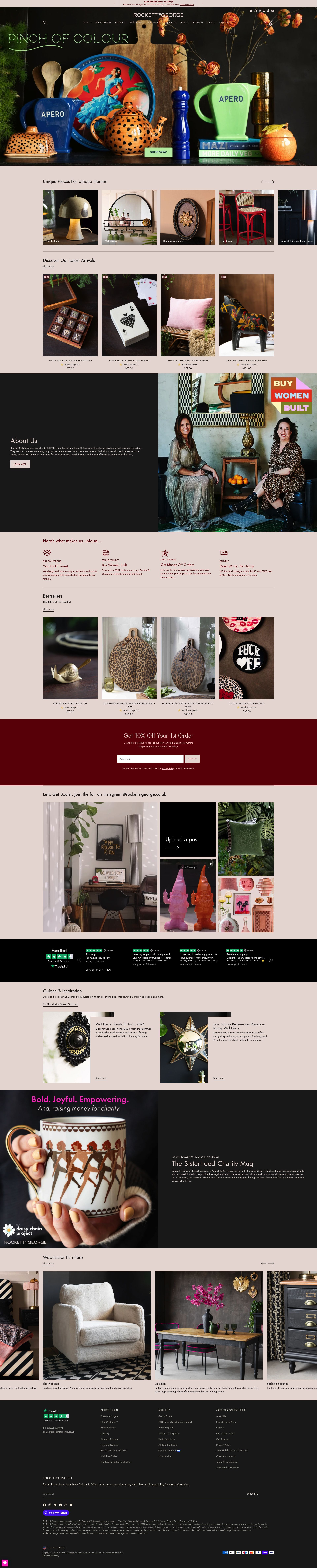
Rockett St George sits between maximalist and eclectic: bold, personality-driven home accessories, lighting, and furniture that attracts buyers who find the high street too safe. The brand has operated out of Sussex since 2007 and has built one of the strongest editorial voices in UK home retail. Their Shopify store channels that voice directly into the commerce experience.
The blog and editorial content section is unusually strong for a mid-market retailer. Style guides, trend reports, and product features are written with genuine personality, and they link directly to product pages throughout, making content a genuine top-of-funnel acquisition channel rather than a checkbox exercise. Product descriptions follow the same editorial voice rather than reverting to dry specification copy, which keeps the brand consistent from discovery through to cart.
Navigation is structured around themes and moods rather than just product categories, meaning a shopper hunting for "dark and moody" or "maximalist botanicals" can find a curated range without knowing what product type they want. That emotional-entry navigation is rare in Shopify implementations and particularly well-suited to a brand where aspiration drives the purchase.
Bluebell Gray
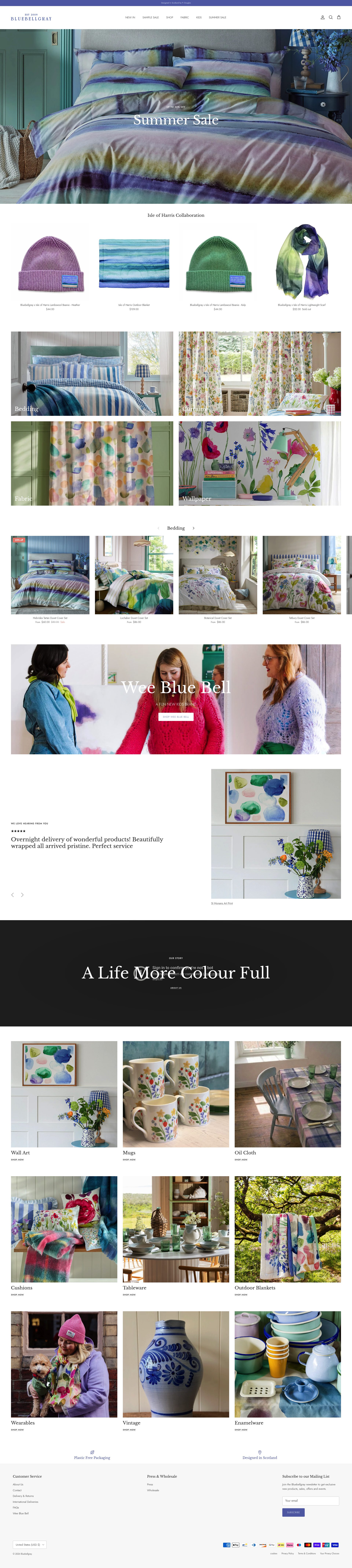
Bluebell Gray is a Glasgow-based design studio selling art prints, ceramics, and homeware built around the founder's hand-painted textile designs. The Shopify store has a clean, gallery-quality aesthetic that puts the artwork front and centre without visual clutter.
What stands out technically is the product page architecture for limited-edition prints. Each print has a dedicated long-form product page that tells the story of the design, the inspiration, the process, and the print specifications. This level of depth serves two functions: it justifies premium pricing, and it provides SEO-rich content that drives organic discovery without a separate blog article. The product page does the work of both a product listing and an editorial piece.
The art and home crossover positioning is handled gracefully. Bluebell Gray avoids the mistake many artist-led stores make of presenting products in a portfolio layout that makes buying feel intrusive. The add-to-cart flow is prominent and clear, and delivery and returns are surfaced on every product page without making the store feel like a warehouse. Shoppers who come for the art stay for the homewares, and the store navigation facilitates that journey well.
Urbanara
Urbanara is a Berlin-founded, UK-operating brand selling premium natural textiles: blankets, cushions, bed linen, and towels made from ethically sourced materials. The Shopify store handles a wide product range with strong filtering and a material-story approach that consistently anchors price perception.
The key UX decision Urbanara has made is to lead with material transparency on every product page. Fabric origin, yarn grade, and production process are laid out prominently before the product specifications, and this ordering of information directly supports higher price point acceptance. Shoppers do not question why a cashmere blanket costs £180 when the page has already explained exactly what cashmere grade was used and where it was sourced.
The bundle builder, integrated into their Shopify setup, allows shoppers to build textile sets (matching cushion covers, throw, and pillow cases) with automatic bundle pricing. This is both a revenue lever and a practical tool for shoppers decorating a room who would otherwise need to browse multiple category pages and hope that the colours match. Urbanara also handles size variants across bedding well, which is a genuinely tricky Shopify implementation for products where size names differ by country (UK double versus EU 200x200).
Ruggable
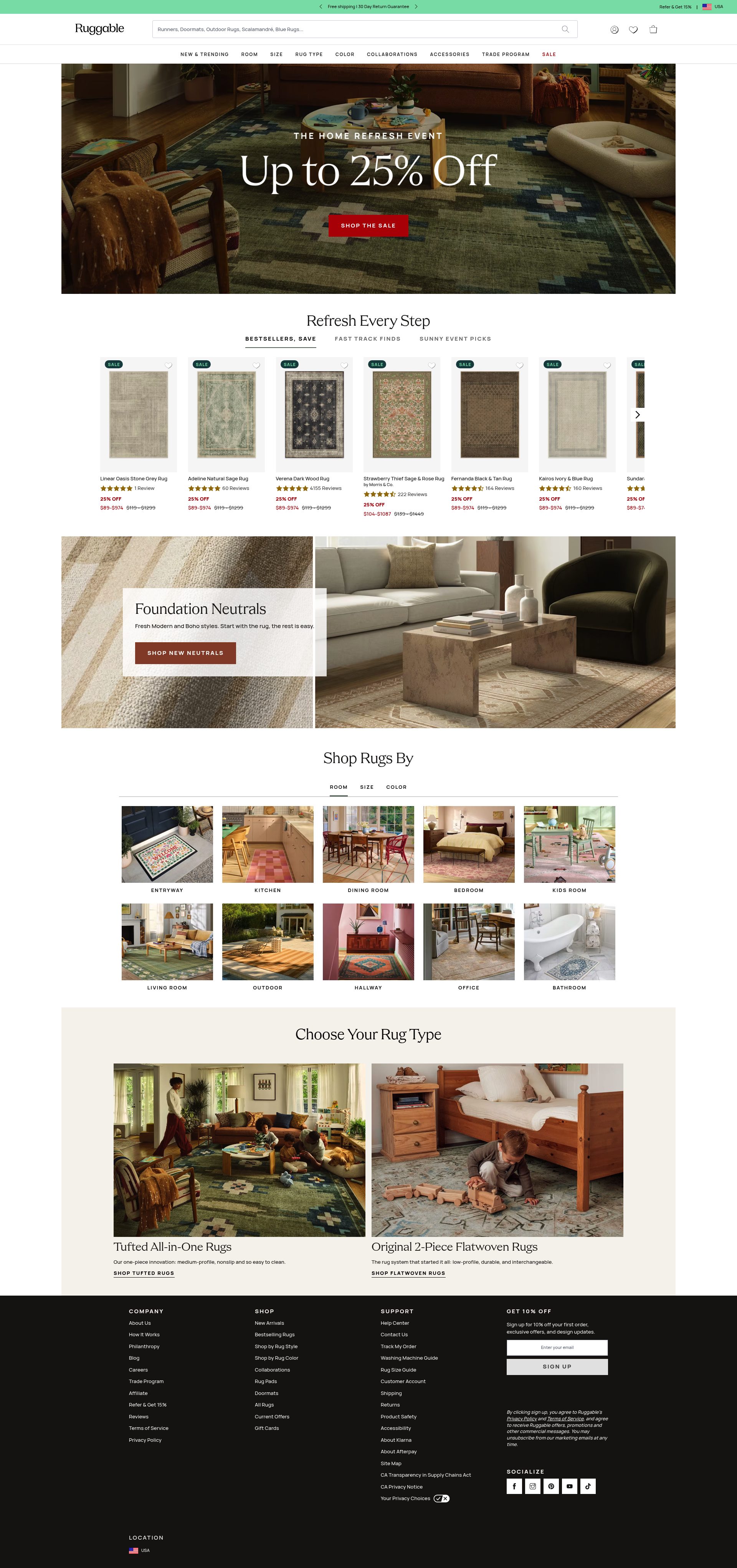
Ruggable built its business around one genuinely useful innovation: washable rugs with a two-part system that lets you remove and machine-wash the top layer. The Shopify store is built entirely around communicating that single product truth clearly and repeatedly.
The homepage uses video in a way that actually converts: a short, auto-playing clip of someone removing the rug top, putting it in a washing machine, and reattaching it. That 15-second video does more selling work than any written product description could. Every product page then reinforces the message with care instruction content, customer review videos, and a persistent "how it works" explainer that appears before the add-to-cart button.
Ruggable's room visualiser integration, built into their Shopify storefront, lets shoppers place a rug virtually in a room photo. For a category where the risk of getting the scale or colour wrong is high, this tool materially reduces purchase hesitation. The filter system handles a very wide SKU count (hundreds of designs across multiple sizes) well, with visual swatch grids rather than dropdown menus that force shoppers to imagine what "terracotta" or "sage" looks like in their space.
Parachute Home
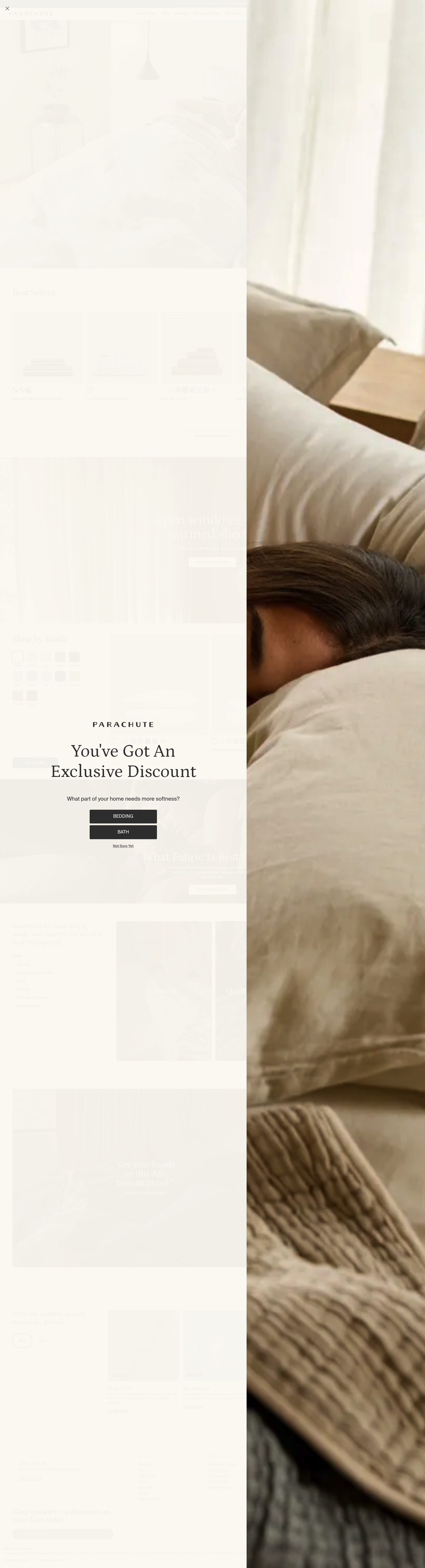
Parachute Home is the US premium bedding and bath brand that built its reputation on transparent supply chain and Oeko-Tex certification. The Shopify Plus store is one of the most polished in the home category: clean, spacious, and structured around soft conversion points rather than aggressive promotional mechanics.
The product photography is shot on real beds in real-looking rooms, with a consistent muted colour palette that makes the range feel cohesive even across dozens of colourways. Parachute uses a "feel the fabric" sample programme for textiles, integrated into the Shopify checkout, which dramatically reduces return rates for bedding by letting shoppers experience the material before committing to a full set.
The store's quiz-led personalisation journey is worth studying. Shoppers who do not know what thread count or fabric weight they want can enter a short quiz that routes them to a product recommendation based on sleeping temperature and preferred feel. The quiz output links directly to a pre-filtered product page, compressing the discovery journey significantly. That kind of guided selling architecture is straightforward to implement on Shopify but rarely done this well.
Rifle Paper Co
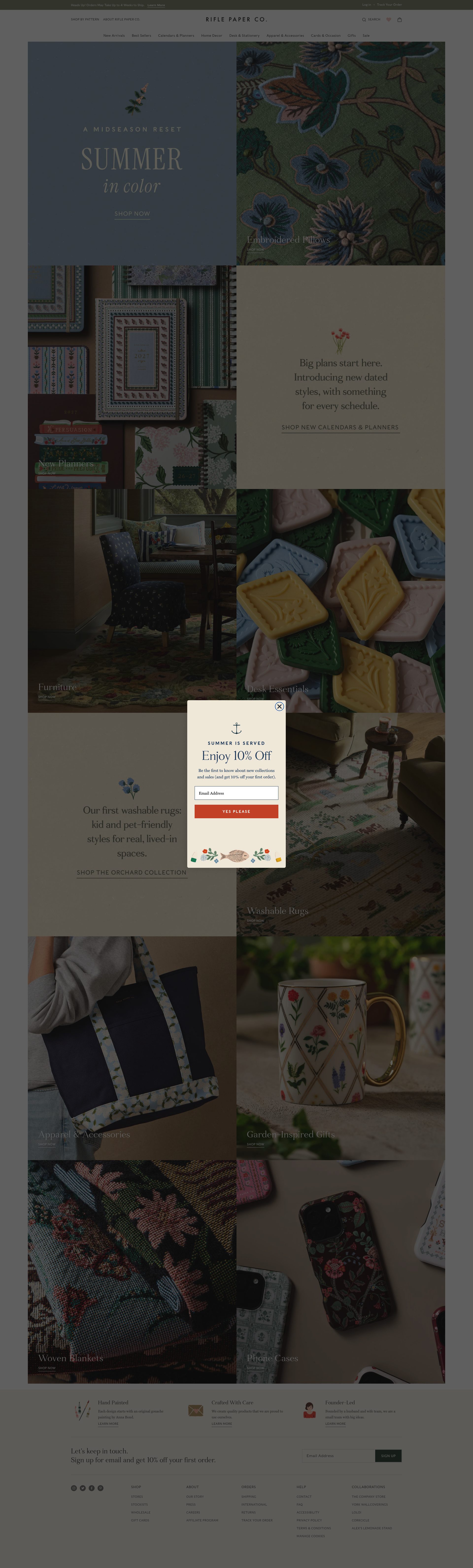
Rifle Paper Co started as a stationery brand in Florida and has grown into a full home and lifestyle label built around founder Anna Bond's distinctive hand-illustrated, floral-forward design language. The Shopify store is as visually distinct as the products themselves.
The brand has done something unusual with its category architecture: stationery, home goods, accessories, and gifts all live under a single design identity without any of the tonal inconsistency that usually appears when a brand extends into new categories. The Shopify theme is bespoke, with illustrated header elements that mirror the product motifs, which makes the store feel like a physical boutique that has been art-directed rather than a Shopify storefront with a theme applied.
Product gift-wrapping is integrated into the checkout flow using a simple Shopify app that adds a gift message and wrapping option as a line item. For a brand whose customer base skews heavily toward gift purchasing, this is a meaningful conversion lever. The email capture pop-up is illustrated in the brand's signature style, which means even a normally-intrusive mechanic feels on-brand and designed.
Boll and Branch
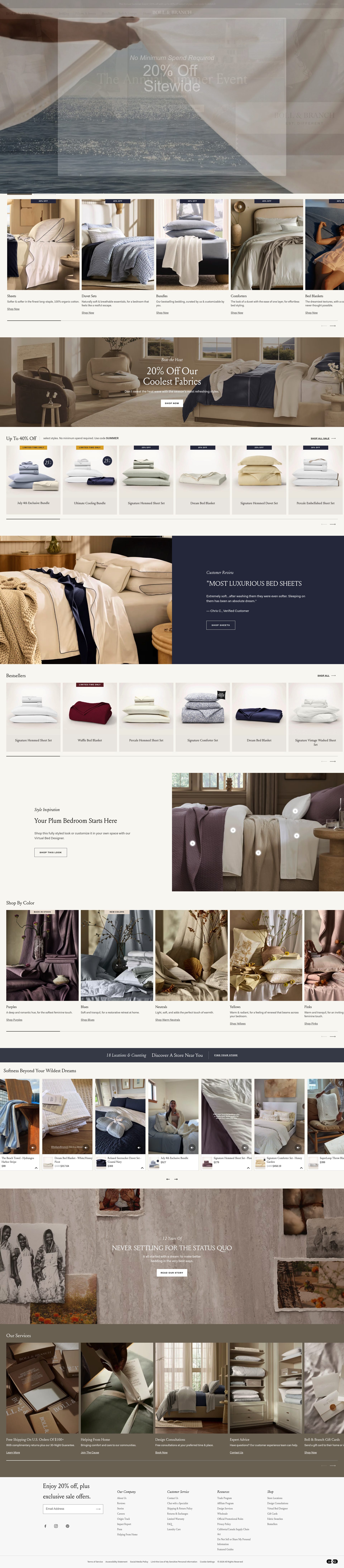
Boll and Branch sells Fair Trade Certified organic bedding with an explicit ethical positioning that targets environmentally-conscious buyers in the US. The Shopify store is built around trust signals: certifications, supply chain transparency, and an unusually detailed FAQ structure that addresses every objection a sceptical shopper might raise before they arrive at the checkout.
The thread count mythology is directly addressed in the product content. Rather than competing on a number (higher is better being a widespread misconception in bedding), Boll and Branch explains why weave quality and yarn grade matter more than thread count, positioning their products accurately and building shopper knowledge in the process. This approach requires confidence in the product and produces loyal, well-educated buyers who are less likely to return items because expectations were properly set.
The store handles bundle and set purchasing cleanly, with sheet sets, duvet inserts, and pillowcases clearly grouped with a combined set discount. The unboxing experience is prominent in user-generated content sections on product pages, which is smart social proof for a product where presentation matters to the gifting audience. Boll and Branch also runs a refer-a-friend programme integrated into the post-purchase Shopify flow, with a meaningful credit rather than a token gesture.
Norsu
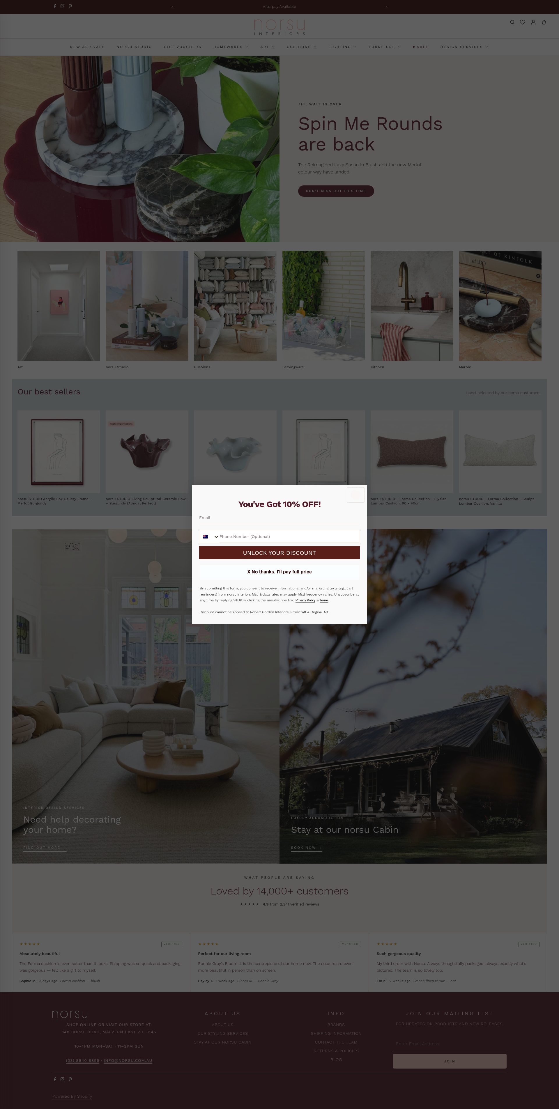
Norsu is a Melbourne-based online homewares retailer selling Scandinavian-influenced home accessories, ceramics, textiles, and furniture from a curated selection of European and Australian brands. The Shopify store handles a multi-brand range well, with strong brand story pages for each stockist that create the feeling of a curated boutique rather than a warehouse.
The brand filtering system is a standout Shopify implementation. Shoppers can filter by brand, material, room, and aesthetic (minimalist, earthy, coastal), and the filter combinations persist across category pages in a way that many larger retailers fail to implement correctly. For a multi-brand retailer selling aesthetically similar products across a wide price range, this filtering architecture is essential to avoiding decision fatigue.
Norsu's product photography is shot on a consistent neutral set that lets the products read clearly without competing backgrounds, and lifestyle imagery is woven into product pages alongside technical stills. The shipping and returns information is presented in a collapsible section on every product page rather than buried in the footer, which is a small UX decision that removes a friction point for first-time buyers. New arrivals are prominently badged across the catalogue, which drives repeat visitor browsing behaviour and increases return visit frequency.
Comparison Table
| Brand | Niche Focus | Price Point | Shopify Standout |
|---|---|---|---|
| Piglet in Bed | Linen bedding and leisurewear | Mid-high | Lifestyle-only photography system, subscription bedding model |
| House of Hackney | Maximalist wallpaper and décor | Premium | Room visualiser, trade pricing tier, wishlist remarketing |
| Rockett St George | Eclectic home accessories and lighting | Mid-high | Editorial navigation by mood, content-to-product linking |
| Bluebell Gray | Artist-led art prints and homeware | Mid-premium | Long-form product pages as editorial and SEO assets |
| Urbanara | Natural textiles and bedding | Mid-high | Material-first product pages, bundle builder for room sets |
| Ruggable | Washable rugs | Mid | Video-led selling, room visualiser, visual swatch filtering |
| Parachute Home | Premium bedding and bath | Premium | Quiz-led personalisation, fabric sample programme in checkout |
| Rifle Paper Co | Illustrated stationery and home goods | Mid | Bespoke illustrated theme, gift-wrapping at checkout |
| Boll and Branch | Organic Fair Trade bedding | Premium | Trust-signal architecture, misconception-busting product content |
| Norsu | Curated Scandi multi-brand homewares | Mid-high | Multi-brand filtering system, persistent filter state |
What These Stores Get Right
- Photography does the selling, not the copy. Every store on this list invests disproportionately in product photography, and specifically in lifestyle imagery that shows the product in use rather than isolated on white. In interior design, context is the product.
- Navigation matches the way customers shop. Shoppers in this category often do not know what product type they want. The best stores offer emotional or aesthetic entry points (by mood, by room, by material) alongside standard category navigation, meeting customers at the top of their decision journey.
- Product pages justify the price. High-ticket home products require trust before purchase. These stores achieve that through material transparency, supply chain storytelling, detailed specification copy, and certification badges that answer the "why does this cost this much" question before it forms.
- Content and commerce are integrated, not separate. The stores with the strongest editorial presence use blog content and buying guides that link directly to products, making content a measurable commercial asset rather than a brand awareness exercise with no attribution path.
- Checkout friction is removed systematically. Gift wrapping at the cart level, bundle builders that pre-assemble coordinated sets, sample programmes that reduce return rates: the best home brands have identified every hesitation point in their specific customer journey and built a Shopify feature to address it.
If you sell home goods or interiors on Shopify, the gap between an average store and one of these is rarely a lack of platform capability. It is a lack of deliberate decisions about photography, navigation architecture, product content, and checkout flow. All of that is fixable without a replatform.
Frequently asked questions
Which interior design Shopify stores are best for learning from as a merchant?
Piglet in Bed and Parachute Home are the two most instructive examples for home merchants: Piglet for photography discipline and subscription architecture, Parachute for quiz-led personalisation and the fabric sample programme. Both solve the core challenge of selling tactile products online without a physical touchpoint.
Do interior design brands need a custom Shopify theme to compete?
Not necessarily. House of Hackney and Rifle Paper Co run bespoke themes, but Rockett St George and Urbanara achieve strong results with heavily customised premium themes. The bigger lever is deliberate UX decisions: mood-based navigation, material-first product pages, and lifestyle photography, not the theme itself.
How do the best home décor Shopify stores handle high-ticket product pages?
The strongest implementations, including Boll and Branch and Urbanara, lead with supply chain transparency and material credentials before specifications or price. This ordering of information shifts the shopper's frame from "is this expensive?" to "do I trust the quality?" and it measurably reduces the gap between product page visits and add-to-cart.
What Shopify apps and features appear most often across these top home décor stores?
Room visualisers (Ruggable, House of Hackney), subscription apps for repeat-purchase products (Piglet in Bed), quiz-led product finders (Parachute Home), and bundle builders for coordinated room sets (Urbanara) are the most impactful. Gift-wrapping at checkout is also common given how heavily the home category skews toward gifting.
How do multi-brand home retailers like Norsu compete with single-brand stores on Shopify?
Norsu's approach is to give each stockist a dedicated brand story page and to build filtering that lets shoppers navigate by brand, material, room, and aesthetic simultaneously. This creates the feel of a curated boutique rather than a marketplace, and the persistent filter state across category pages prevents the decision fatigue that typically kills conversion on wide multi-brand catalogues.