
Quick summary
Emma Sleep leads the mattress category with a 200-night trial surfaced at every touchpoint and a product page built entirely around de-risking the purchase. Helix Sleep takes a different approach, routing every visitor through a sleep quiz that produces a personalised recommendation before a product page is even shown. Nectar Sleep wins on guarantee boldness with a 365-night trial and lifetime warranty that dominate the store from header to PDP. Brook + Wilde is the strongest luxury pick, with editorial photography, a tiered good-better-best architecture, and white-glove delivery confirmed directly on the product page.
Mattresses are one of the most challenging categories in DTC ecommerce: high price points, no tactile experience, and a purchase decision most people make once a decade. The brands below have found smart answers to those problems through trial mechanics, trust-building content and product pages that do serious persuasion work. Here are 10 of the best mattress Shopify stores worth studying.
1. Emma Sleep
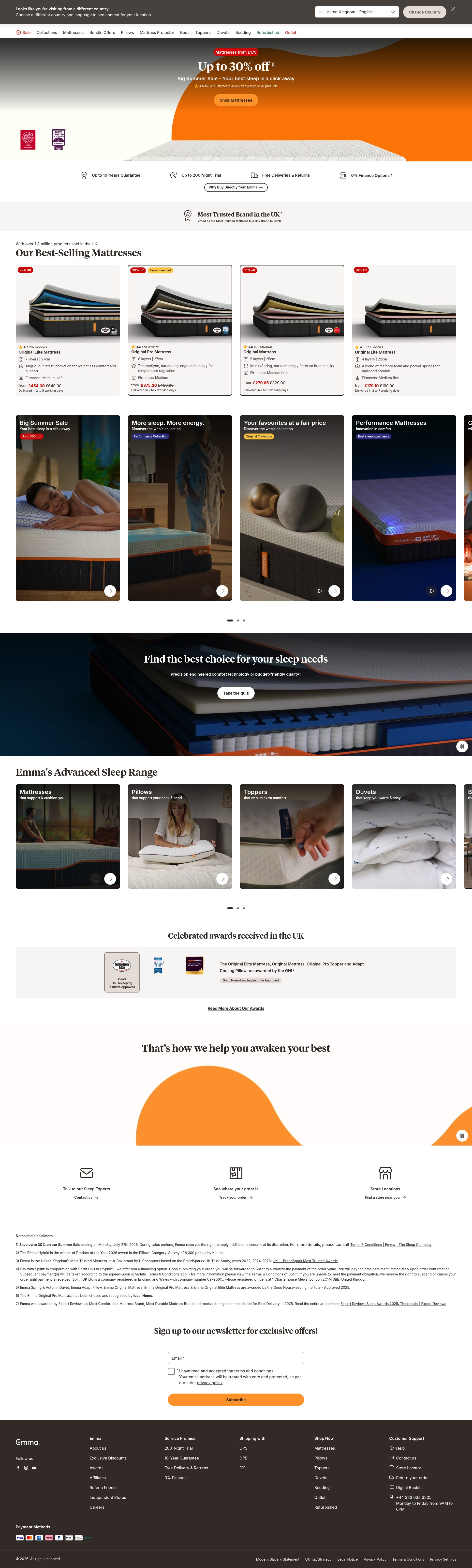
Emma Sleep has become one of the most recognised mattress brands in Europe, and the Shopify store reflects the scale of that ambition. The homepage leads with a clear value proposition tied to sleep science credentials, not just price. The hero section rotates between award badges and press mentions, which builds authority fast for new visitors who arrive with scepticism.
Product pages are structured around the trial offer rather than the product specifications. The 200-night trial is surfaced in the hero image, in the sticky add-to-cart bar, and again in the delivery and returns summary. That repetition is deliberate: for a purchase of this size, the buyer needs to see the risk reversal multiple times before they act.
Emma also uses a comparison table on the PDP to distinguish between mattress lines by sleep position and body weight. This reduces support queries and helps the right buyer self-select, which matters for a brand with a wide product range.
2. Simba Sleep
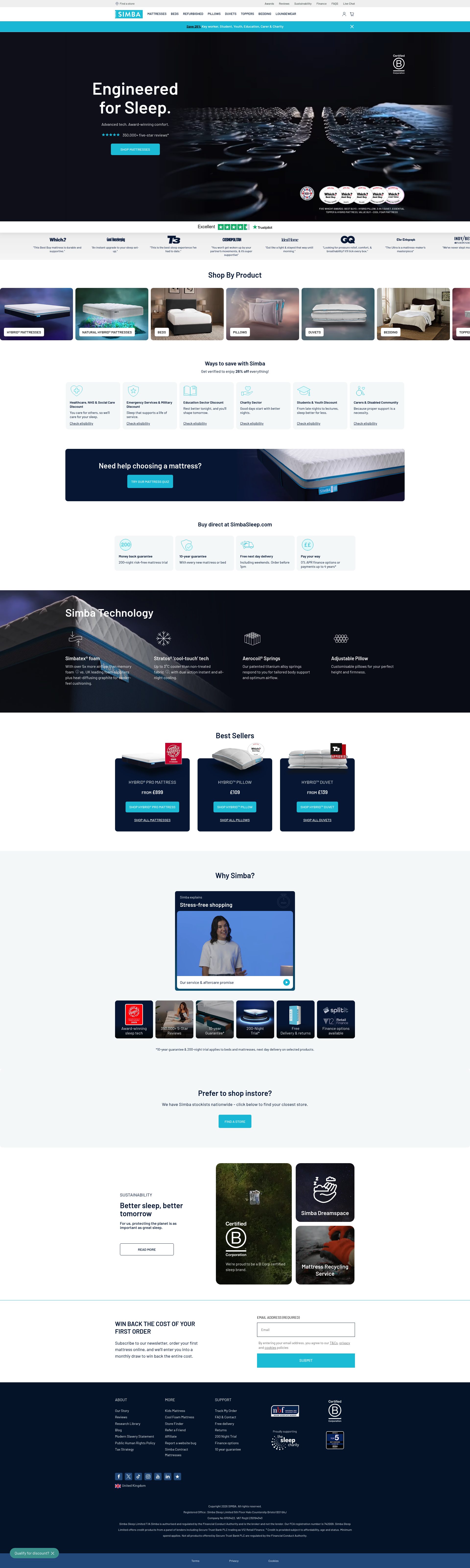
Simba built its brand around proprietary spring-and-foam technology, and the PDP reflects that. The product page breaks the technology into named layers with cross-section diagrams, making something invisible and intangible into a concrete reason to buy. The "Simba Hybrid" nomenclature becomes a brand asset rather than just a descriptor.
The checkout flow handles financing well. Klarna is surfaced at the product page level with a per-month figure, not just at checkout, which reduces sticker shock and keeps the customer moving through the funnel. For a product averaging several hundred pounds, that early payment context is a meaningful conversion tactic.
Simba's sleep quiz is also well executed. Rather than gating the quiz behind an email capture, it leads directly to a product recommendation with a pre-populated cart. The friction is front-loaded in the quiz, which makes the final click to purchase feel like a low-effort confirmation rather than a decision.
3. Casper

Casper is the original DTC mattress brand and the store still shows the ecommerce thinking that made it famous. The product range has expanded considerably, but the site maintains clarity through a clean navigation structure that separates mattresses, sleep accessories and bundles without overwhelming the homepage.
The PDP is notable for its review integration. Rather than simply displaying an aggregate star rating, Casper surfaces customer quotes by sleep type and use case, which means a side sleeper or a hot sleeper can immediately find social proof relevant to their specific concern. That segmentation of reviews is a meaningful conversion tactic that most brands apply inconsistently.
Casper also uses content marketing as a conversion tool rather than just an SEO play. Sleep guides and product comparisons sit under a dedicated Sleep Resource hub, and many of those pages link directly to relevant PDPs. The content is functional, not decorative.
4. Nectar Sleep
Nectar's homepage is built around value and certainty. The offer structure, a 365-night trial backed by a lifetime warranty, is the boldest in the category, and the site makes sure that message cannot be missed. Both guarantees appear in the site header, on the homepage hero, and in the PDP trust badges. For a budget-to-mid mattress brand competing against more premium positioning, that certainty is the primary differentiator.
The product pages are leaner than competitors. Rather than layering in multiple content modules, Nectar keeps the focus on the add-to-cart action, the trial terms, and the review count. That restraint makes sense for a product where the price does a lot of the initial persuasion work.
Nectar's bundle mechanic is well used. Pillows and a mattress protector are surfaced as an add-to-bundle option rather than as separate product recommendations, which increases AOV without introducing the decision fatigue of a product recommendation carousel.
5. Otty
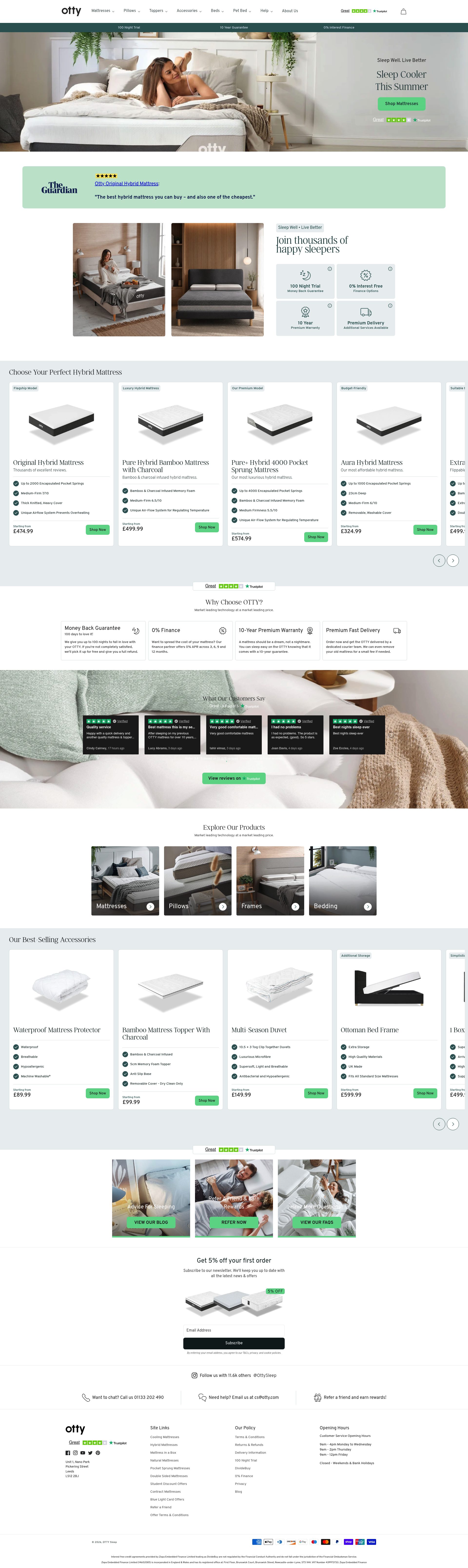
Otty is a UK-founded brand that has built a credible premium positioning on a founder-led story and a focus on open-coil hybrid construction. The homepage leads with the brand's manufacturing transparency: showing the production process and the materials used before any promotional offer appears. That ordering is deliberate, and it works by building trust before asking for attention.
The PDP uses a firmness selector that updates the product imagery in real time. A visual change that immediately follows a user interaction is a small UX detail, but it keeps the buyer engaged on the page and makes the configuration feel personal. Most mattress PDPs use static firmness charts; Otty makes the interaction tangible.
Customer review management is handled well. The brand surfaces negative reviews alongside positive ones, with responses where relevant. That transparency signals confidence in the product and reduces the risk that a buyer will dismiss the review section as curated.
6. Brook + Wilde
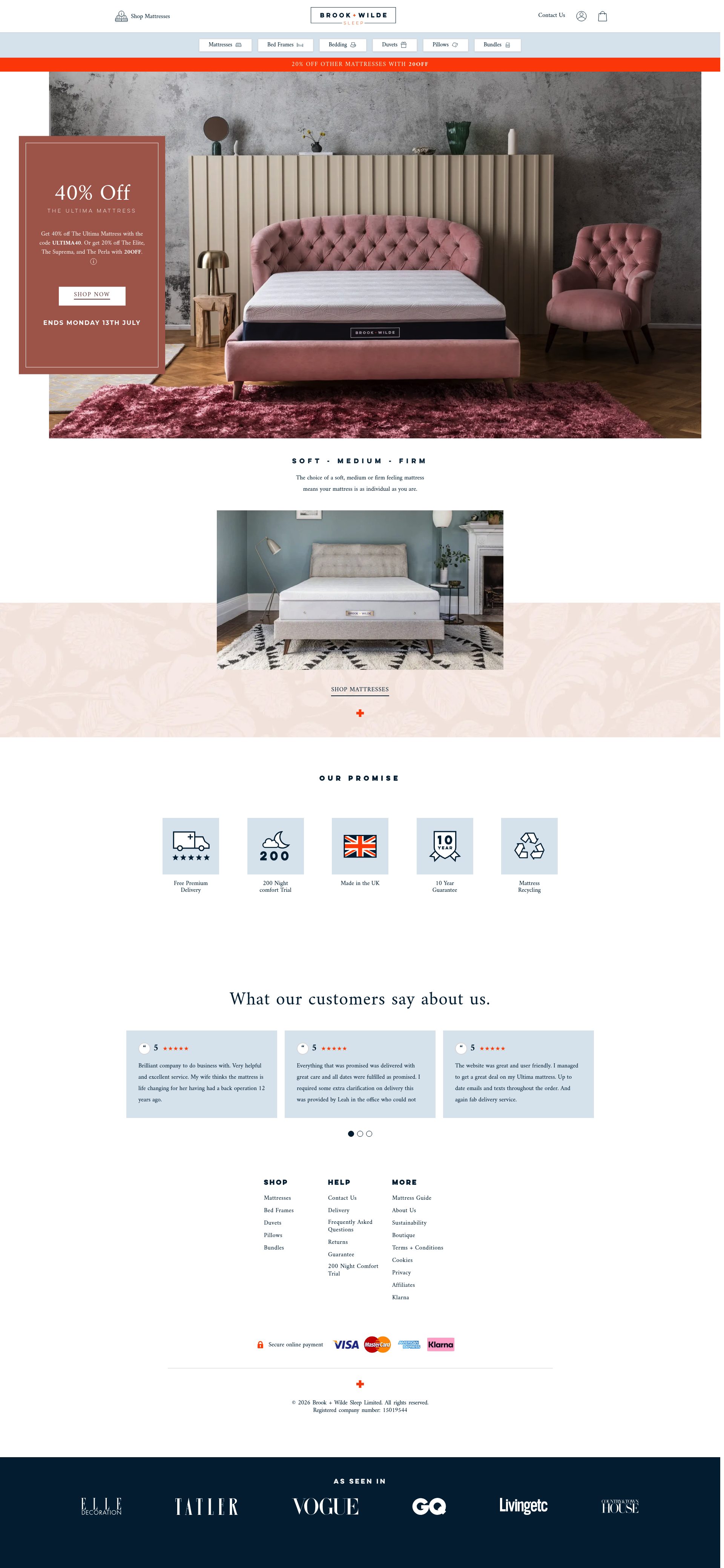
Brook + Wilde targets the luxury tier of the UK mattress market, and the store is built to match that positioning. The product photography is editorial rather than white-background, with bedrooms styled to feel attainable rather than aspirational in an alienating sense. The colour palette is muted and consistent across every page.
The range is built around a good, better, best architecture: Lux, Elite and Prestige. That tiering is surfaced clearly on the category page with a comparison table, which guides buyers without requiring them to visit individual PDPs to understand the differences. The tiering also supports AOV: buyers who arrive intending to spend at the entry level can see the upgrade proposition immediately.
Brook + Wilde's delivery and installation messaging is strong. White-glove delivery, old mattress collection and a specific installation time window are all confirmed on the PDP rather than buried in FAQs. For a product of this weight and price, those logistics details directly influence the purchase decision.
7. Helix Sleep
Helix is an American Shopify Plus brand whose primary conversion mechanic is the sleep quiz. Every significant CTA on the homepage directs visitors to the quiz rather than directly to a product, which is an unusual approach and one that works because the mattress category is genuinely confusing. The quiz produces a recommended mattress with a clear rationale, which removes the primary cognitive obstacle in the purchase journey.
The product pages are built around personalisation data. A buyer who has completed the quiz lands on their recommended PDP with a personalised header confirming why this mattress was matched to them. That continuity between the quiz and the PDP is a sophisticated use of the Shopify session, and it meaningfully reduces the drop-off that typically happens when a customer moves from a recommendation to a product page.
Helix's range also includes couples-specific configurations where each side of the mattress can be different firmnesses. The PDP for these products handles a genuinely complex product option in a clean, intuitive UI, which is harder to build well than it looks.
8. Purple
Purple's differentiator is its proprietary GelFlex Grid, and the Shopify store is built around making that technology legible and memorable. The homepage includes video demonstrations of the grid under pressure, which solves a real problem: the product's key benefit is invisible from the outside, so the store has to do the job that the physical product cannot.
The PDP uses an interactive pressure map showing how different mattress types distribute weight. This is a genuinely useful piece of content that doubles as a conversion tool by making Purple's technology concrete in comparison with foam and spring alternatives.
Purple's product range is premium, and the financing options are prominent throughout. Monthly pricing appears in product titles on category pages, not just on PDPs, which means a buyer browsing the range always has a payment-normalised view of the price. That normalisation reduces the moment of price shock that kills high-value DTC transactions.
9. Eve Sleep
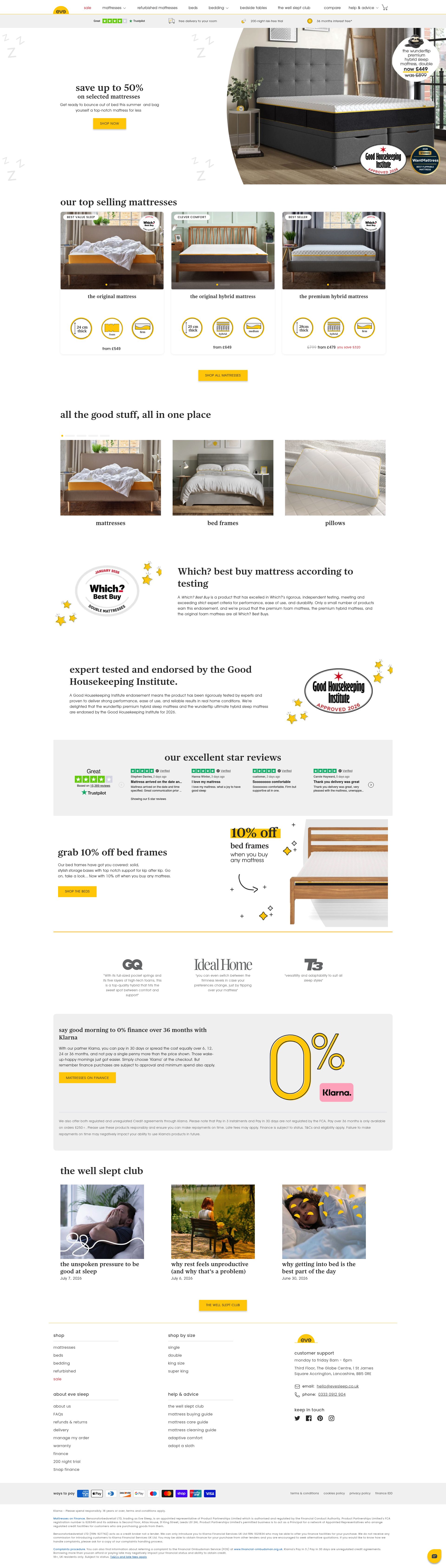
Eve Sleep is a UK DTC brand with a strong press record, and the homepage makes good use of that coverage. The media logo strip features names that UK shoppers trust, and it appears early in the page scroll, before any product information. The sequencing matters: credibility first, product second, price third.
The product pages have a well-structured Q&A section that surfaces common objections rather than leaving them to the FAQ page. Questions about firmness, heat retention and delivery are answered directly on the PDP with specific, non-generic answers. That specificity builds trust more effectively than boilerplate reassurances.
Eve's referral programme is surfaced in the post-purchase flow and in the account section, which is the right place for it. Referral programmes in mattress ecommerce work because the purchase is high-value enough for a discount to feel meaningful, and buyers who are satisfied after a week or two of sleeping on a new mattress are in a natural sharing moment.
10. Dormeo
Dormeo is a European brand with a strong UK presence and a product range that covers mattresses, toppers and bases. The site handles a wide SKU count well, with category pages that use fabric and firmness filters to narrow options quickly. The topper category is particularly well structured: a comparison table highlights the key differences between models, with a clear entry-level option for buyers who are not yet ready to replace a mattress.
The brand's TV advertising history gives it name recognition, and the homepage leans on that with consistent brand colour use and a visual identity that matches the offline creative. That coherence between TV and digital reduces the friction for buyers who arrive having already seen a Dormeo ad.
Dormeo's trial policy is 60 nights, shorter than competitors like Nectar and Emma. Rather than hiding that difference, the PDP is direct about it, which builds trust by not over-promising. For a brand competing partly on price, honest positioning on trial terms is more durable than inflated guarantees.
If you sell mattresses or bedroom products and want a Shopify store that converts browsers into buyers, SuttonCommerce builds and optimises Shopify stores for exactly this kind of high-consideration purchase: explore our Shopify design service or get in touch.
Frequently asked questions
Which Shopify mattress store has the best trial period?
Nectar Sleep offers the longest trial at 365 nights, backed by a lifetime warranty. Emma Sleep's 200-night trial is the next strongest, and it is surfaced more aggressively across the store than any competitor. If trial length is your primary concern, Nectar is the clear winner.
Do mattress brands actually use Shopify Plus?
Several leading mattress DTC brands run on Shopify Plus, including Helix Sleep and Emma Sleep. Shopify Plus handles the high-volume traffic spikes common during sale events, supports custom checkout flows for financing integrations, and makes bundle mechanics and subscription upsells easier to implement at scale.
How do mattress Shopify stores handle the problem of buying without trying?
The best stores solve this through extended trial periods, detailed firmness guides, sleep quizzes that match buyers to the right product, and customer reviews segmented by sleep type. Helix Sleep goes furthest with its quiz, routing every visitor to a personalised recommendation before showing a product page. Emma surfaces its 200-night trial at every scroll point on the PDP.
What conversion tactics are most effective for a high-consideration product like a mattress?
Monthly payment figures shown at category level rather than just at checkout, customer reviews filtered by sleep position and body type, cross-section product diagrams that make invisible materials tangible, and white-glove delivery confirmed on the PDP rather than buried in FAQs. These are the tactics that consistently appear across the highest-converting mattress stores.
How do mattress stores use Klarna and BNPL to increase conversions?
The most effective implementation shows the per-month figure on the PDP hero, not just in the checkout flow. Simba Sleep does this well, surfacing a Klarna monthly breakdown alongside the full price so buyers mentally shift from a several-hundred-pound decision to a smaller monthly commitment before they reach the cart. Introducing BNPL only at checkout is a missed opportunity.