
Quick summary
Grenade sets the benchmark in this niche: clean product pages, inline subscription surfacing, and a variety pack structure that lifts AOV without friction. Barebells wins on flavour-first positioning, with photography and reviews that make taste the hero rather than macros — the right call for a brand built on taste differentiation. RXBAR's ingredient-as-headline product page approach is the most distinctive in the category, converting sceptical buyers by leading with verifiable claims rather than marketing copy. Pulsin and Trek both demonstrate that smaller independents can compete by being specific where larger brands are vague: certifications, allergen data, and honest nutritional breakdowns placed above the fold.
Protein bars sit in an unusual ecommerce position: the product is low-ticket individually but high-frequency by nature, which makes subscription mechanics and repeat purchase loyalty the defining commercial variable. The brands that build strong Shopify stores in this niche have figured out how to convert a first-time snack buyer into a monthly subscriber, how to handle flavour variety without overwhelming the product page, and how to back up nutritional claims credibly enough that a sceptical buyer does not click away. Here are ten that do it well.
1. Grenade
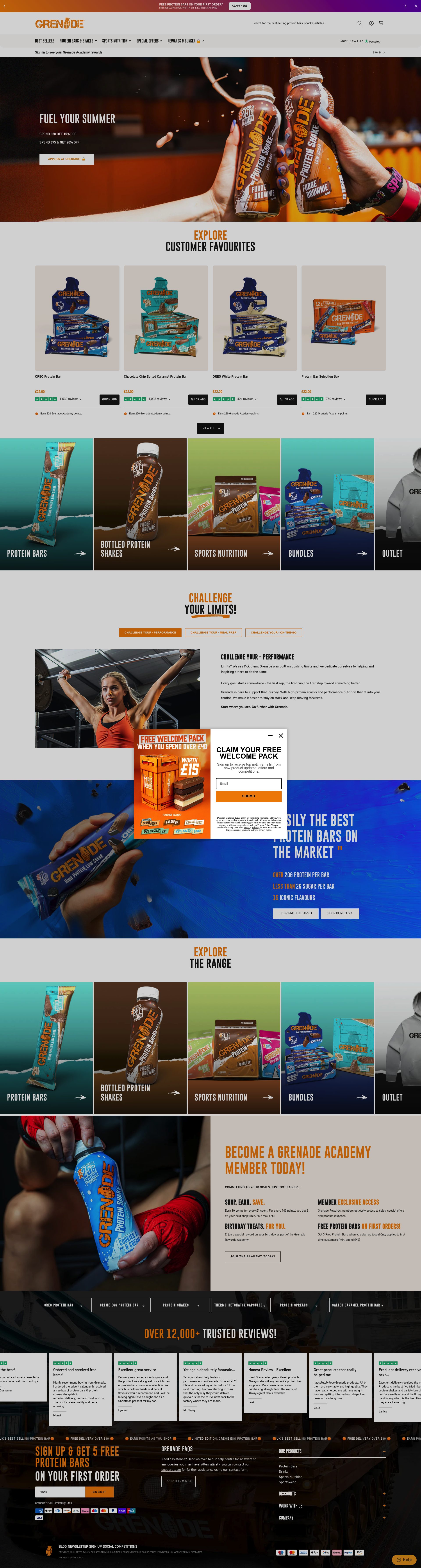
Grenade is the UK's dominant protein bar brand and its Shopify store reflects the confidence of a brand that outsells the competition in most UK convenience and online channels. The product pages are built around the bar itself: macro breakdown, flavour gallery, and verified reviews are above the fold on desktop and in the first scroll on mobile. Grenade does not over-complicate the buying flow. The box structure is clear, the per-bar price is shown alongside the box price, and the flavour selection interface is clean enough that a returning buyer can reorder in under a minute. The subscription offer is surfaced on the product page rather than on a dedicated landing page, which is the right placement for a brand whose core buyer comes in knowing exactly what they want. Multi-flavour variety packs are a consistently visible option throughout the catalogue, which lifts average order value without requiring a bundle builder or additional app.
2. Pip & Nut

Pip & Nut builds its store around ingredient transparency and that approach is credible because it is specific rather than vague. Product pages list the exact nut butter percentage, confirm the absence of palm oil, and explain why each ingredient is included rather than simply listing them. That level of disclosure is particularly effective in the snack category, where "natural" and "clean" are routinely used without any supporting detail. The navigation distinguishes between nut butters and bars without forcing the customer to choose between product types upfront, which works because the brand's audience shops across both. The subscription option surfaces realistic savings in pound terms rather than just a percentage, which is a small detail that materially affects conversion when a buyer is comparing spend across a month of snacking.
3. Barebells

Barebells is a Swedish brand that broke into the UK market with a proposition built entirely on the idea that a high-protein bar does not need to taste like one. The Shopify store commits to that positioning at every level: flavour photography is the dominant visual asset, customer reviews focus heavily on taste rather than macros, and the flavour selection on product pages is presented as a core purchase decision rather than a secondary filter. The site handles a wide flavour range without creating decision paralysis by showing stock availability inline with flavour selection, which nudges buyers toward the most popular options while still presenting the full range. Barebells runs both a direct subscription and a variety pack structure, and both are visible without navigating away from the main product page. The brand's UK retail expansion is referenced on the site, but the store is clearly built to capture the buyers who want to buy direct.
4. RXBAR
RXBAR built its brand around a product page that puts the full ingredient list on the front of the bar itself, and the Shopify store carries that logic through every part of the buying experience. Product pages open with the ingredient statement rather than a marketing headline: "3 Egg Whites. 6 Almonds. 4 Cashews. 2 Dates. No B.S." That copy format is as distinctive online as it is on pack, and it works because it makes a credibility claim that is immediately verifiable without requiring a buyer to read a separate ingredients section. The variety pack structure is well executed: flavour selection is grouped by flavour profile (chocolate, fruit, nut) rather than by name alone, which makes sense for a customer who has not tried the range and is navigating by preference rather than by prior knowledge. Subscription mechanics are clear and include flexible delivery intervals, which is the right approach for a product that is consumed daily by some customers and occasionally by others.
5. Kind Snacks
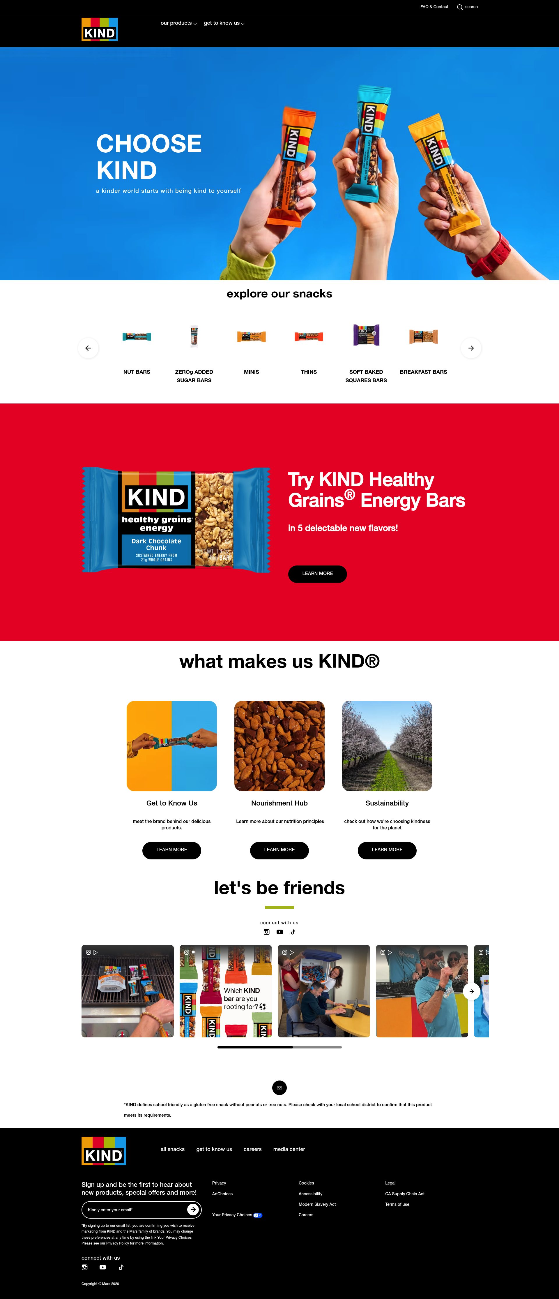
Kind Snacks operates a Shopify store across multiple markets, and the UK experience is built around the brand's core differentiation: visible whole nuts and fruit, not a blended compressed bar. Product photography shows the inside of bars, not just the wrapper, which is an unusually honest product presentation and one that communicates quality credibly. The product range spans bars, clusters, and pressed fruit bars, and the navigation handles that breadth with a clean category structure. Variety pack selection is strong, with flavour-grouped bundles that make it easy to trial the range without committing to a single flavour box. The loyalty programme and subscription offer sit on dedicated account and product pages, and the subscription terms, including the cancellation process, are stated clearly before signup. For a brand competing on ingredient honesty in a category full of processed snacks, that level of transparency at the transactional level is commercially consistent with the product positioning.
6. Pulsin
Pulsin is a Welsh brand selling plant-based protein bars, protein powders, and snacks with a store structure that reflects its range clearly: a shopper coming in from a search for vegan protein bars lands directly on a relevant collection page rather than a generic homepage. Product pages include the full nutritional breakdown with a clear vegan and allergen indicator above the fold. The store uses Shopify's subscription tools to offer regular delivery with a stated saving, and the subscription is presented as a default option on the product page rather than requiring a separate sign-up flow. Pulsin's B Corp certification is visible in the footer and on relevant product pages, which functions as a trust signal for the brand's core audience. For a smaller independent competing against heavily backed brands, the clarity of the store's navigation and the credibility of its certification signals is a practical commercial advantage.
7. Trek
Trek is a UK brand owned by Natural Balance Foods and its Shopify store is structured for buyers who are navigating across a broad product range: bars, flapjacks, protein balls, and kids' snacks. The navigation separates these clearly enough that a customer looking for a high-protein adult bar does not wade through a children's snack range to find it. Product pages include the macro breakdown as a primary visual element, not as a footnote, which is the right call for a customer making a purchase decision based on protein-to-calorie ratio. The brand's focus on natural ingredients is backed by the product page with specific certifications (Vegan Society, Rainforest Alliance) placed near the add-to-cart button. Variety packs are a prominent option in each category, and the pricing structure makes the per-unit savings from a multi-pack obvious without requiring the customer to do the calculation themselves.
8. Warrior
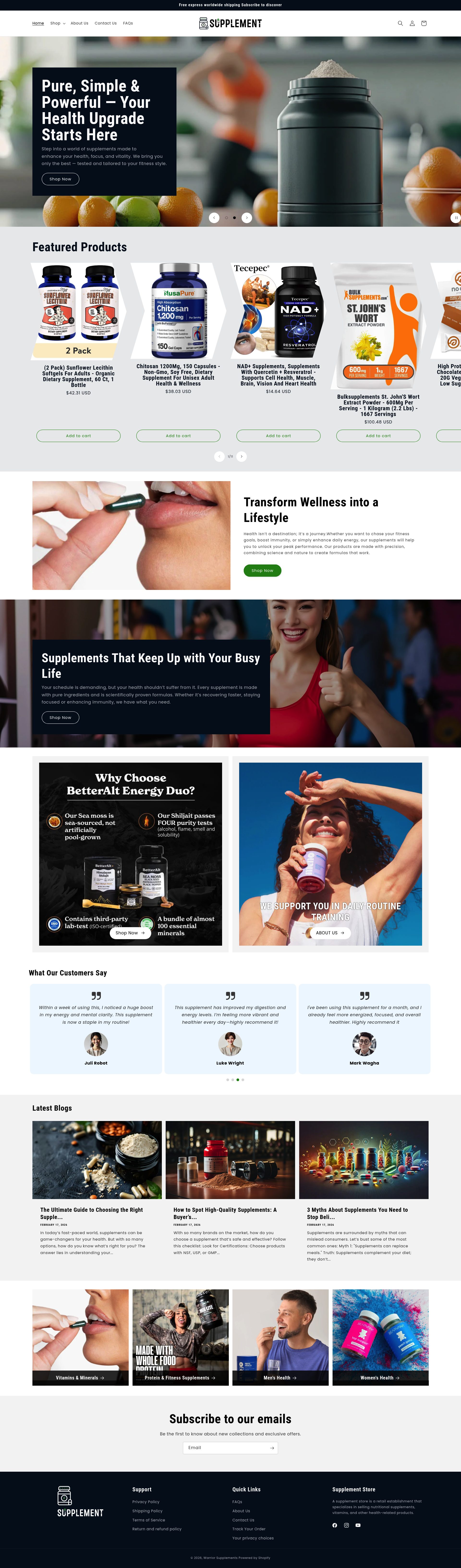
Warrior is a UK sports nutrition brand whose protein bars, particularly the Warrior Crunch range, have built a strong following in the gym and bodybuilding community. The Shopify store reflects that positioning: product pages feature macro profiles, flavour variety, and gym-environment photography rather than the clean minimalism of lifestyle snack brands. Box pricing is the dominant purchase format, and the per-bar cost is surfaced clearly so a buyer can compare against retail pricing without doing mental arithmetic. The brand does a strong job of cross-referencing its protein bar range with its protein powder and snack product lines: "Complete your stack" product recommendations are placed below the add-to-cart button and are editorially curated by training goal rather than being a generic algorithmically generated suggestion. Warrior's approach is less polished than some brands on this list but it converts well within its audience because the store speaks the same language as the buyer.
9. Oatein
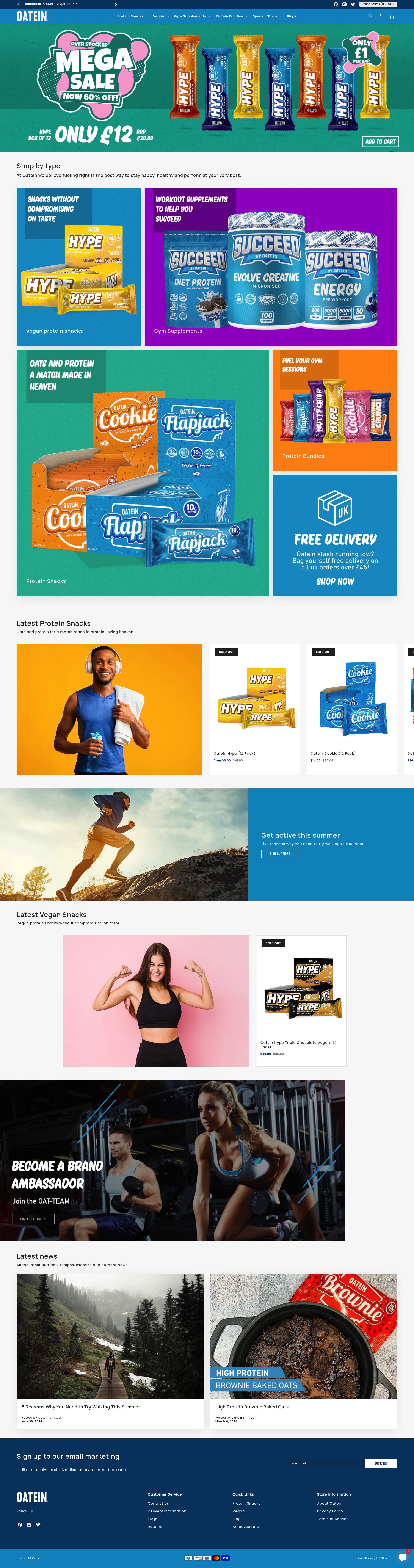
Oatein is a UK independent whose Shopify store is built around one clear proposition: high-protein, oat-based bars with macros that work for serious gym-goers. Product pages are structured to surface the nutritional data first, with macros, ingredients, and calorie breakdown appearing before any lifestyle copy. That ordering is correct for a buyer who has arrived specifically because they want to know the protein content, not because they need to be convinced that fitness matters. Oatein handles flavour variety on product pages well: a visual flavour selector shows current stock status inline, which reduces the frustration of selecting a flavour and then discovering it is out of stock at the point of add-to-cart. Subscription options are available and the savings are stated in cash terms. For a brand competing in a market dominated by larger players, the combination of clear nutritional claims and an honest product page experience is a defensible commercial position.
10. FULFIL Nutrition
FULFIL is an Irish brand now widely distributed in the UK and its Shopify store reflects the confidence of a brand whose bars are stocked in most UK supermarkets and gym chains. The DTC store focuses on the flavour variety and value proposition for buyers who want to buy in bulk: multi-bar boxes, variety packs, and bundle offers are the dominant purchase formats. Product pages communicate the macro headline quickly, macro badge with protein grams per bar above the fold, followed by the flavour selector and then the full nutritional breakdown. The brand's wide retail footprint is used commercially rather than apologised for: the store positions direct purchasing as the way to access exclusive flavours and bundle pricing not available in retail. Subscription mechanics are present and the email capture on the homepage is tied to a clear offer, a first-order discount, rather than a generic newsletter prompt. That kind of specific, conditional offer consistently outperforms vague "sign up for updates" flows in terms of list quality and conversion from that first email.
If you sell protein bars, health snacks, or sports nutrition products and your Shopify store is not converting at the level these brands achieve, the gap is usually product page structure, subscription UX, or navigation clarity. Take a look at our Shopify design service or get in touch to discuss what your store needs.
Frequently asked questions
Which protein bar Shopify stores handle subscriptions best?
Grenade and RXBAR both surface subscription options directly on the product page rather than burying them in a separate flow, which is where subscription conversion happens. Pulsin goes further by making subscription the default selection, removing the friction of opting in entirely. FULFIL ties email capture to a first-order discount, which improves both list quality and subscription uptake from that initial purchase.
How do the best protein bar stores handle flavour variety without overwhelming buyers?
Barebells and Oatein both show stock availability inline with the flavour selector, so buyers are naturally nudged toward in-stock options rather than selecting a flavour and hitting a dead end at checkout. RXBAR groups its variety packs by flavour profile (chocolate, fruit, nut) rather than by name, which works well for new customers navigating by preference rather than brand familiarity.
Do any of these protein bar brands sell exclusively DTC or do they also have retail distribution?
Most brands on this list have significant retail distribution alongside their Shopify stores. FULFIL and Grenade are stocked in most major UK supermarkets and gym chains, but both use their DTC stores to offer exclusive flavours and bundle pricing unavailable at retail: a smart reason-to-buy-direct that keeps the DTC channel commercially relevant.
What makes a protein bar product page convert better than average?
The highest-converting pages in this niche share three traits: macro breakdown presented as a primary visual element (not hidden in a tab), a flavour selector that shows stock availability inline, and a subscription offer surfaced on the product page itself rather than on a separate landing page. RXBAR adds a fourth lever: leading with the ingredient list as the headline copy, which works as an instant credibility signal for ingredient-conscious buyers.
How do smaller independent protein bar brands compete with larger players on Shopify?
Pulsin and Trek show the clearest path: compete on specificity rather than brand awareness. That means certification badges (B Corp, Vegan Society, Rainforest Alliance) placed near the add-to-cart button, allergen and nutritional data above the fold, and navigation structured so that a buyer arriving from a category search lands directly on a relevant collection page rather than a generic homepage. Oatein adds honest stock transparency to that mix, which reduces frustration and return rates.