

Quick summary
SuitSupply is the benchmark for suit ecommerce: their fit-first product pages, mill provenance storytelling, and guided quiz convert customers who have never bought a suit online. SPOKE London is the strongest pick for the fit-anxiety problem, with a custom measurement engine baked into every purchase flow rather than offered as an optional extra. Lanieri wins the made-to-measure space outright, with real-time pricing, fabric swatch previews, and a configuration journey that removes every reason to abandon. Moss handles the breadth problem — ready-to-wear, hire, and MTM — better than any other UK suit brand, routing each customer type into its own dedicated journey from the first click.
Suits are one of the hardest categories to sell online. The customer is spending anywhere from £200 to £2,000 on something they cannot try on, and the purchase decision depends on fabric feel, fit precision, and confidence in the brand. The stores that convert in this category do not just have great photography: they have built their entire UX around reducing fit anxiety, communicating quality credibly, and guiding customers through what is often a considered, high-stakes purchase. Here are ten that do it well.
1. Moss
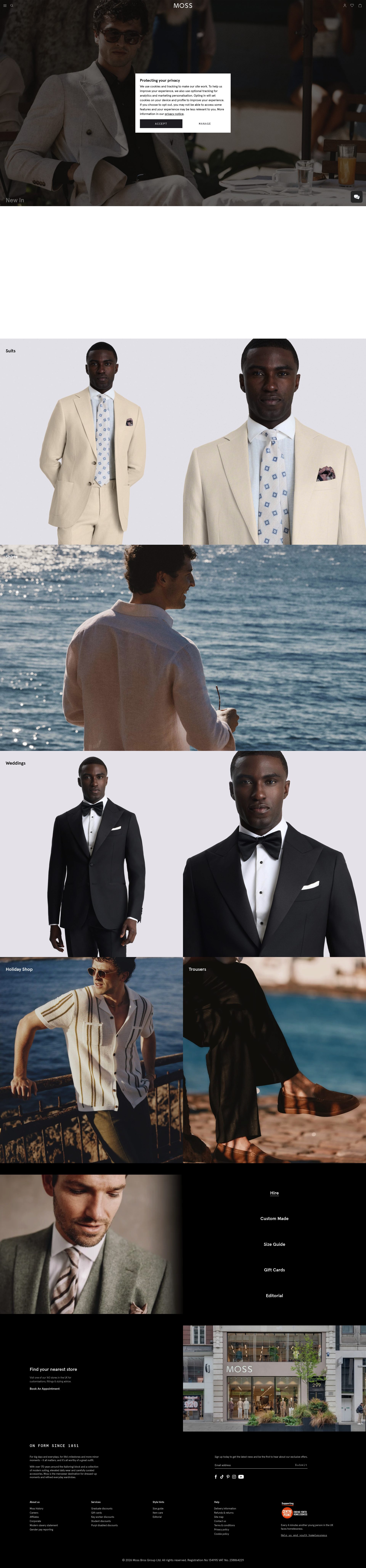
Moss (formerly Moss Bros) has rebuilt its digital presence around its made-to-measure and rental proposition, and the store architecture reflects this clearly. The main navigation separates ready-to-wear, made-to-measure, and hire into distinct paths, so customers are routed into the right journey from the start rather than landing on a generic collection page. Their made-to-measure flow is particularly strong: it is broken into clear steps, progress is visible throughout, and the customisation choices are presented one decision at a time rather than all at once, which reduces overwhelm on a complex configuration.
Product pages in the ready-to-wear range include a fit-type selector (slim, tailored, regular) that persists across browsing sessions, so returning customers do not have to reset their preference. Social proof includes verified occasion-specific reviews, which is exactly the right format for a category where customers want to know the suit worked at a wedding, not just that the fabric is nice.
2. SuitSupply
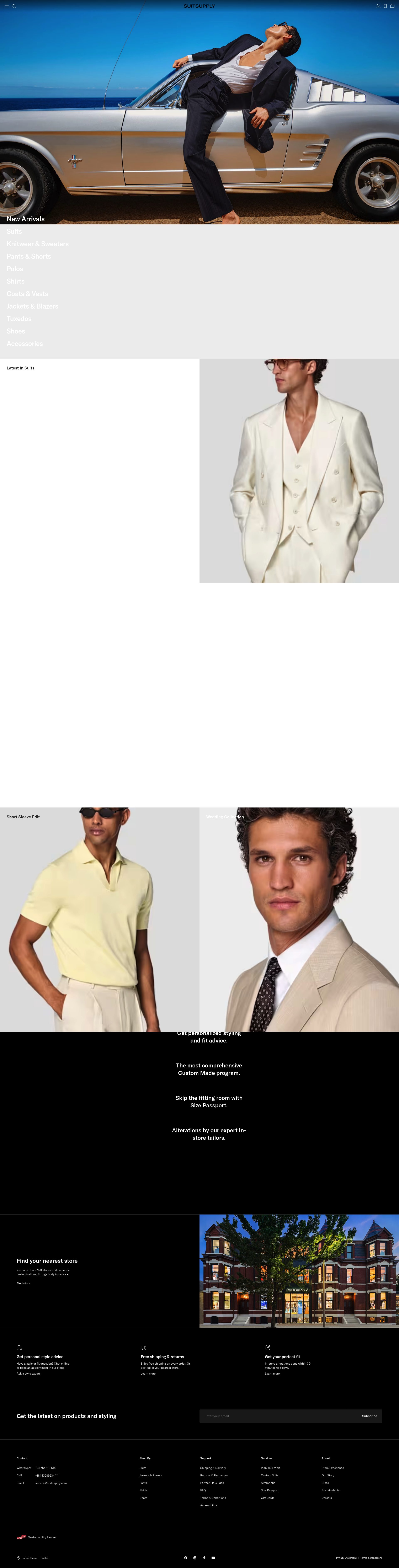
SuitSupply has built one of the most conversion-optimised suit stores on Shopify Plus. Their product pages are structured around fit first: before a customer engages with fabric, colour, or price, they are prompted to select their fit profile. The store remembers this selection and surfaces relevant products accordingly, which means a shorter customer on a second visit does not wade through Neapolitan cuts that will not work for their proportions.
The fabric storytelling is detailed without being overwhelming: mill provenance, thread count, and composition are included on every PDP, but structured as scannable bullet points rather than walls of text. Their "Find Your Fit" guided quiz drives significant traffic from customers who are new to buying suits online and unsure where to start. The store's photography is consistent and highly controlled: every suit is shot on the same model in the same lighting, which makes it easy for customers to compare options side by side.
3. Reiss
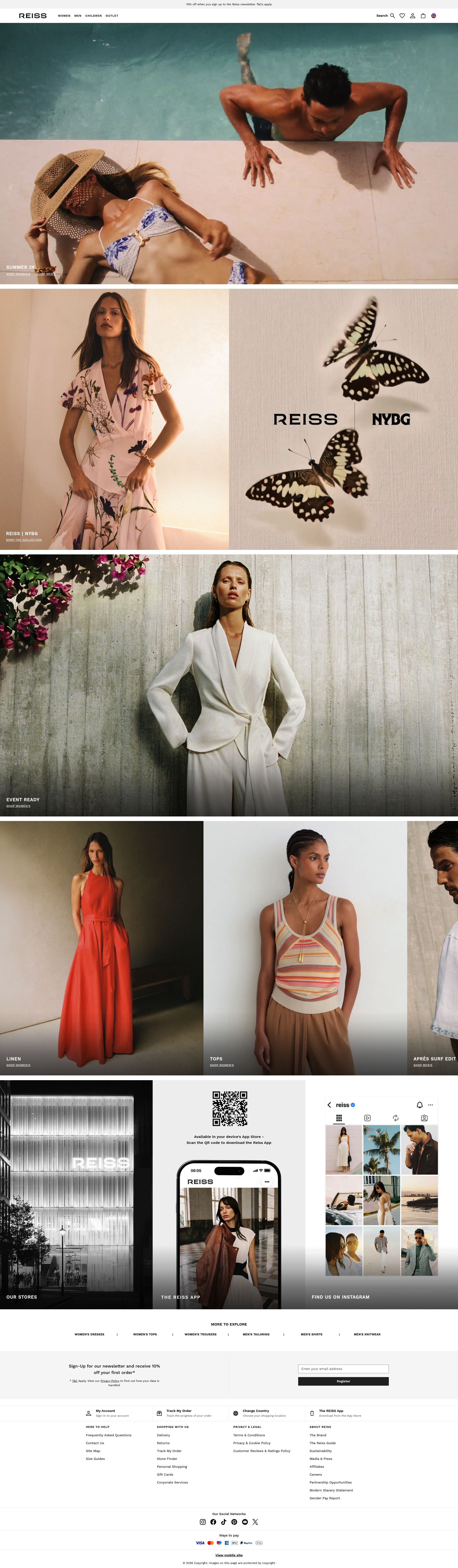
Reiss operates at the premium end of the accessible suit market, and their store communicates that positioning at every touchpoint. Collection pages open with editorial campaign imagery before transitioning into a product grid, which primes the customer's price perception before they see the £350 price tag. The PDPs include size and fit notes written by Reiss's own team, covering model height, garment measurements at size M, and cut notes for each specific style rather than a generic size guide.
The cross-sell logic on suit PDPs is well-calibrated: related shirts, ties, and shoes are surfaced as a complete look rather than as disconnected recommendations. A customer can build a full outfit in a single session without returning to the homepage. Reiss also surfaces their loyalty programme in the cart and at checkout rather than burying it in the footer, which gives customers a clear reason to create an account before they complete the purchase.
4. Charles Tyrwhitt
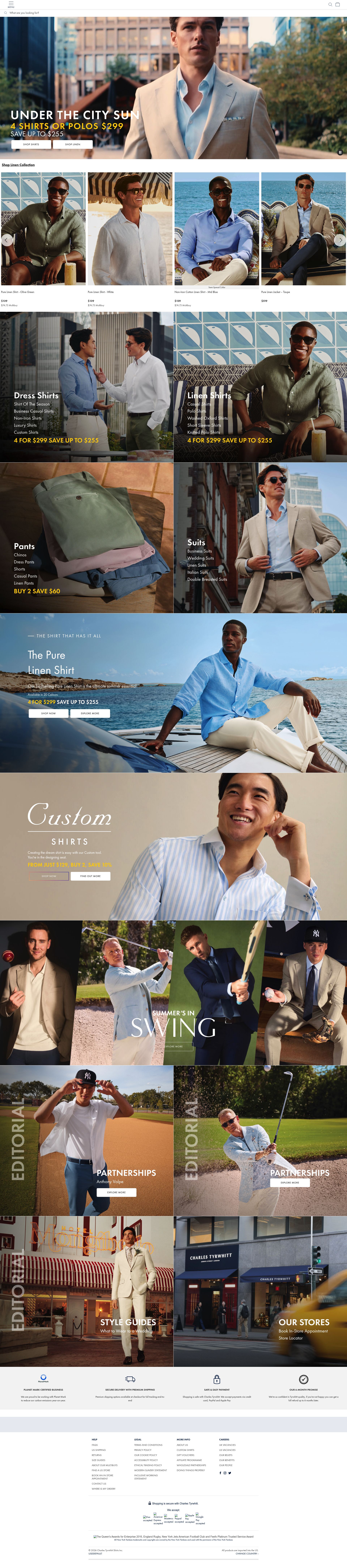
Charles Tyrwhitt has built its reputation on value at the price point, and their store's conversion architecture reflects this. Multi-buy promotions (three suits for a set price) are surfaced persistently across collection pages and PDPs, which drives both average order value and the "may as well complete the set" purchasing logic that the brand understands well. The promotional pricing is never hidden: the original price, promotional price, and per-item saving are all displayed clearly, which builds trust rather than raising questions about the original price integrity.
Their size guidance is thorough: a video-led fit guide, an illustrated measurement tool, and written fit notes per style mean that a first-time buyer has multiple formats for understanding what they need before committing. The checkout includes a clear indication of their return policy, which is important for a category where customers are often uncertain about fit. Charles Tyrwhitt's made-to-measure option is positioned as an upsell from the ready-to-wear PDP, with a clear explanation of what the additional cost delivers.
5. SPOKE London
SPOKE London has done something most suit brands have not: it built its entire store around the insight that men's trousers and suit separates rarely fit off the peg. Their product pages start with a fit engine that captures waist, seat, and leg length separately rather than defaulting to S/M/L sizing, and the store calculates a specific size recommendation rather than a range. This is a genuine differentiator that is embedded in the purchase flow rather than bolted on as an optional extra.
Their copy is direct and practical: product descriptions focus on where and how you would wear each piece, the specific fit problem each garment solves, and what the construction detail means for everyday wear. There is no aspirational lifestyle waffle. The checkout is clean with a clear returns policy shown at the point of hesitation, which addresses the primary concern a first-time buyer has when committing to a custom-fit purchase they have never tried on.
6. Paul Smith
Paul Smith's Shopify store is one of the more sophisticated examples of using editorial content as a conversion tool without sacrificing product clarity. The homepage and landing pages carry significant brand storytelling through photography and copy, but the product pages themselves are concise: key details, clean imagery, and a size guide that includes both chest and waist measurements to help customers understand how the suit is cut. The Stripe design, which is synonymous with Paul Smith, is called out in product copy in a way that makes it feel like provenance rather than marketing.
Their gifting flow is well-handled: gift wrap, gift notes, and suggested complementary pieces are surfaced naturally at checkout and in the cart, which is important for a brand that does significant volume in occasion-gifting. The international currency selector is prominent, which matters for a brand with a strong international customer base. Paul Smith also surfaces its in-store tailoring services from the website, creating a bridge between digital and physical that reinforces the brand's tailoring heritage.
7. Richard James
Richard James is one of the few British luxury tailoring houses to build a Shopify-native DTC store that holds its own against the brand's Savile Row positioning. The product pages for their ready-to-wear suits carry the detail you would expect from a brand with bespoke roots: specific fabric weights, season suitability, and construction notes (canvassed vs fused, working buttonholes) that a knowledgeable customer will recognise and value. This level of specificity signals authenticity and helps justify premium pricing without resorting to discount.
The store's photography is controlled and consistent, with multiple product angles and a fabric swatch close-up on every PDP. Navigation is deliberately simple: suits, tailoring, and shirting sit in a clean top-level menu without the sub-category sprawl that clutters many fashion stores. The bespoke enquiry route is surfaced clearly from the ready-to-wear PDPs, which captures consideration from customers who arrive intending to buy off the peg but are open to exploring a full bespoke option.
8. Ted Baker
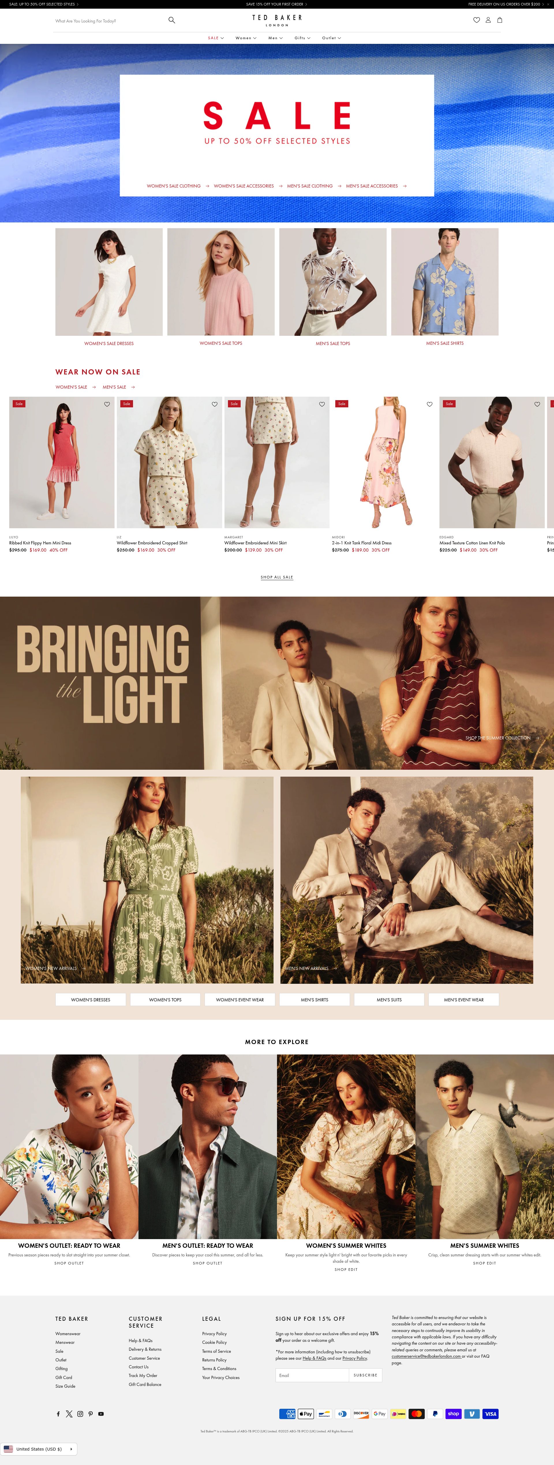
Ted Baker's store manages the challenge of a broad catalogue without losing the brand's distinct character. The suits and tailoring category is clearly signposted from the navigation, and collection pages use editorial photography that reflects Ted Baker's well-established brand personality. The PDPs include a "Complete the Look" section that is better calibrated than most: the recommended accessories and shirts are specifically matched to the suit's colour and pattern rather than being generic suggestions.
Their fit and returns messaging is consistently placed throughout the journey: the returns policy appears in the product page, the cart, and the checkout, which is the correct approach for a category where fit anxiety is the primary reason for purchase abandonment. Ted Baker also surfaces their loyalty programme, Ted's Club, at multiple points without making it feel like a pressure tactic. The in-store appointment booking is linked from the website for customers who want to try before buying, which provides an important exit ramp for high-consideration purchases.
9. Hawes and Curtis

Hawes and Curtis has built a store that competes primarily on value at the formal end of the market. Multi-buy pricing on suits and separates is the dominant promotional mechanic, and it is implemented well: the pricing is transparent, the per-unit saving is explicit, and the multi-buy logic is explained without requiring the customer to work it out themselves. This is a conversion mechanic that works well in suits because customers often want multiple suits and are waiting for a reason to buy more than one.
Their product pages are structured to serve a customer who is comparing options across the range: colour and fabric variants are shown as thumbnail swatches rather than forcing a page reload, and the size guide includes both UK and EU sizing conventions. The store handles the formal/casual spectrum of their range clearly, with separate navigation paths for occasion wear versus workwear. Subscription to their newsletter comes with a discount code surfaced on exit intent, which works well for a brand where the customer base is likely to return for seasonal updates.
10. Lanieri
Lanieri operates in the custom suit space and their Shopify store is built around the complexity that comes with configuring a made-to-measure garment. The configuration journey is their primary differentiator: a customer selects fabric, lining, lapel, buttons, and fit in a structured flow with visual previews at each step, and the price updates in real time as options are added. This makes the pricing fully transparent and eliminates the anxiety of discovering the final price only at checkout.
Their fabric selection interface is particularly well-executed: swatches are shown at scale, with fibre composition, weight, and season suitability all labelled clearly. The store surfaces a style advisor chat option throughout the configuration journey, which provides an escape valve for customers who feel uncertain without derailing those who know what they want. Lanieri also provides a clear lead time at the point of purchase: a customer knows before completing their order when their suit will arrive, which is critical information for occasion-wear purchases.
Suit brands selling direct need stores that convert at a high AOV while managing fit anxiety and communicating quality credibly. If your store is not achieving that, the gap is usually product page structure and UX. See our Shopify design service or get in touch to talk through what is possible.
Frequently asked questions
Which Shopify suit store has the best made-to-measure experience?
Lanieri is the strongest MTM experience online. Their configuration journey lets customers choose fabric, lining, lapel style, and buttons with visual previews at each step, and the price updates in real time so there are no surprises at checkout. SPOKE London is a close second for separates, using a custom measurement engine that calculates a specific size recommendation rather than defaulting to a size range.
What do the best suit Shopify stores do to reduce fit anxiety?
The top performers use multiple, overlapping tactics rather than a single size guide. SuitSupply uses a fit-profile quiz and persists the customer's selection across sessions. Charles Tyrwhitt combines a video-led fit guide, an illustrated measurement tool, and written fit notes per style. Ted Baker and Hawes and Curtis repeat their returns policy on the product page, in the cart, and at checkout rather than burying it in the footer.
Are any of these suit stores on Shopify Plus?
SuitSupply runs on Shopify Plus and is frequently cited as one of the best-performing fashion stores on the platform. Moss, Reiss, and Charles Tyrwhitt also operate at the scale where Shopify Plus is the logical infrastructure choice, handling multi-currency, high-volume promotional events, and custom checkout flows.
How do the best suit stores handle cross-selling without being pushy?
Reiss and Ted Baker both execute this well by surfacing complete outfit recommendations on suit PDPs rather than generic related products. The key difference is specificity: the shirts, ties, and shoes shown are matched to the specific suit's colour and pattern, so the suggestion feels like styling advice rather than an upsell. Paul Smith does this particularly well in their gifting flow, surfacing complementary pieces naturally in the cart rather than as a pop-up.
What Shopify features matter most for selling suits online?
Persistent fit profiles, guided quiz flows, and real-time variant switching are the three highest-impact features for the suit category. Customers buying suits online need to make multiple decisions under uncertainty, so anything that reduces the number of choices presented at once and remembers previous selections directly improves conversion. A transparent, prominently placed returns policy is also non-negotiable at the AOVs involved.