
Quick summary
Grenson leads on product page depth, using Goodyear welt specs and break-in timelines to justify a £200–£400 price point without discounting. Dr. Martens sets the benchmark for community-driven conversion at scale, with real customer photography and a smart mid-funnel loyalty upsell. Blundstone turns a narrow catalogue into a strength, using material education and a quiz mechanic to reduce decision fatigue. Hunter solves the product-breadth problem with clear navigation hierarchy and a real-time personalisation configurator that drives gifting revenue.
Boots is one of the most technically complex footwear categories to sell online. Fit, shaft height, sole construction, and material all affect buying decisions in ways that a single hero image cannot communicate. The stores that convert best in this space have built product pages that close that information gap without overwhelming the customer. Here are ten that do it well.
1. Grenson
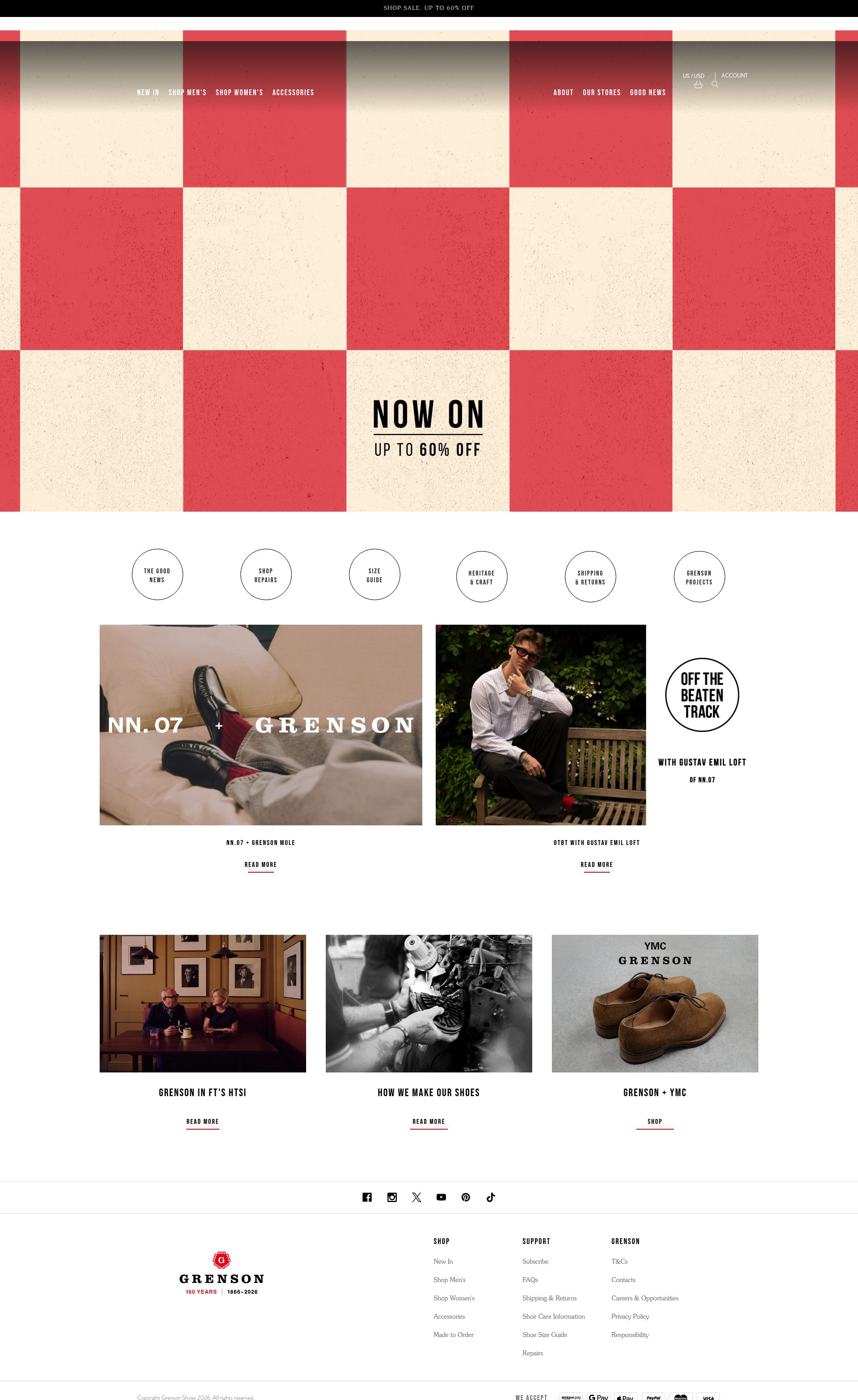
Grenson is a 160-year-old Northampton cobbler that built a modern DTC operation on Shopify Plus without losing any of its craft credibility. Their product pages lead with manufacturing process: Goodyear welted construction, Northampton-tanned leather grades, and sole specifications are all front and centre before the customer reaches size selection. This works because Grenson's buyer is making a considered, high-ticket purchase and needs to justify the spend to themselves. The technical detail is the conversion tactic.
The store uses a "break-in" timeline section on leather boot PDPs, which directly addresses the most common pre-purchase objection in quality footwear. Stock and size availability is surfaced clearly with a low-stock trigger. For a brand selling boots at £200 to £400, eliminating doubt at the product page is more important than discounting.
2. Tricker's
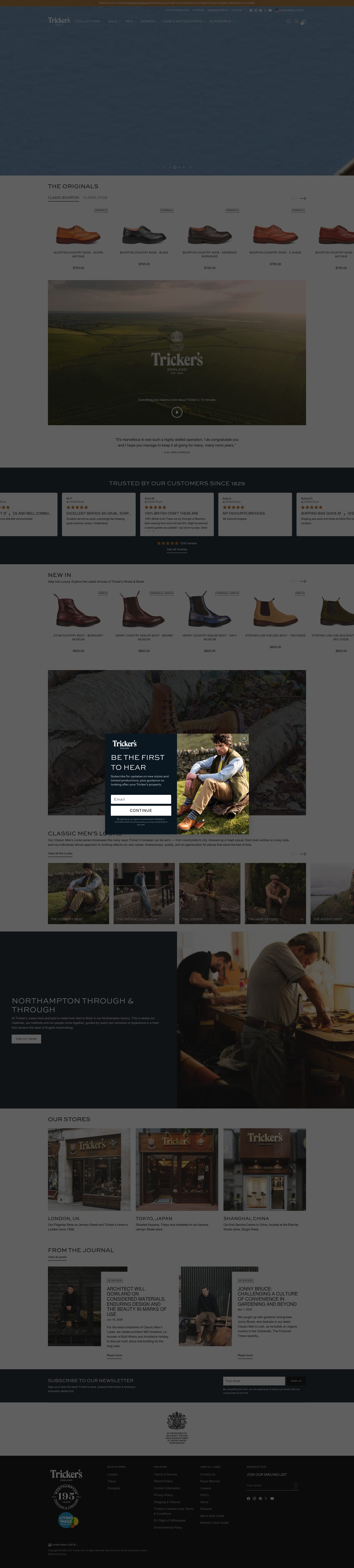
Tricker's is another Northampton heritage brand, and their Shopify store handles the complexity of made-to-order and ready-to-wear in the same catalogue without creating confusion. The navigation separates the two clearly, and the made-to-order configurator surfaces leather colour, sole, and last options in a step-by-step format that guides rather than overwhelms. That configurator is one of the stronger examples of Shopify's customisation capabilities applied to high-end footwear: it answers the question "can I get exactly what I want?" before the customer even has to ask.
Country of origin and craftsperson stories are woven into collection pages, which gives the store an editorial quality uncommon at this price point. Delivery timescales for bespoke orders are communicated clearly, which matters for a customer who may be buying for a specific occasion.
3. Dr. Martens
Dr. Martens runs one of the largest boots operations on Shopify Plus globally, and the store architecture reflects the scale of the catalogue: thousands of SKUs across boots, shoes, and accessories, organised by silhouette, collection, and culture. The navigation is the store's most important conversion asset. Filtering by silhouette (1460, 2976, Jadon) works because DMs buyers are often loyal to a specific last and want to explore colourways and leathers within it rather than browsing blind.
Product pages are built around community: real customer photos in the reviews section, outfit context shots, and a "Made for Life" repair messaging that directly addresses the premium price point. The subscription offer for the loyalty programme is surfaced mid-funnel on the cart page rather than at checkout, which is a smart placement: the customer is already committed to buying and the value exchange is clear.
4. Chelsea Paris
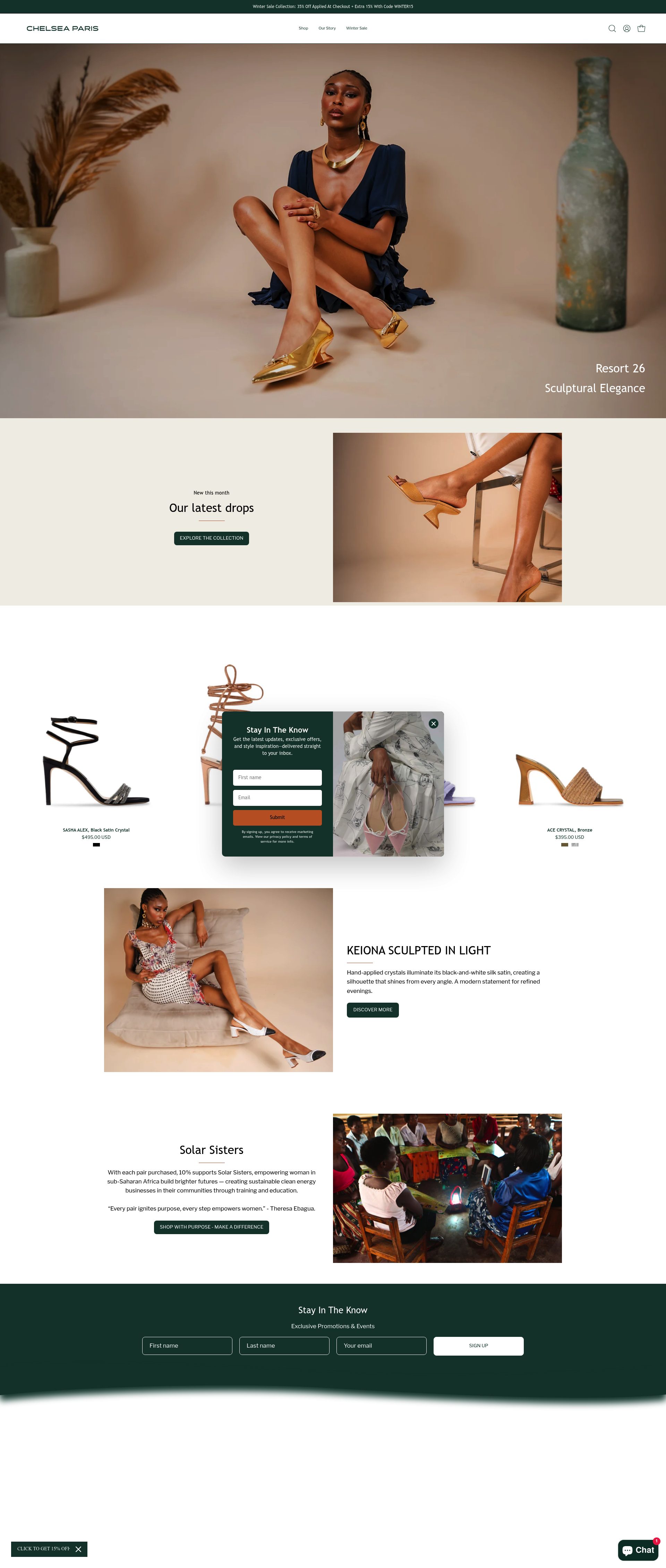
Chelsea Paris is a New York-based DTC label that sells directly on Shopify and punches above its size on product page quality. Each boot page includes a detailed fit guide with calf and ankle measurements for over-the-knee and tall shaft styles, which is exactly the information that prevents a return. The photography is styled to show both the boot in isolation and on a range of body types, which builds confidence for customers who cannot try in-store.
The homepage is structured as a visual journey through the season's edit rather than a grid dump of the full catalogue, which creates a curated feel that supports their premium positioning. Checkout upsell is clean: matching care products are offered in the cart without feeling aggressive.
5. Muck Boot
Muck Boot's Shopify store is a lesson in category navigation done right. Their catalogue spans wellies, riding boots, work boots, and hunting boots, and the challenge is routing customers to the right product quickly. The store solves this with activity-based navigation rather than generic product-type filtering: "equestrian", "farming", "hunting", "construction" are the top-level menu choices, meaning a customer's first click takes them to a relevant shortlist rather than a broad catalogue.
Product pages carry extensive technical specification: temperature ratings, waterproofing standards, and sole traction data are presented in a scannable spec table. This detail is essential for a customer making a practical purchase decision. Their in-store retail partnership messaging is handled well: buy online or find a stockist links coexist without undermining the DTC channel.
6. Blundstone
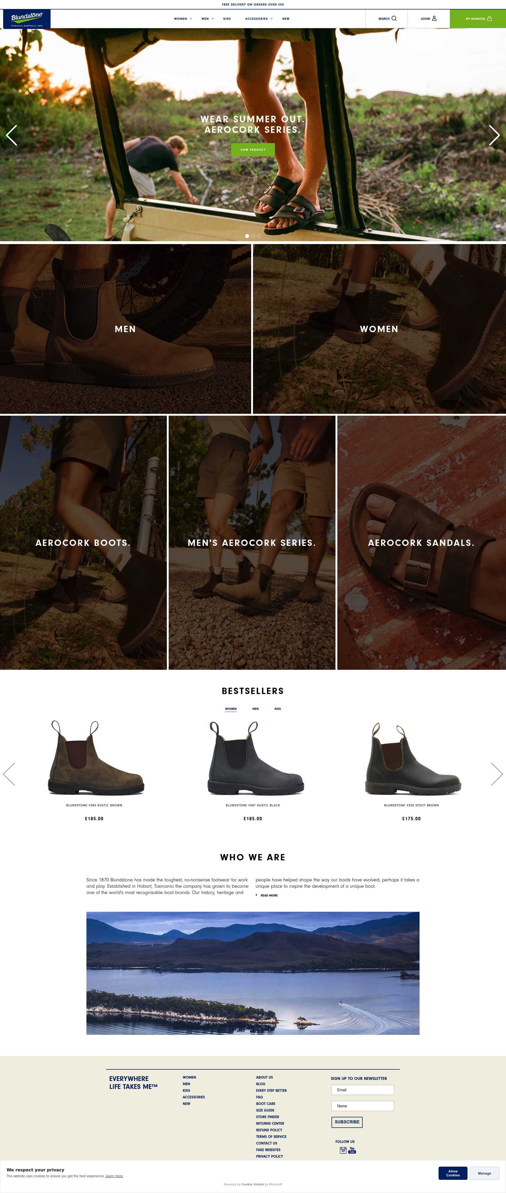
Blundstone's Shopify Plus store sells a relatively narrow product range by boots standards, which means the store's job is conversion depth rather than navigation breadth. Their product pages invest heavily in material education: the elastic side panel construction, the removable footbed system, and the XRD impact protection are all explained in short, jargon-free copy blocks supported by close-up photography. A customer who arrives knowing nothing about Blundstones should leave the PDP understanding exactly why the product is worth £165.
Their "Find your style" quiz is placed prominently on the homepage and functions as a lightweight merchandising tool for customers who are open-minded about colourway and finish. It captures preference data while reducing decision fatigue: a smart conversion mechanic for a brand whose customers often buy multiple pairs over years.
7. Penelope Chilvers
Penelope Chilvers is a British independent that built its reputation on the Tassel Boot and expanded from there. Their Shopify store carries the brand's personality clearly: editorial photography, limited colourways released seasonally, and copy that speaks to occasion and lifestyle rather than spec. The store is an example of how a smaller catalogue handled well outperforms a larger one handled carelessly.
Their product pages use waiting list functionality for sold-out sizes, which captures demand and reduces the conversion loss from stockouts. Email capture in exchange for restock notification is integrated cleanly into the PDP rather than as a modal. For a brand with constrained production runs, this is a better strategy than discounting: it builds a list of warm buyers for the next season.
8. Ariat
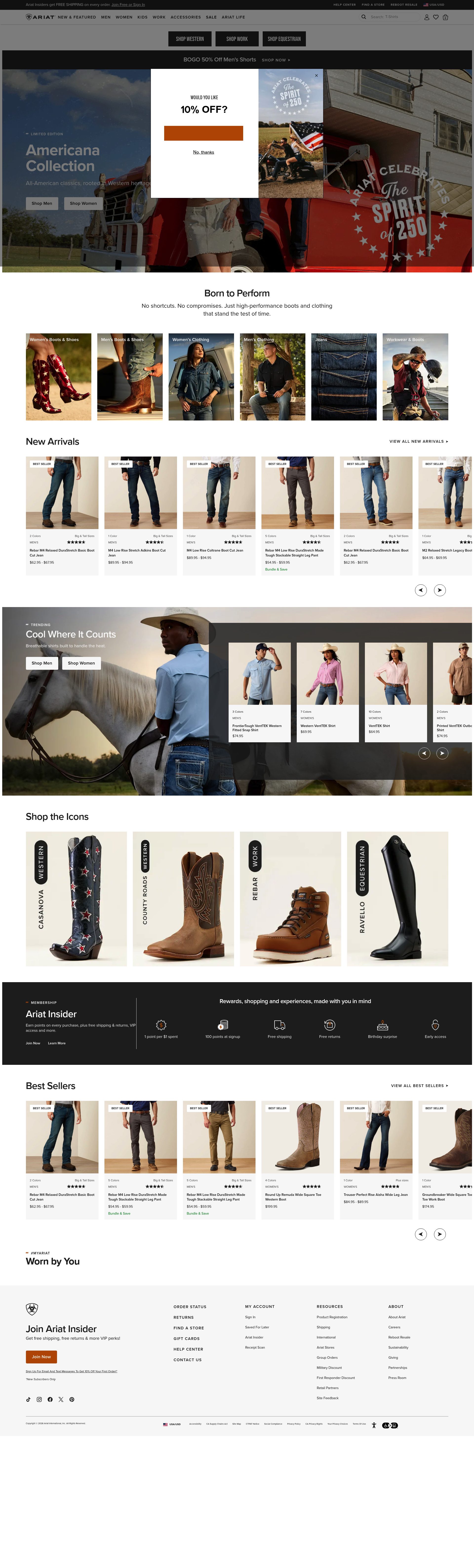
Ariat sells equestrian and western boots and runs a sophisticated Shopify Plus operation that handles both retail and wholesale. Their product pages carry the clearest sole and last technology descriptions in this list: ATS (Advanced Torque Stability) is explained with a diagram on relevant PDPs, which is exactly the right approach for a functional claim that customers cannot evaluate from a photo alone. Ariat's buyers are knowledgeable and respond to specifics: vague "comfort technology" copy would not work here.
The store handles size complexity well: western boots require width fitting across a broader range than most UK footwear brands, and the size guide is thorough without being intimidating. Gift card functionality and a strong loyalty programme (Team Ariat) are surfaced at checkout without being intrusive.
9. Sorel
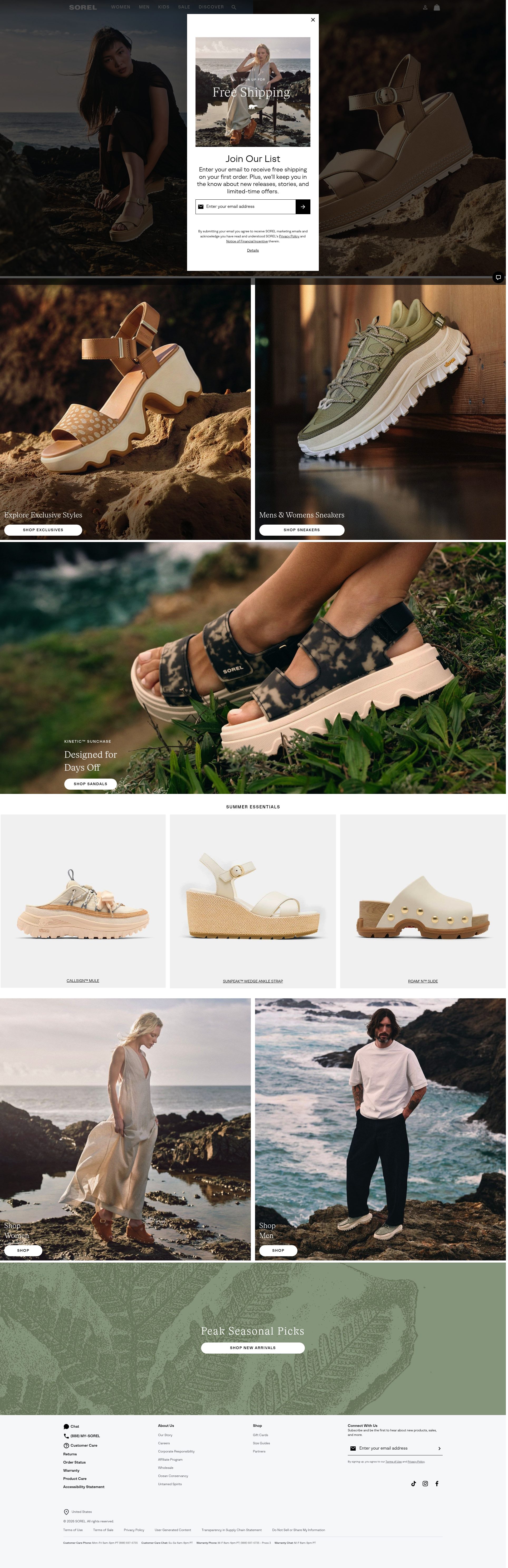
Sorel's Shopify store is one of the better examples of a brand that straddles functional and fashion positioning without losing coherence in either direction. Their winter boot PDPs carry waterproofing and temperature ratings alongside outfit photography, which means the same page serves both the practical buyer researching for cold-weather performance and the fashion buyer looking for something that works with an outfit. Getting that dual positioning right at the product page level is harder than it looks.
Collection organisation switches between "by use" (snow, rain, everyday) and "by style" (platforms, boots, shoes) via the navigation, giving customers two valid paths to the same products. Bundle promotions with socks and insoles are surfaced in the cart, contributing to a measurably higher AOV in a category where accessories are a natural add-on.
10. Hunter

Hunter is the most recognisable welly boot brand in the UK and their Shopify Plus store has evolved well beyond their Original Boot heritage into a full footwear and accessories range. The challenge Hunter faces, and largely solves, is communicating product breadth without diluting the core brand identity. Their navigation anchors the Original collection prominently while surfacing the wider range for customers ready to explore: a clear hierarchy that protects the brand anchor while enabling cross-sell.
Personalisation is a standout feature: monogramming and colour customisation on the Original Boot is handled via a clean product configurator that updates preview imagery in real time. For a gifting-heavy category like wellies, this is a conversion driver with real purchase motivation behind it. Their rubber care and maintenance content is embedded in PDPs, extending the customer relationship beyond the transaction.
If your boots store is not converting at the level these brands achieve, the gap is usually product page depth and navigation architecture. See our Shopify design service or get in touch to talk through what is possible for your store.
Frequently asked questions
What makes a boots Shopify store convert well?
The biggest conversion drivers in footwear are product page depth and navigation architecture. Boots buyers need fit information, material specs, and construction details before they commit — stores that surface this clearly, without burying it below the fold, consistently outperform those that lead with lifestyle imagery alone. Activity-based or silhouette-based filtering also reduces bounce from customers who arrive with a specific use case in mind.
How do heritage boots brands handle premium pricing on Shopify?
The strongest heritage stores — Grenson, Tricker's, Penelope Chilvers — lead with manufacturing process rather than discounting. Goodyear welt construction, country of origin, craftsperson stories, and material grades all serve as justification for the price before the customer reaches the add-to-cart button. The technical detail is the conversion tactic.
How should a boots store handle made-to-order or bespoke products on Shopify?
Tricker's is the clearest example: they separate made-to-order and ready-to-wear in navigation from the start, then use a step-by-step configurator for bespoke options covering leather, sole, and last. Delivery timescales for bespoke orders are communicated upfront, which is critical for customers buying for a specific occasion. The key is separating the two journeys early so customers are never confused about lead times.
What is the best approach to size guides for boots with complex fit requirements?
Chelsea Paris includes calf and ankle measurements for tall shaft styles; Ariat publishes width fitting data across a broader range than most UK footwear brands. Both demonstrate the same principle: a thorough size guide reduces returns more cheaply than any post-purchase returns process. For boots specifically, shaft height and calf circumference data should be on the PDP, not hidden behind a separate size guide page.
How do functional boots brands communicate technical specs without overwhelming buyers?
Muck Boot and Ariat both use scannable spec tables — temperature ratings, waterproofing standards, sole traction data, and ATS technology diagrams — presented in a format that rewards customers who want detail without forcing it on those who do not. The rule of thumb is: lead with the outcome (warm, waterproof, stable) and put the supporting spec data one click or scroll below for buyers who need to verify the claim.