

Quick summary
Zita West sets the benchmark for clinical authority in fertility ecommerce, leading with practitioner credentials and a subscription flow built around the full conception journey. Proceive wins on formulation depth and deliberate simplicity: a tight product range steered toward a high-value couples bundle. Needed is the strongest US reference point, with named practitioner partnerships embedded into every product page and a subscription architecture designed to retain customers through changing circumstances. Beli Wellness stands out for genuinely addressing male fertility rather than treating it as an afterthought, with specific social proof and a couples bundle as the primary conversion path.
Fertility supplements sit at the intersection of health anxiety, high purchase intent, and real clinical nuance. Customers researching preconception nutrition are not impulse buyers: they read ingredient labels, they look for clinical backing, and they are acutely sensitive to trust signals. The Shopify stores that perform well in this niche have figured out how to convert that research-heavy mindset into subscriptions, bundles, and long-term retention.
1. Zita West
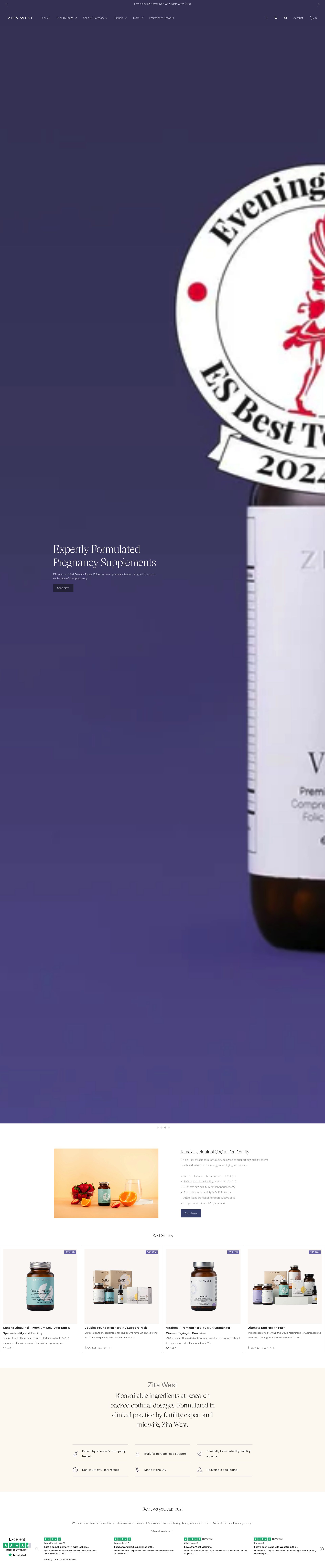
Zita West is the clearest example of clinical authority translated into ecommerce. The brand was founded by a midwife and fertility specialist, and that provenance is used as a conversion lever throughout the store: product pages lead with the clinical rationale for each formulation, reference specific nutrient forms (methylfolate rather than folic acid, for example), and make the professional credentials of the team visible. That level of specificity is exactly what a customer who has already done their research expects to see before they trust a supplement at this price point.
The subscription mechanic is well-executed: the default product page selection is a subscribe-and-save option, with a visible saving clearly stated, and the frequency selector is part of the primary add-to-cart flow rather than hidden behind a tab. Product bundles are structured around the conception journey: there are paired male and female programmes, trimester-specific ranges, and post-natal options, which increases average order value by meeting customers at each stage rather than treating fertility as a single purchase moment.
Navigation is organised by journey stage (trying to conceive, pregnant, post-natal) rather than by product type alone, which mirrors how customers actually categorise their need. This is an important structural decision: it reduces cognitive load and shortens the path from landing to conversion.
2. Proceive
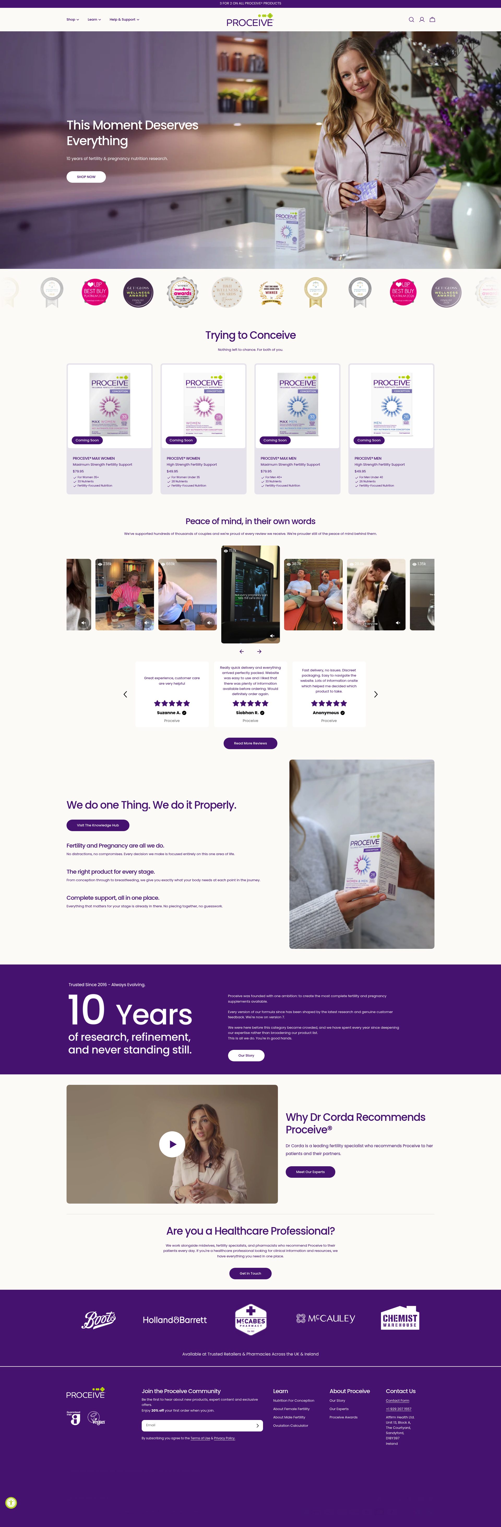
Proceive's store is built around a clear positioning claim: the most comprehensive fertility supplement formulation available. That claim is substantiated throughout the product pages with ingredient lists, clinical references, and an explanation of why each micronutrient is included. The store does not shy away from technical detail, which is the right call for a customer who will compare labels before committing to a monthly subscription at this price.
The product range is deliberately tight: male and female formulations, an advanced variant for each, and a combined couples bundle. That simplicity reduces decision paralysis. The bundle is the clearest high-value offer in the range and is positioned prominently on both the homepage and collection pages, which steers customers toward the highest average order value option without aggressive upselling.
Trust signals are layered throughout: press coverage from national titles, clinical advisor credentials, and user review counts are all present above the fold on product pages. The return policy and money-back guarantee are stated clearly in the product page sticky header, which directly addresses one of the primary purchase barriers for a high-ticket health supplement.
3. FertilityFamily
FertilityFamily's store is structured around a slightly different ecommerce model: they position as a curated marketplace for fertility supplements and products rather than a single-brand manufacturer. This allows the store to capture customers who are still in the brand comparison phase, and it creates natural cross-sell opportunities across a broader product catalogue than a single-brand store can offer.
The curation narrative, backed by a clinical advisory team, is what earns trust in this model. If you are not the manufacturer, you need to be demonstrably expert in selection, and FertilityFamily uses clinical partnerships and expert content to establish that credibility. Their editorial content, including cycle guides and supplement explainers, keeps organic traffic high and positions the brand as a resource rather than just a retailer.
The cart and checkout flow is clean: bundles are surfaced at the cart stage, and subscription options are available across the catalogue. The design is warm and reassuring rather than clinical and cold, which is a deliberate tonal choice for a category where emotional resonance matters alongside technical credibility.
4. Nuo by Proceive
Nuo is Proceive's premium sub-brand, sold through a separate Shopify store with a distinct aesthetic and positioning. The decision to operate separate storefronts rather than a single brand with tiered products is a sound strategic one: it avoids cannibalisation, allows different creative direction, and lets each brand own a specific price-point perception. Nuo targets a more design-conscious, premium buyer and the store reflects that with a restrained layout, premium product photography, and a softer editorial voice.
The product page structure is notable: it leads with the sensory and lifestyle elements of the product before moving into clinical detail, which inverts the Proceive approach deliberately. For a buyer who has already decided they need a premium supplement and is now choosing between options, the experience of the product becomes a relevant differentiator. Nuo leans into that.
Subscription messaging is present but understated: the emphasis is on routine and ritual rather than the cost-saving angle that dominates most supplement subscriptions. This is a positioning choice that protects the premium perception of the brand.
5. Needed
Needed is a US-based Shopify brand that has become the reference point for premium prenatal and fertility nutrition in the DTC supplement market. Their store makes a single strong bet on clinical credibility: every product is developed with, and validated by, a team of practitioners, and those practitioner partnerships are featured prominently across the store. This is not a logo wall of endorsements: the store names specific practitioners, their credentials, and their clinical rationale for the formulations, which is a more compelling trust signal than generic professional approval.
The subscription model is a core part of the revenue architecture: subscribe-and-save is the default selection on every product page, and the store uses a subscription management app that lets customers easily adjust, pause, or swap their formulation as their journey progresses. That flexibility directly reduces churn, which is critical in a category where customer circumstances change frequently.
Product education is integrated into the purchase flow: each PDP includes a "why we made this" section, a breakdown of key ingredients, and a clinical reference tab. This depth serves the informed buyer without overwhelming a customer who just wants to know what is in the bottle.
6. Beli Wellness
Beli Wellness built their Shopify store around a specific audience insight: male fertility is significantly underserved in the supplement market, and men searching for fertility support have almost nowhere credible to go. Their men's formulation is not an afterthought added to a primarily female-focused range: it is positioned as a product with its own clinical rationale, its own creative direction, and its own conversion path. That specificity resonates with a customer who is used to being an edge case.
The couples bundle is the highest-converting product on the site and is positioned as the primary option on the homepage. Surfacing the combined solution above the individual products is a strong ecommerce decision: it increases average order value and frames the purchase as a shared commitment, which is emotionally relevant to the customer's actual situation.
Review content on Beli's product pages is notably specific: reviewers mention cycle outcomes, partner engagement, and product comparison with competitors. This kind of detailed social proof is more persuasive in a high-consideration category than star ratings alone. The store actively surfaces this content rather than burying it below the fold.
7. Ōura
Ōura sits at the edge of this category: they are primarily a wearable brand, but their Shopify store increasingly positions the ring as a fertility and cycle tracking tool, and the health data ecosystem they have built around it creates a natural upsell path into their supplement and health product recommendations. The store is an example of how a non-supplement brand can own a position in the fertility space by owning the data layer.
The hardware-first ecommerce model presents different challenges from a pure supplement store: the product is physical, the value is in the software, and the conversion argument depends on the customer understanding what the data unlocks. Their PDP handles this with a clear "what you track" section positioned prominently before technical specs, which is the right prioritisation for a non-technical buyer.
Subscription mechanics are built around the software plan rather than the hardware, which is an interesting model: the ring is a one-time purchase with a recurring revenue tail. That architecture is worth studying for any DTC brand considering how to build subscription revenue without forcing product replenishment.
8. Premama Wellness
Premama is a US Shopify brand that has built a strong position in drink mix and dissolvable supplement formats: their store is structured around the format differentiation (you are not taking more pills, you are adding a sachet to your water) and that distinction is used to address the pill fatigue objection that is common in the prenatal supplement category. Format as a conversion argument is underused in supplements, and Premama executes it well.
The homepage leads with the "no pills" message and backs it up immediately with product imagery that shows the drink format in context. That visual-first approach to a functional claim shortens the explanation needed on PDPs. Product pages are clean and focused, with the key benefit statements above the fold and clinical detail below.
The starter bundle is positioned as a low-risk entry point: it is priced below the full subscription commitment and includes a variety of formats, which reduces the barrier for a customer who is sceptical about the format or the brand. Converting trial buyers to subscribers is then handled by the post-purchase email flow.
9. Vitl

Vitl's Shopify store is built around personalisation: the onboarding quiz that recommends a supplement stack is the primary conversion path, and the store actively steers traffic toward the quiz rather than direct product browsing. This is a strong ecommerce decision in a category where customers often do not know which formulation they need: the quiz captures intent data, reduces decision paralysis, and produces a personalised recommendation that the customer is more likely to commit to than a cold product browse.
The subscription model is deeply integrated: recommended stacks come pre-configured as monthly subscriptions, and the pricing presentation makes the subscribe-and-save option clearly superior. Vitl's retention strategy leans on the personalisation layer: changing your needs means updating your quiz, not cancelling and starting from scratch, which keeps customers in the subscription ecosystem rather than churning.
Vitl's product pages are lighter on clinical detail than brands like Zita West or Needed, which is a deliberate tonal choice for a broader mass-market audience. The trade-off is that customers who want deep formulation detail will look elsewhere, but the simplicity serves customers who are earlier in the research journey and just need a clear recommendation.
10. Myvitamins
Myvitamins is part of The Hut Group's Shopify infrastructure and represents the volume end of the fertility supplement market: accessible pricing, frequent promotions, and a broad catalogue that covers fertility, preconception, and pregnancy nutrition. Their store's conversion model is built on discount mechanics: bundle deals, multi-buy savings, and subscribe-and-save discounts are surfaced across every collection page and frequently in the header and homepage hero.
The trade-off for volume pricing is lower clinical depth: product pages are concise, ingredient detail is present but not prominent, and the professional credibility signals are less developed than premium brands in this category. For a buyer making a first purchase in the fertility supplement category, or a buyer switching from a pharmacy own-brand product, that is not necessarily a barrier: the price point and the brand recognition do the conversion work.
What Myvitamins executes well is cross-sell and upsell at scale: related products, bundle recommendations, and "frequently bought together" modules are deployed across the full catalogue. In a category where customers typically need multiple supplements (CoQ10, methylfolate, vitamin D, omega-3 as a common stack), the ability to build a basket of complementary products in a single session is a meaningful conversion advantage.
If you are building or scaling a Shopify store in the health and supplements space, the ecommerce decisions in these stores, from subscription architecture to trust-signal placement, are worth studying closely. Get in touch to talk through what your store needs, or see how we work with Shopify merchants.
Frequently asked questions
What makes a fertility supplement Shopify store high-converting?
The highest-converting stores in this niche combine clinical credibility with frictionless subscription mechanics. Customers are research-heavy and sceptical, so trust signals like named practitioners, specific ingredient forms (methylfolate over folic acid, for example), and money-back guarantees must appear above the fold. Subscription as the default purchase path, rather than an opt-in, is the single biggest revenue architecture decision in this category.
Which fertility supplement store has the best subscription model?
Needed is the strongest example: subscribe-and-save is the default selection on every product page, and their subscription management allows customers to pause, adjust frequency, or swap formulations without cancelling. That flexibility is critical in fertility, where customer circumstances change frequently and churn is otherwise high. Zita West also executes well, with a clearly visible saving and the frequency selector built into the primary add-to-cart flow.
How do the best fertility Shopify stores handle male fertility?
Beli Wellness is the clearest example of a store that treats male fertility as a primary product line rather than an afterthought. Their men's formulation has its own clinical rationale, distinct creative direction, and its own conversion path. Proceive and Needed both include male formulations, but neither dedicates the same editorial and creative resource to the male customer as Beli does.
Should a fertility supplement store use a quiz or direct product browsing?
A quiz is the stronger conversion path when customers do not know which formulation they need, which is common at the start of a fertility journey. Vitl demonstrates this well: their onboarding quiz is the primary conversion path, and personalised stack recommendations have higher conversion rates than cold product browse because they remove decision paralysis. The trade-off is increased time-to-purchase, so the quiz must be short and the recommendation must feel credible.
How do fertility supplement stores build trust without a medical license?
The most effective approach is named, credentialled clinical advisory boards with specific roles in product development, not just endorsement. Needed names individual practitioners and their clinical rationale for each formulation. Zita West leads with the founder's credentials as a midwife and fertility specialist. FertilityFamily uses a clinical advisory team to justify their curation model. Press coverage from national titles and clinical references on product pages also carry significant weight in this category.