
Quick summary
Branch Furniture is the standout for high-ticket furniture ecommerce, with bundle configurators and spec-heavy product pages that remove doubt at a £500 price point. Grovemade leads on visual merchandising, using context-styled photography to justify premium pricing for desk accessories. Minisopuru punches above its weight with accurate compatibility tables and use-case-led reviews that out-convert most electronics brands. Ugmonk is the strongest example of founder voice driving trust and margin protection in a commoditised accessories market.
Home office is one of the more demanding niches in Shopify ecommerce. Purchases tend to be considered and high-ticket, customers are comparing multiple options before buying, and products like desks or monitor arms require detailed specifications to convert at all. The stores that succeed here invest in product page depth, clear use-case photography, and navigation built around how remote workers actually shop. These ten stores do all of that well.
1. Branch Furniture
Branch has built one of the clearest product pages in the furniture ecommerce category. Each desk and chair listing includes weight capacity, dimension breakdowns in multiple configurations, and an adjustment range for height-adjustable models — the kind of spec detail that removes doubt for a buyer who cannot sit in the chair before purchasing. Their "build your office" configurator lets customers price up a full desk, chair, and storage bundle in a single flow, which lifts average order value significantly compared to category-based navigation.
Their shipping and warranty messaging is specific: exact delivery windows, white-glove delivery options for large items, and a return policy that acknowledges the difficulty of returning flat-pack furniture. That specificity builds confidence at the moment a buyer is weighing up whether to commit to a £500 purchase online.
2. Fully
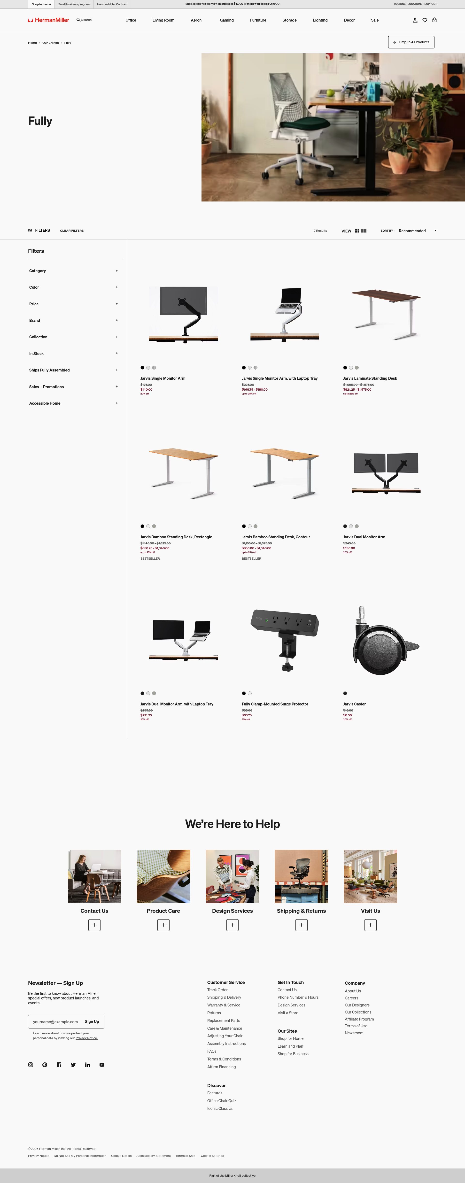
Fully specialises in standing desks and ergonomic seating, and their product pages are built around the scepticism a first-time standing desk buyer brings. They address the "will I actually use it?" objection with research references, usage guides, and before/after posture content linked from PDPs. Their desk configurators handle complexity well: frame colour, top material, size, and memory handset options are presented in a logical sequence without overwhelming the customer.
Their cross-sell structure is strong. Add a monitor arm or a cable management tray during the desk build, and the recommendation is surfaced at the right moment in the purchase journey, not buried in a "you might also like" block after checkout. Repeat customer mechanics are reinforced through their wellness content hub, which creates return visits even after purchase.
3. Grovemade
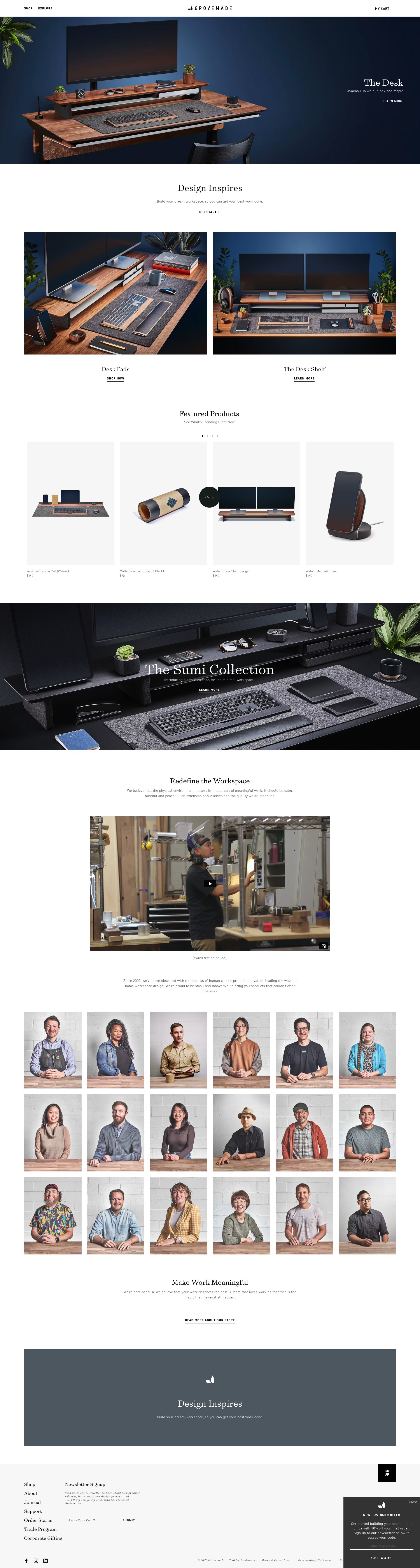
Grovemade sells premium wood and aluminium desk accessories, and their store treats product photography as the primary conversion tool. Every listing shows the product in context: styled on a real desk, alongside other pieces from the same collection. That approach lets a buyer visualise how a $90 pen tray fits into their setup, which is a harder job than it sounds when you are selling stationery at a price point people usually find absurd until they see it properly.
Their collection pages are structured around desk setup building blocks: surface, organisation, lighting, sound. That architecture mirrors how a customer actually thinks when they are decking out a home office, and it drives multi-item baskets naturally. Bundle promotions are woven into collection pages rather than relegated to a sale tab.
4. Oakywood

Oakywood is a Polish DTC brand that sells across Europe and the US from a Shopify Plus store, and their international approach is handled cleanly. Currency switching and regional shipping options are persistent and unobtrusive. Their sustainability storytelling is embedded at product level: each item lists the wood species, certification status, and the production location, which speaks directly to a buyer who wants to know what they are actually buying.
Their personalisation mechanic is a genuine conversion driver: laser engraving is offered on most desk accessories with a live preview, and the configurator is fast enough to use without friction. Personalised products reduce return rates and increase perceived value, and Oakywood surfaces this option early in the product page rather than as an afterthought.
5. Orbitkey
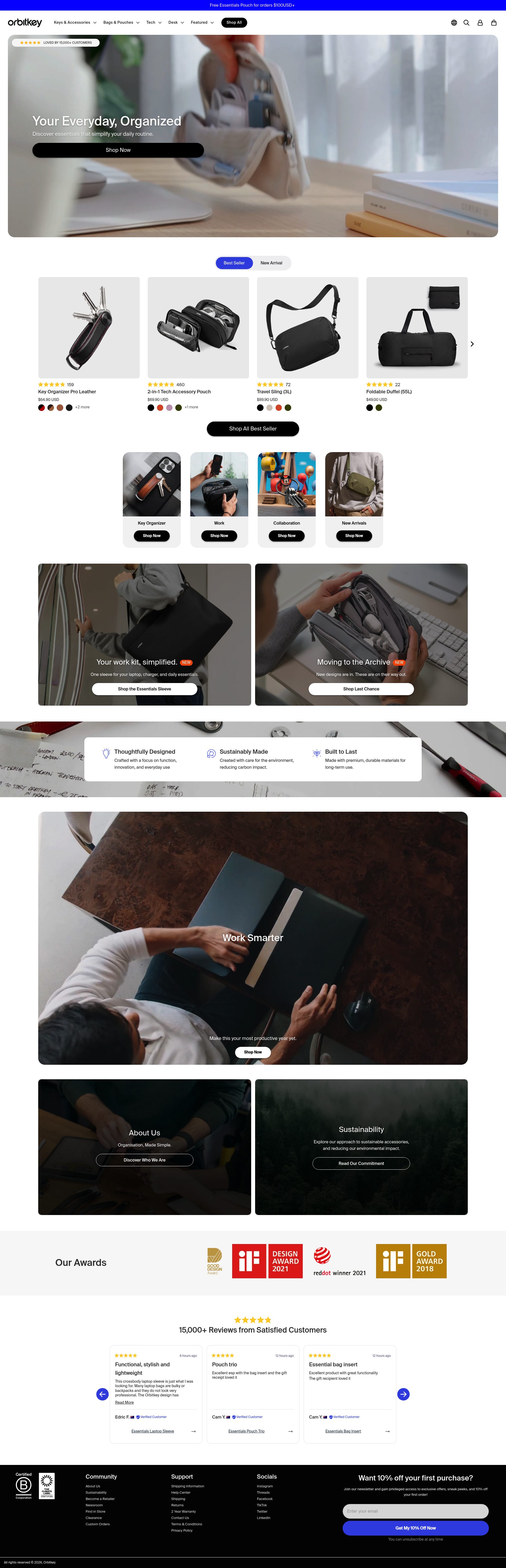
Orbitkey started as a key organiser and has expanded into a full desk accessory range. Their Shopify store handles the resulting breadth well: a persistent "Desk" category in navigation keeps the home office range discoverable without diluting the original EDC product identity. Product pages for their desk mat and cable management range lead with the problem being solved, not the product specification, which is the right structure for accessories that customers do not know they need until they understand what the problem is.
Their gifting mechanics are well-implemented: gift sets are curated and presented with clear occasion labelling, add-on gift wrapping is surfaced at cart, and their gift finder tool narrows the product range by recipient and budget. For a brand whose products sit in a popular gift price range, this reduces decision friction for buyers who are not already familiar with the range.
6. Ugmonk

Ugmonk is a small US DTC brand that operates at a deliberately reduced scale, and their store reflects that intentionally. Product photography is shot with unusual precision: neutral backgrounds, multiple angles, and detail crops that show material quality at a level that justifies their price points. Their Gather desk organisation system is sold as a modular ecosystem, and cross-sell is handled through the product page itself rather than through a separate recommendations block.
Founder Jeff Sheldon's voice is present throughout the copy: product descriptions are first-person and specific, which builds trust in a market full of generic product listings. Their email capture is handled through a lead magnet tied to desk setup content rather than a generic discount pop-up, which attracts buyers more likely to convert and protects margin.
7. Paper Republic
Paper Republic sells premium leather notebooks and journal accessories, and their Shopify store positions the product at the intersection of craft and utility. Material sourcing is described in detail: leather grade, origin, ageing characteristics. That specificity is appropriate for a customer paying £80 for a notebook cover, and it directly addresses the "why does this cost so much?" question.
Their product page structure puts the tactile story first. Written descriptions focus on how the product feels and develops over time rather than listing dimensions first. Size and format options are presented with real-world use-case guidance ("A5 suits daily journaling; passport format for travel notes"), which removes hesitation for a buyer choosing between variants.
8. Minisopuru
Minisopuru sells USB hubs, docking stations, and cable management products, and their store handles a technically complex product range clearly. Each hub listing includes a compatibility table covering MacBook, Windows, and Chromebook models, with USB-C standard notes (USB 3.2, Thunderbolt 4) that are accurate rather than vague. That level of accuracy is rare in the accessories category and builds disproportionate trust with a buyer who has been burned by incompatible products before.
Their customer review integration highlights use-case context: reviews mention specific setups (M3 MacBook Pro, dual 4K monitors) which helps a buyer with an identical setup self-qualify. The store's collection structure separates hubs by port count and use-case (home office, portable travel), making it easy to find the right product without reading every listing.
9. Cubitac
Cubitac sells ready-to-assemble kitchen and office cabinetry, and their Shopify store has to handle a high-consideration purchase with a long decision cycle. Their approach is to lead with finished installation photography: real rooms, styled and photographed well, which lets the product speak before any specification is read. Each cabinet listing links to a matching range, encouraging customers to plan a full wall unit rather than a single cabinet.
Their measurement and planning guides are embedded within the product section rather than buried in a help centre, which is the right placement for a product where getting dimensions wrong means a wasted delivery. Sample door swatches can be ordered directly from the product page, which is a proven conversion tactic for home furnishing products where colour and finish are hard to judge from a screen.
10. Couverture and the Garbstore
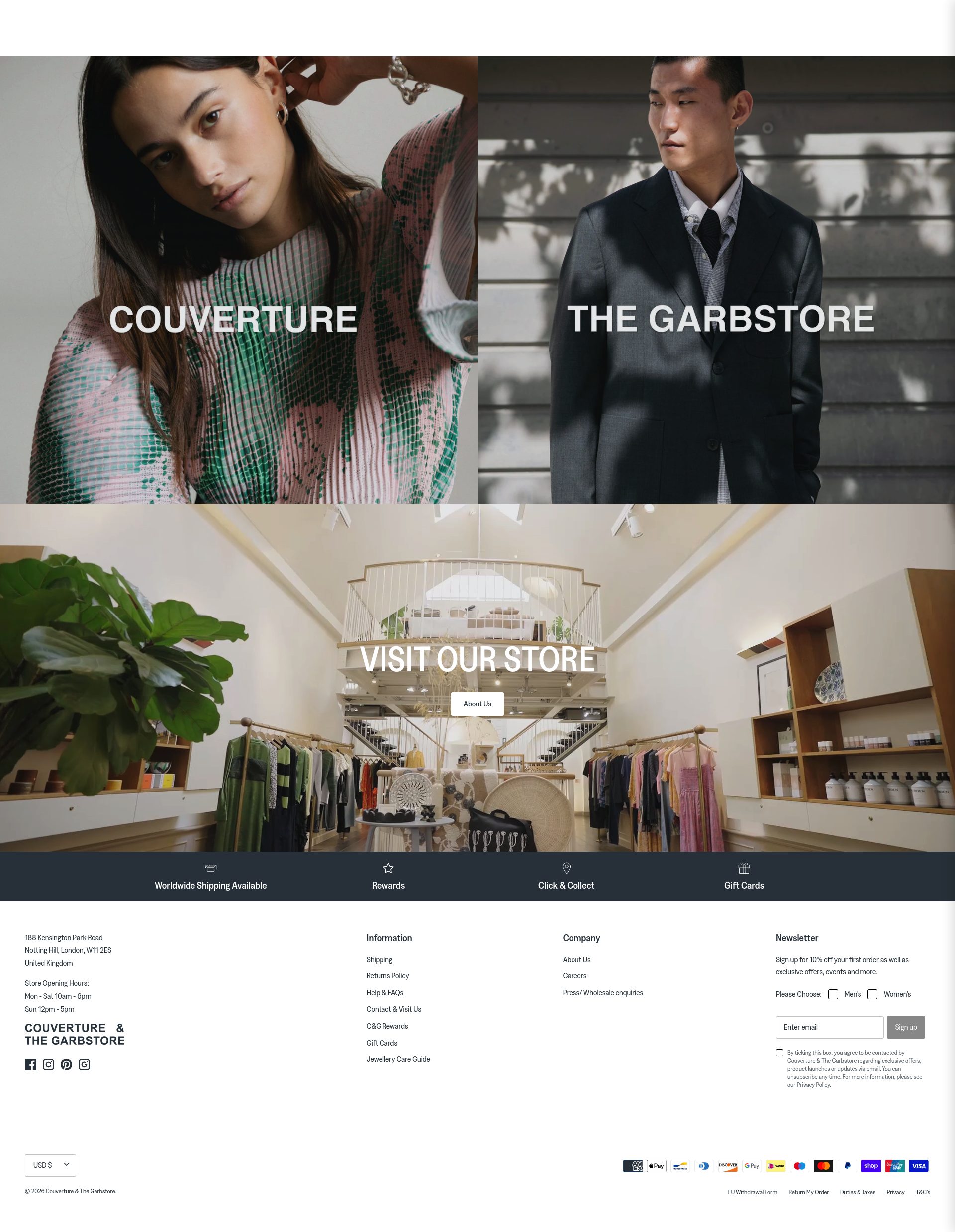
Couverture and the Garbstore is a London independent retailer operating a tightly curated Shopify store that covers desk accessories, stationery, and objects alongside clothing. Their home office product selection spans Japanese stationery, architect lamps, and ceramic organisers. The store's editorial approach to product photography, rich brand descriptions, and curated supplier pages give it a gallery quality that pure-play desk accessory brands rarely achieve.
Their curation is a commercial differentiator: a buyer who trusts the store's taste will browse across categories rather than searching for a specific product, which drives higher basket values and return visits. Product descriptions include provenance detail for independent makers, which adds a discovery layer to the shopping experience that keeps buyers engaged longer than a standard grid browse.
If your home office or workspace brand is not converting at the level these stores achieve, the gap is usually product page depth and visual storytelling. See our Shopify design service or get in touch to talk through what is possible.
Frequently asked questions
Which Shopify stores are best for buying ergonomic home office furniture?
Branch Furniture and Fully are the strongest options. Branch excels at product page depth for desks and chairs, with dimension breakdowns and a bundle configurator that lifts AOV. Fully targets standing desk sceptics directly with research-backed content and a cross-sell structure that surfaces monitor arms and accessories at the right moment in the purchase flow.
What makes a home office Shopify store convert well for high-ticket products?
Specification depth is the biggest lever: weight capacities, dimension configurations, compatibility tables, and adjustment ranges remove doubt for buyers who cannot physically assess the product. Alongside that, clear delivery and return policies for large or fragile items significantly reduce cart abandonment at the final decision stage.
Are there good Shopify stores for premium desk accessories and stationery?
Grovemade and Ugmonk are the two strongest for premium desk accessories. Grovemade uses context photography and collection architecture to drive multi-item baskets. Ugmonk builds trust through founder-written copy and a modular product system that encourages customers to expand their setup over time rather than buying once.
Which home office brands on Shopify handle personalisation well?
Oakywood is the best example of personalisation done right: laser engraving is offered on most products with a live preview, and the configurator is fast enough not to create friction. Personalised products on the store see lower return rates and higher perceived value, and the option is surfaced early on the product page rather than as an afterthought near checkout.
How do home office Shopify stores handle technically complex products like USB hubs?
Minisopuru is the clearest example. Each hub listing includes a compatibility table covering MacBook, Windows, and Chromebook models with accurate USB-C standard notes rather than vague marketing language. Their review integration highlights real customer setups, which helps technically-minded buyers self-qualify quickly without contacting support.