

Quick summary
Peepers is the strongest all-round reading glasses DTC store, with best-in-class filtering across hundreds of frame styles and a persistent multi-pair bundle offer that lifts average order value. Caddis stands out for its unusually sharp brand voice — the anti-ageing positioning is genuinely differentiated and converts because it means something. Cubitts runs the most distinctive brand storytelling in the category, with every frame named after a London street and editorial content that holds attention in a way most eyewear stores cannot. For value-positioned buyers, EyeBuyDirect on Shopify Plus handles the highest catalogue complexity of any store on this list with a prescription customisation flow that a non-expert can complete without confusion.
Reading glasses sit at an unusual intersection in ecommerce: a product with a strong functional brief, a clear repeat-purchase cycle, and far more room for brand differentiation than most people expect. The stores doing this well are not just selling lenses and frames. They are solving a navigation problem (helping buyers find the right strength and fit without a physical trial), building trust around prescription accuracy, and turning what was once a pharmacy aisle commodity into something people are willing to buy direct. Here are ten that have worked out how to do that on Shopify.
1. Peepers

Peepers is a US-based DTC reading glasses brand with a product catalogue that spans hundreds of frame styles across multiple strengths. Their Shopify store handles this breadth through strong filtering: customers can narrow by strength, frame shape, face shape, and material from the collection page, which is the right approach when a wide range risks overwhelming a first-time visitor. The "Find Your Fit" guide is prominently linked from the navigation, and it does the job a physical retailer's sales assistant would do, reducing the hesitation that kills conversion in this category.
Product pages include multiple photography angles, frame measurements, and a material breakdown. The strength selector is built directly into the PDP rather than being a separate configuration step, which keeps the add-to-cart friction low. Peepers also use bundle promotions effectively: a multi-pair discount offer is surfaced persistently across the store, which makes sense for a product people genuinely want to own in more than one style.
2. Clearly
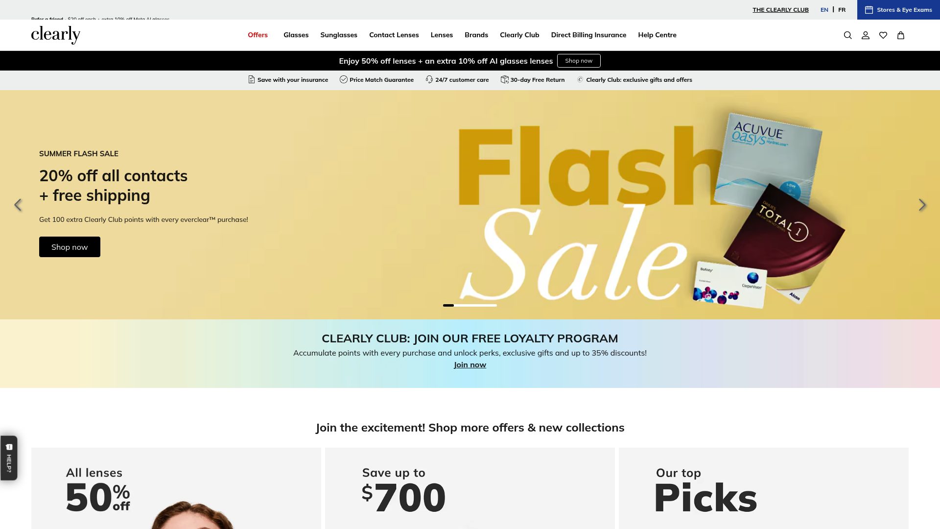
Clearly is a Canadian eyewear DTC brand that has taken the prescription glasses category seriously on Shopify. Their store manages a complex product catalogue covering reading glasses, prescription eyewear, and contact lenses without losing the customer. The navigation architecture uses clear top-level categories and persistent cross-sell prompts to ensure customers land in the right part of the store quickly.
Their virtual try-on tool is the standout conversion feature: customers can upload a photo or use their webcam to see how frames look on their face, which directly addresses the biggest barrier to online eyewear purchase. Frame detail pages include PD measurement guides, prescription entry flows, and a fit guarantee, all of which reduce purchase anxiety for a customer making a higher-consideration decision. The free home try-on programme for prescription eyewear is surfaced early, which is an effective way to move customers past the hesitation point.
3. Bloobloom
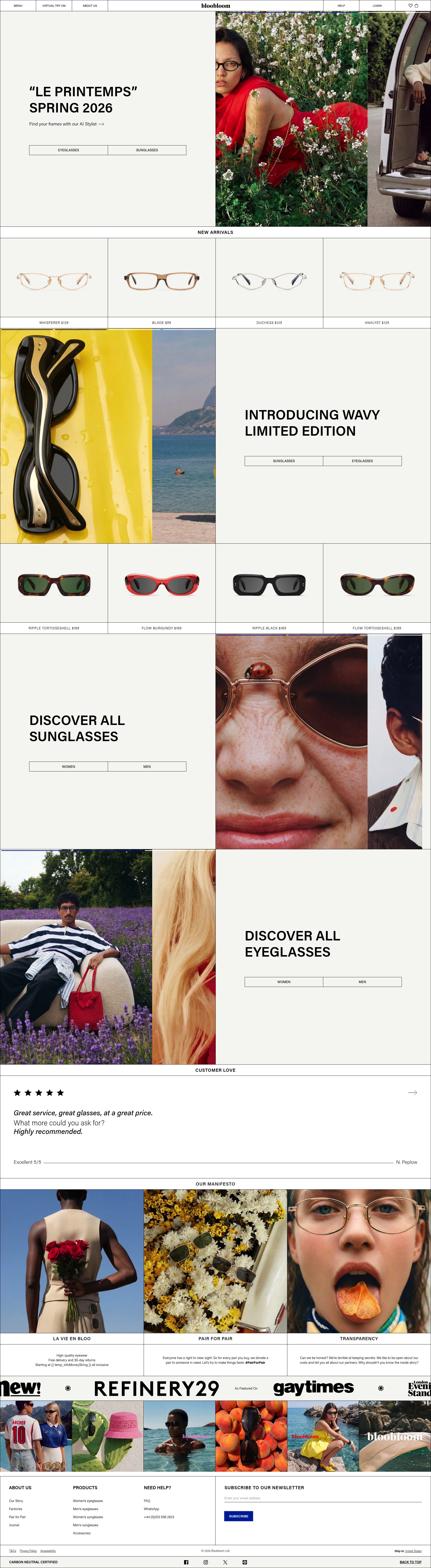
Bloobloom is a London-based sustainable eyewear brand built on Shopify. Their store is a strong example of how a DTC brand can charge a premium through design clarity and transparency. The homepage communicates the brand's sustainability position without being preachy: material sourcing (plant-based acetate, FSC-certified packaging) is mentioned with specifics, not vague claims. That specificity is what makes the premium price credible to a customer who is evaluating the brand for the first time.
The product pages are minimal but well-structured: clean photography on a white background, clear frame dimension data, and a colour palette that allows customers to see exactly what they are getting. Bloobloom offers a free home trial programme, and the mechanics of it (five frames, five days, free postage both ways) are explained clearly on product pages without requiring the customer to dig for terms. That friction reduction is important for a first purchase.
4. Cubitts

Cubitts is a British independent eyewear brand with a strong bricks-and-mortar presence in London and a Shopify store that extends their retail experience online well. Their brand storytelling is unusually strong for an eyewear store: every frame is named after a street in the Clerkenwell and King's Cross area, and the editorial content connecting frame names to London history adds a layer of brand character that is genuinely distinctive in a category full of generic DTC messaging.
Their PDP structure is worth noting: each frame page includes a curated recommendation based on face shape, frame measurements in a visual diagram format, and links to the option to book an in-store appointment. That click-and-collect and in-store booking flow is integrated into the online journey in a way that reinforces rather than competes with the physical retail business. Reading glasses are positioned alongside full prescription options, which lifts basket value for customers who need both.
5. EyeBuyDirect
EyeBuyDirect is a high-volume, value-positioned online eyewear retailer running on Shopify Plus. Their approach to conversion is built around price transparency and volume breadth: new arrivals are pushed hard, promotional pricing is always visible, and the store makes it easy for a price-sensitive customer to understand exactly what they are getting before checkout. The sale section is a permanent and prominent feature, which is the right strategy for a brand competing on value rather than premium positioning.
Their virtual try-on integration is well-executed at scale, and the frame width and fit guide is thorough enough to be a genuine decision-support tool rather than a box-ticking exercise. The prescription lens customisation flow is a strong example of turning a complex configuration step into something a non-expert customer can complete without confusion. EyeBuyDirect also uses quantity bundle offers effectively: buying two or three pairs unlocks a discount, and this is surfaced multiple times through the checkout journey to maximise uptake.
6. Meller
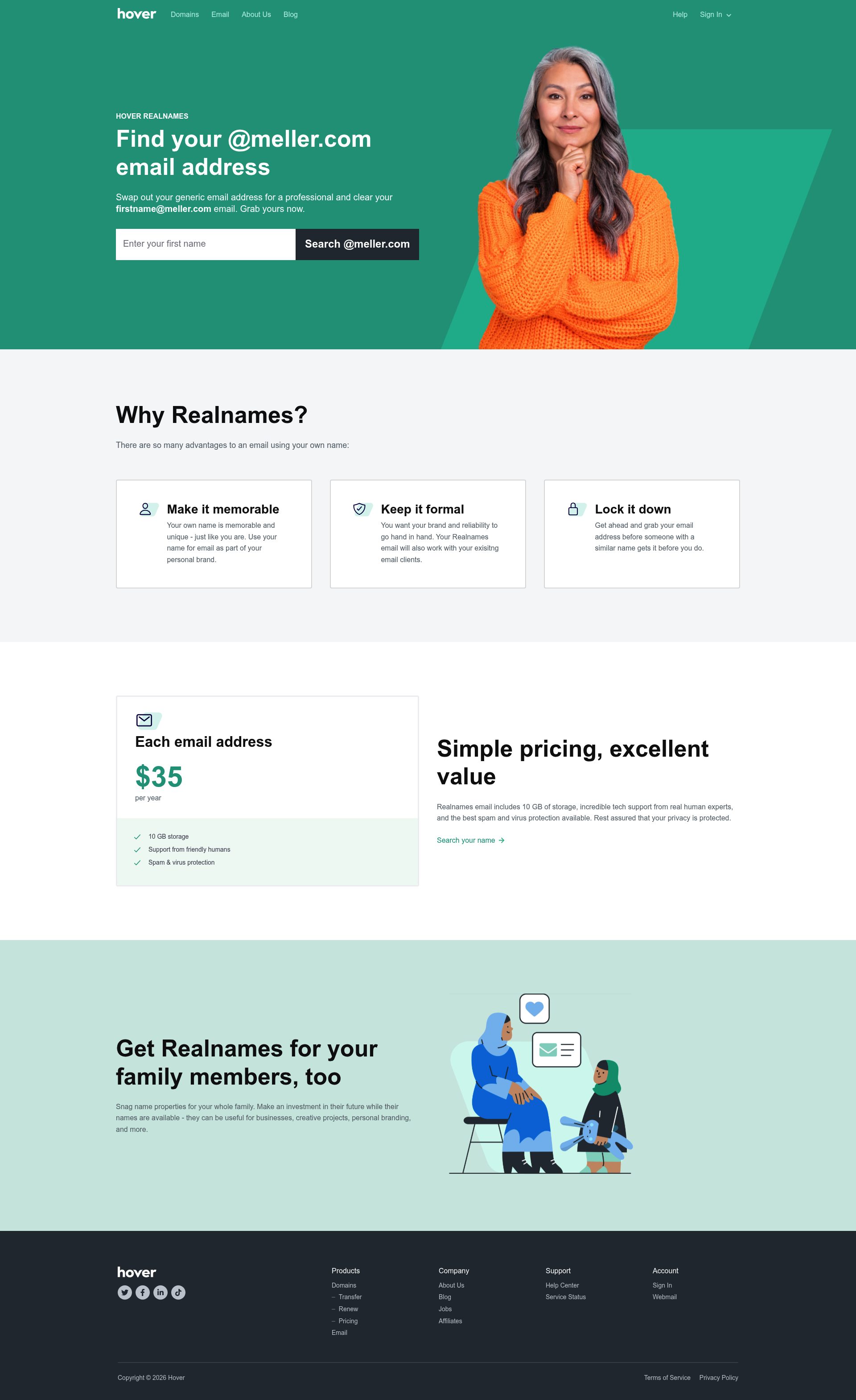
Meller is a Barcelona-based eyewear brand with a strong international DTC presence on Shopify. Their store is built around lifestyle imagery and a fashion-forward positioning that makes them stand out in a category where most brands lead with function. The photography is editorial rather than clinical: frames are shown in outdoor and travel contexts, which communicates the brand's identity before any product copy does.
Their collection page structure uses a grid that prioritises visual appeal over filtering depth, which is the right call for a brand where the buying decision is primarily aesthetic. Reading glasses sit alongside their sunglasses range, and the brand's consistent design language across both categories gives the store coherence. Meller uses scarcity mechanics, including limited-edition colourways with visible low-stock indicators, to drive urgency without resorting to countdown timers.
7. Bailey Nelson
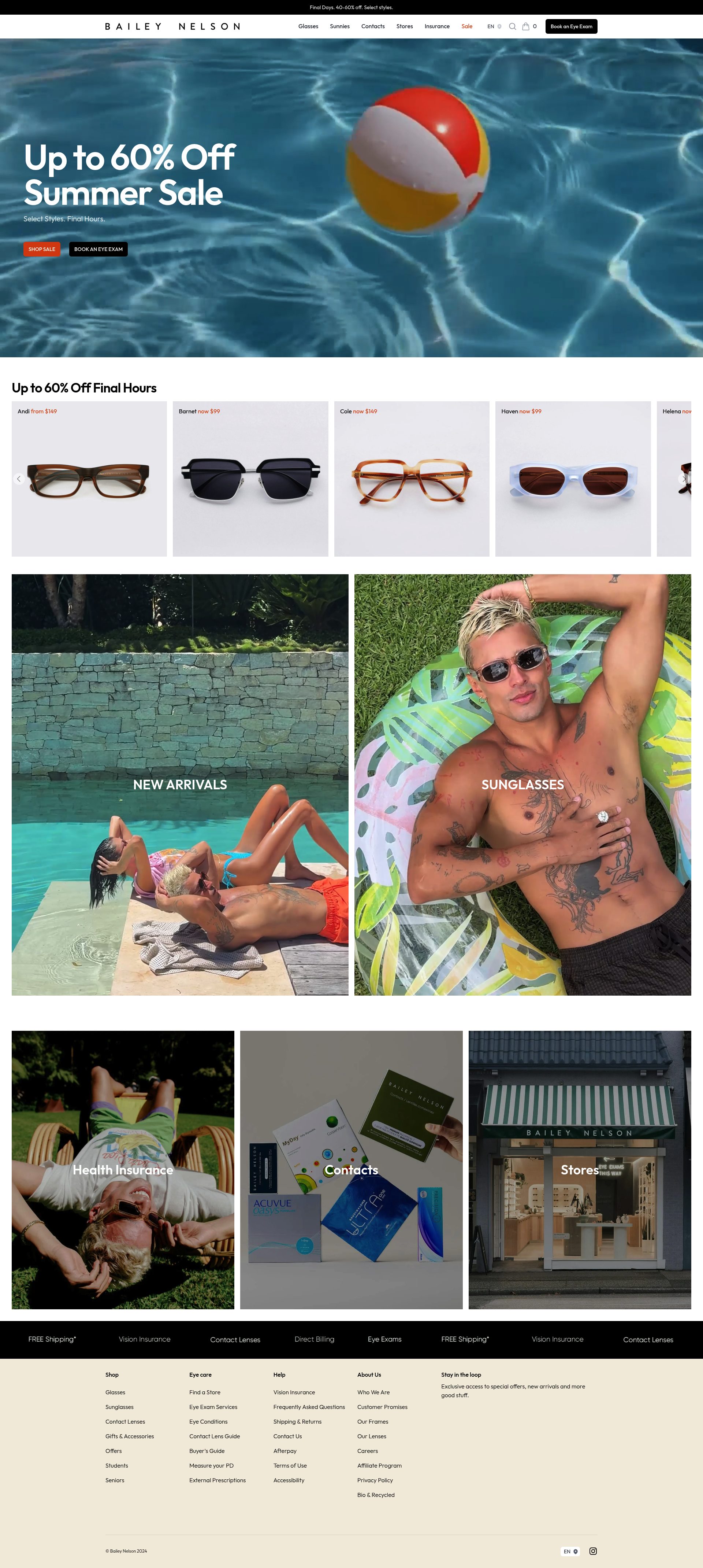
Bailey Nelson is an Australian eyewear brand with a UK retail and online presence operating on Shopify. Their store handles the prescription and non-prescription journey well: the navigation separates the two clearly, and the prescription flow does not interrupt or complicate the browsing experience for customers just looking for reading glasses. The brand tone is warm and direct throughout, which is a deliberate contrast to the clinical positioning of traditional optical retailers.
Their home trial programme is a central part of the conversion strategy, and the mechanics are explained with enough detail on PDPs to make a first-time customer comfortable committing to it. Bailey Nelson uses editorial content about frame care, lens types, and style guidance within the store, which increases time on site and builds the kind of brand familiarity that translates into repeat purchase. Their loyalty mechanics are surfaced in the account creation prompt rather than a standalone landing page, which is a subtler but effective approach.
8. Caddis
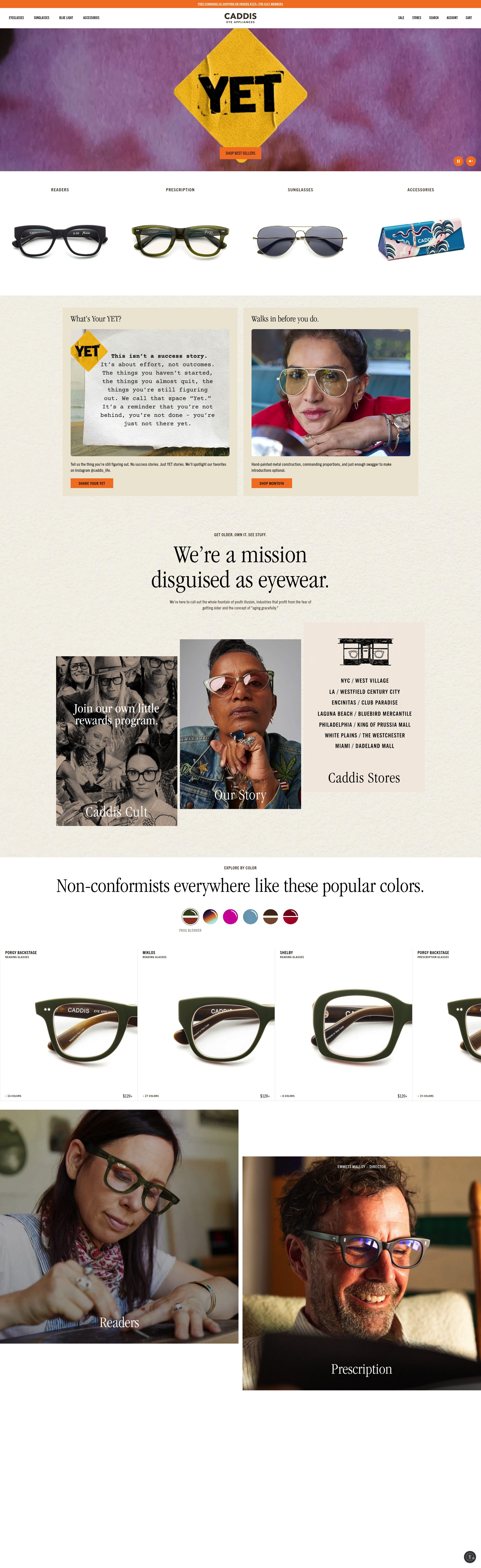
Caddis is a US reading glasses brand with a deliberately opinionated brand voice: their positioning is built around accepting ageing rather than hiding it, and that point of view runs through every page of their Shopify store. The copywriting is unusually sharp for an eyewear brand, and it does a job beyond product description: it filters in the customer who will respond to the brand's values and filters out the ones who will not, which reduces post-purchase dissonance.
Their product pages are well-structured: frame photography at multiple angles, clear strength selector, and copy that treats the customer as an adult who can handle directness. The store has a tight product range by design, which means navigation is simple and discovery is fast. Caddis also publish editorial content through their site that reinforces the brand's philosophical positioning, which contributes to organic search visibility for reading glasses content queries.
9. Rivet & Sway
Rivet & Sway is a US online eyewear brand that built its model around the home try-on experience before the category made it standard. Their Shopify store reflects that origin: the home try-on programme is the primary call to action above the fold, not the product grid. That hierarchy is a deliberate conversion decision. For a customer buying prescription eyewear or reading glasses online for the first time, a risk-free trial removes the principal barrier to purchasing.
Their PDP design prioritises face-shape guidance: each frame comes with an explicit recommendation about which face shapes it suits, which again mirrors the advice a good in-store optician would give. The prescription input flow is clean and well-validated. Rivet & Sway's subscription and loyalty mechanics are less developed than some competitors, but the core purchase experience is tight, and that matters more for a product where the first transaction carries the highest uncertainty.
10. Arlo Wolf
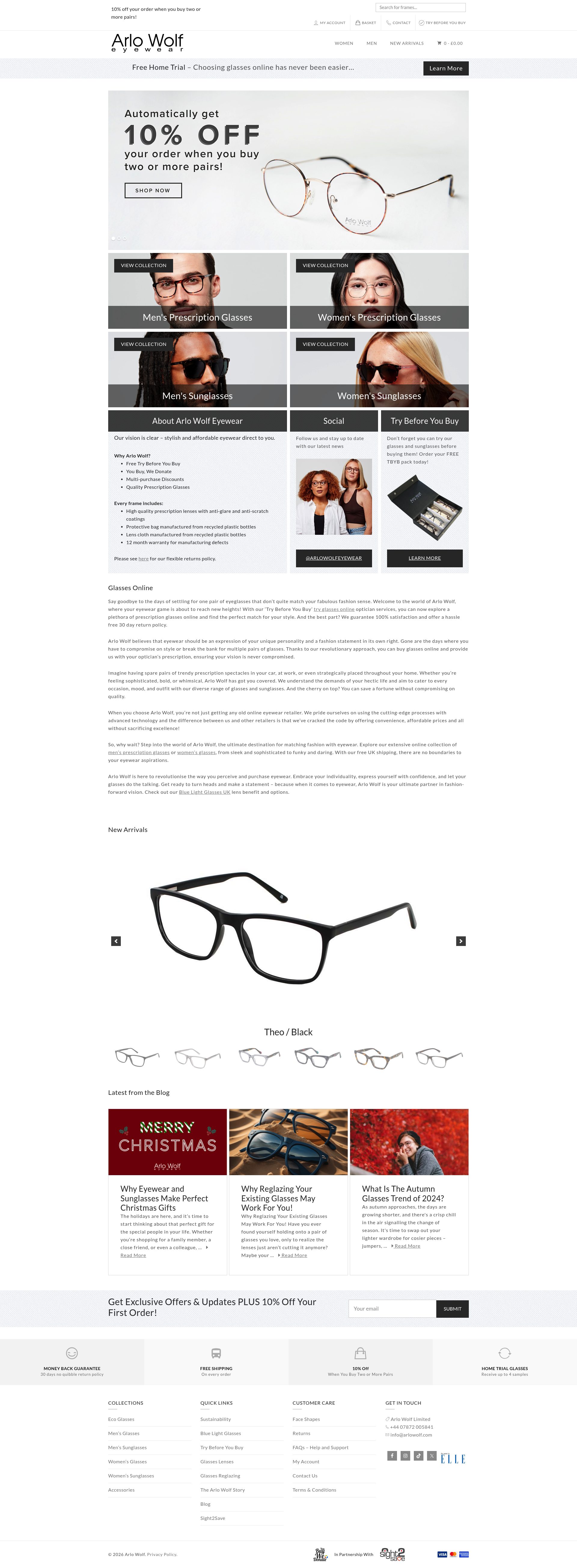
Arlo Wolf is a UK independent eyewear brand that operates both a physical studio in Birmingham and an online Shopify store. Their value proposition is built around quality frames at a fair price, and their store communicates that without over-explaining it. The frame photography is detailed and consistent, and the product pages include material information and sizing data without the clinical tone that makes some eyewear stores feel impersonal.
Their home trial programme (up to four frames, free for seven days) is well-integrated into the buying journey and positioned as a normal part of the purchase process rather than a special promotion. Arlo Wolf's prescription lens pricing is clearly presented alongside frame pricing, which reduces the confusion that often leads customers to abandon prescription eyewear purchases before checkout. For a small independent brand competing with better-funded DTC players, the store punches above its weight on clarity and user experience.
If your reading glasses or eyewear store is not converting at the level these brands achieve, the gap is usually navigation clarity, try-on mechanics, or prescription flow design. See our Shopify design service to find out what we can do, or get in touch to talk it through.
Frequently asked questions
Which Shopify reading glasses stores offer virtual try-on?
Clearly and EyeBuyDirect both have well-executed virtual try-on tools that let customers upload a photo or use a webcam to see frames on their face. Bloobloom and Arlo Wolf take a different approach with free home trial programmes — five frames for five days and four frames for seven days respectively — which achieves the same conversion goal without requiring camera access.
Do reading glasses stores on Shopify handle prescription orders?
Several do. Clearly, EyeBuyDirect, Rivet & Sway, and Cubitts all handle prescription lens customisation on Shopify, with guided flows that walk the customer through entering their prescription details at the product or cart stage. The quality of these flows varies: EyeBuyDirect and Clearly are the most polished for non-expert customers who may be unsure how to read their prescription.
What makes a reading glasses Shopify store convert well?
Three things separate high-converting eyewear stores from average ones: a strength or prescription selector built directly into the product page rather than a separate step, a risk-removal mechanism such as home trial or a fit guarantee, and clear frame dimension data so customers can assess fit without trying on. Stores that put all three on the PDP consistently outperform those that bury any one of them in a FAQ or guide page.
Are reading glasses good for Shopify subscription or repeat-purchase mechanics?
Yes — reading glasses have a natural repeat-purchase cycle. Prescriptions change, customers want different styles for different contexts, and frames get lost or damaged. Peepers' multi-pair bundle offer is the most direct expression of this: it is surfaced persistently across the store because a customer buying two pairs in the first transaction is far more valuable than one buying a single pair. Subscription mechanics are less common in this category but there is a clear opportunity for brands with frequent new arrivals.
How do UK reading glasses stores on Shopify handle prescription compliance and returns?
UK-based stores like Cubitts, Bloobloom, and Arlo Wolf handle this through a combination of clear lens guarantee terms on PDPs, free return postage on home trial programmes, and in-store appointment options where physical retail exists. Prescription compliance in the UK is governed by the Opticians Act, which limits some of what can be sold online without a valid prescription — well-run UK Shopify stores make their compliance position clear in the product page copy rather than hiding it in terms and conditions.