

Quick summary
A deep look at 10 Shopify stores that lead on theme design, user experience, and brand presentation. Covers what each store does exceptionally well in layout, navigation, PDPs, and checkout — useful for any merchant who wants a clear picture of what best-in-class Shopify execution looks like.
Most Shopify stores look fine. A handful look exceptional. The difference is not budget — it is decisions: how product photography is used, how navigation is structured, where trust signals are placed, and whether the brand identity carries through from homepage to thank-you page. The stores on this list have made the right calls consistently. They are worth studying not because they are aspirational, but because the specific things they do well are replicable. Each one teaches a different lesson about what separates a store that converts from a store that just exists.
1. Gymshark
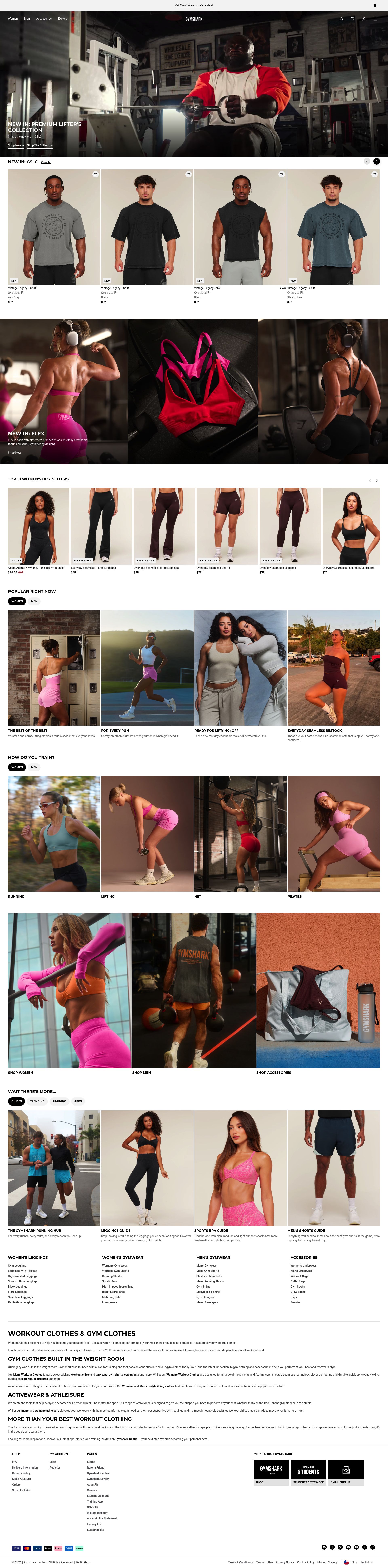
Gymshark built one of the fastest-growing DTC brands in the world on Shopify Plus, and their store reflects that ambition. Product pages are structured around performance: fabric tech specs, activity-specific use cases, and size guide integrations are all surfaced within the PDP without pushing the add-to-cart button below the fold. Collection pages use a dense grid that lets customers scan quickly, with colour swatches visible at collection level so there is no need to enter a PDP just to see a variant. Their campaign drops — timed athlete collaborations and seasonal launches — are handled through dedicated landing pages built directly in the Shopify theme editor, giving the marketing team control over layouts without developer intervention.
The checkout experience is optimised for speed. Gymshark uses Shopify Plus's checkout extensibility to add loyalty points visibility and size recommendations at cart level, reducing the two most common pre-checkout hesitations in activewear. Their loyalty programme, Gymshark+, is woven into the store rather than treated as a standalone app, which means customers see their status and benefits at every point in the purchase journey. Few activewear stores globally handle scale, speed, and brand at this level simultaneously.
2. Allbirds
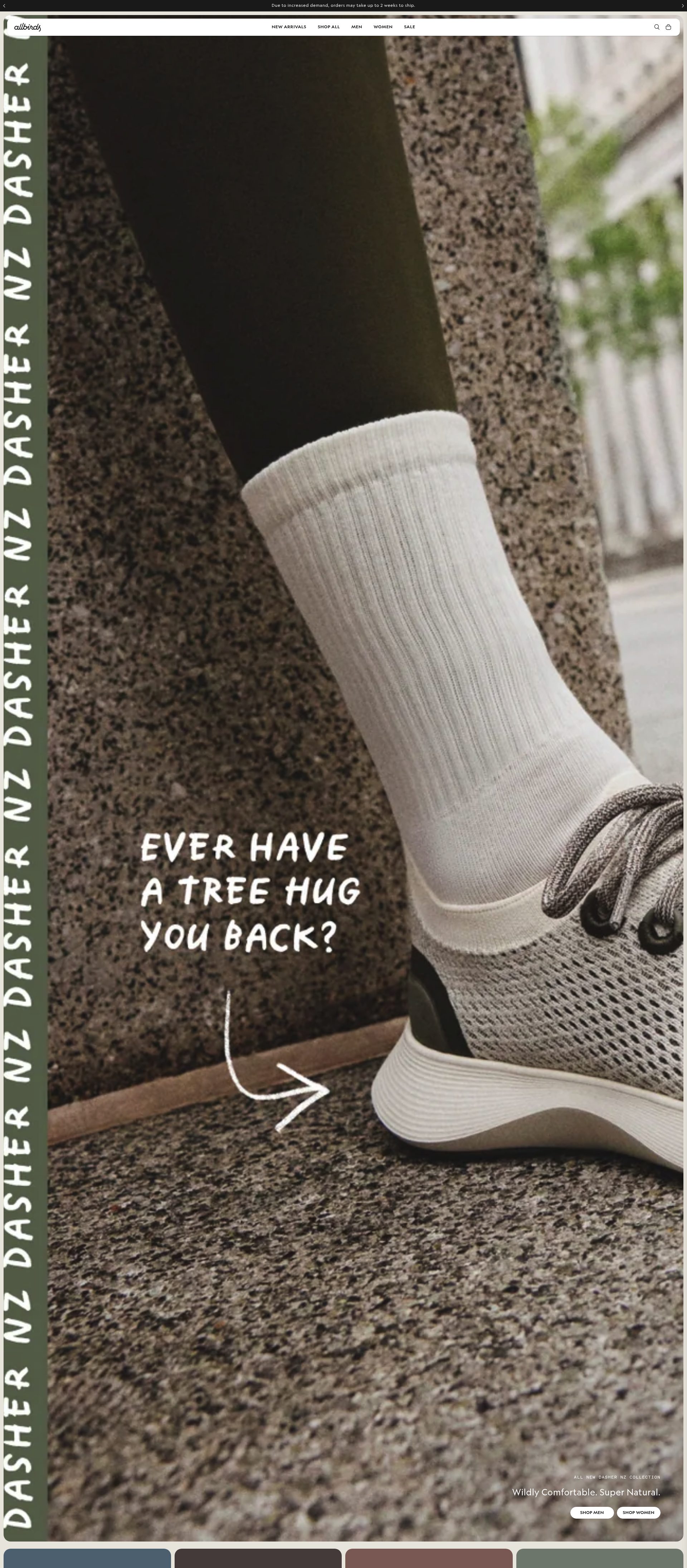
Allbirds built their brand on a single idea — natural materials, low environmental impact — and their Shopify store communicates that idea at every touchpoint. The homepage does not open with a hero banner and a discount. It opens with a material story: what the shoe is made from, where the material comes from, and what its carbon footprint is. That choice tells the customer immediately who this brand is and what it stands for. Product pages carry the same discipline: carbon footprint per product is displayed alongside price, which is a bold UX choice that either converts the customer quickly or self-selects out a customer who would never have been loyal long-term.
Navigation is deliberately simple. A small number of product lines are presented without the category sprawl that clutters most footwear stores. The visual design is restrained — off-whites, soft greens, natural textures — which reinforces the brand identity without needing a style guide explained in words. Their "Wool Runners vs Tree Runners" comparison content is integrated into the product range rather than sitting on a separate blog, which means customers with genuine decision uncertainty can resolve it without leaving the purchase funnel. Allbirds is one of the strongest examples anywhere of brand identity driving store architecture.
3. Kylie Cosmetics
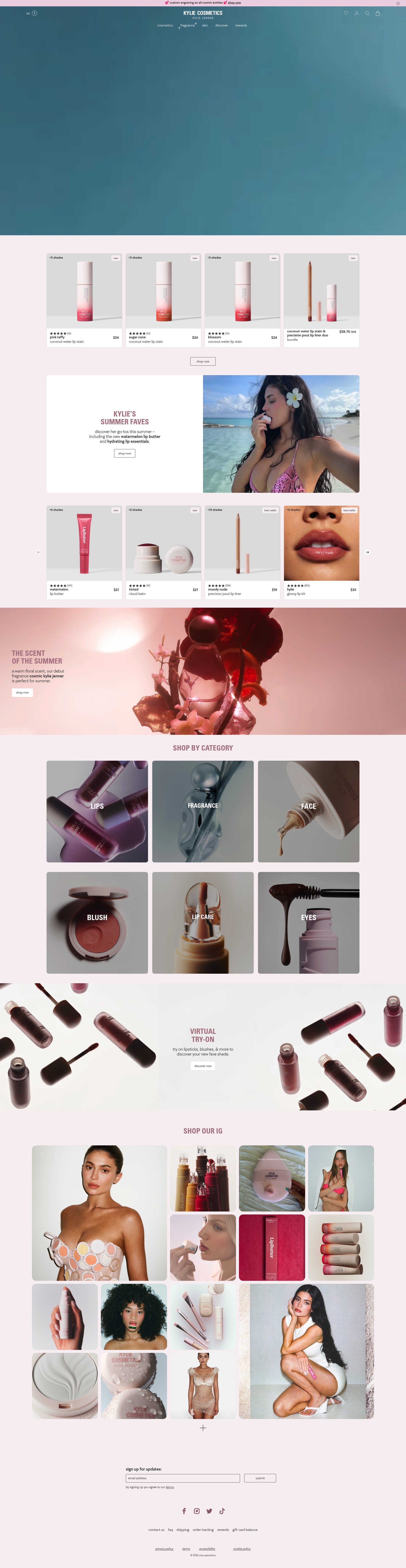
Kylie Cosmetics runs one of the highest-traffic Shopify Plus stores in existence, and their approach to launch-driven ecommerce is worth understanding. The store is built around drops: new collections and limited editions generate substantial demand before they go live, and the store infrastructure handles that demand without degrading the customer experience. Countdown timers, waitlist integrations, and real-time stock indicators are all implemented natively within the product page, not bolted on as separate overlays. That cohesion matters at high traffic volumes where slow app loads become visible.
Product photography is consistent across an extremely large catalogue — lips, eyes, face, and sets all shot to the same standard, which makes the collection grid usable at scale. Their bundle builder, allowing customers to construct custom lip kits or palette combinations, is embedded in the product page rather than requiring a separate customisation flow. At this volume of SKUs and at this level of brand recognition, the store's ability to make browsing feel manageable is its most significant UX achievement.
4. Heinz (US DTC Store)

Heinz's DTC Shopify store is an example of a legacy brand making a considered transition to direct commerce. Rather than simply listing their retail products online, the store focuses on limited editions, gift sets, and items not available in supermarkets — giving the DTC channel a genuine reason to exist beyond convenience. The store design uses Heinz's existing brand assets: the keystone bottle silhouette, the heritage reds and golds, and the typography system that has been in continuous use for decades. Brand coherence at this level is easier when the visual identity is already established, but the Shopify implementation earns credit for not diluting it.
Product pages are concise and conversion-focused. There is no unnecessary copy: the product name, the weight or quantity, and a short description are followed immediately by an add-to-cart. The cart and checkout are clean. What makes the store worth studying is the curation: a brand with hundreds of SKUs in retail chose to launch DTC with a deliberately small, high-intent catalogue. That restraint is harder to execute than it looks, and it makes the browsing experience significantly more manageable.
5. Ruggable
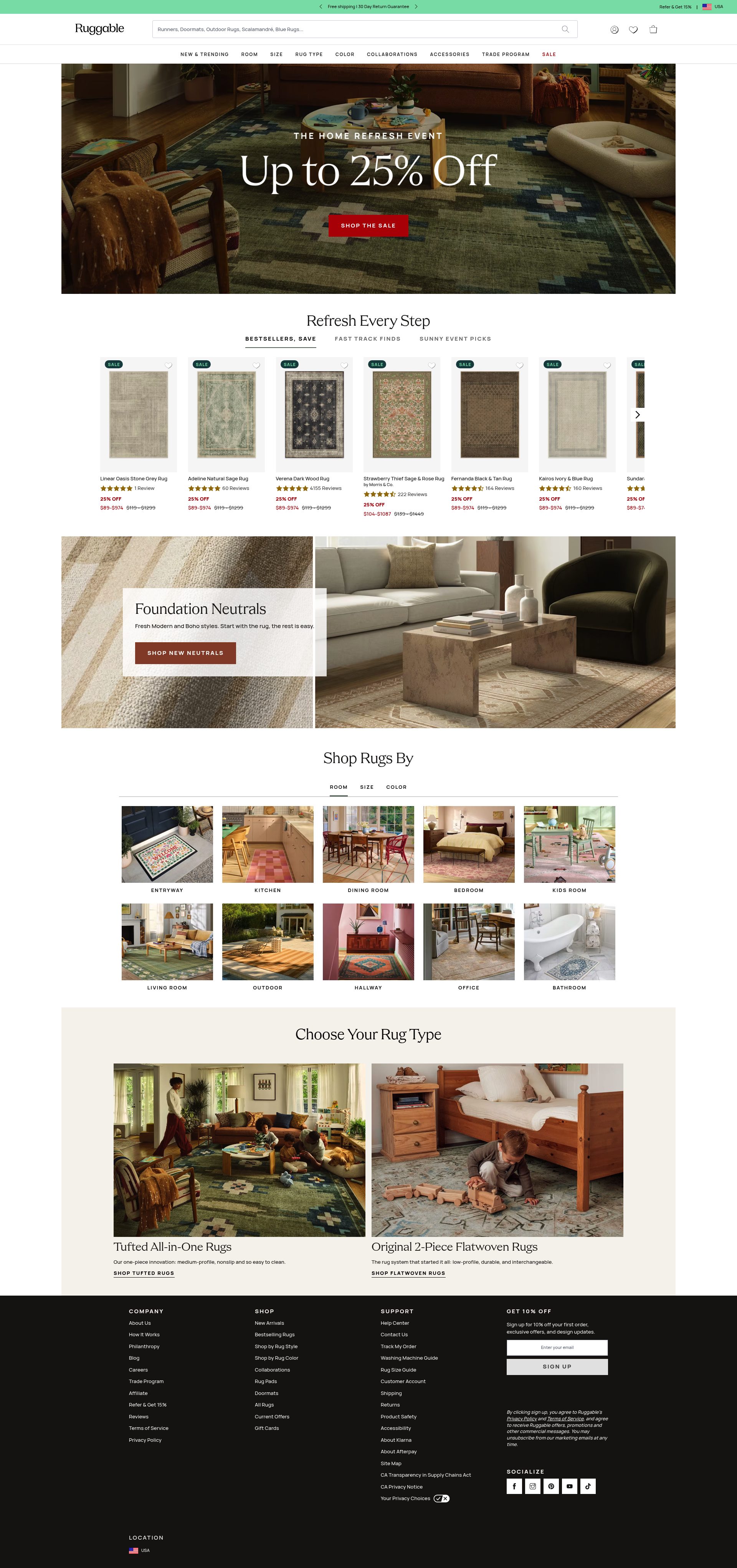
Ruggable sells washable rugs on Shopify and has built one of the most conversion-optimised room visualisation experiences in home ecommerce. Their in-product room visualiser lets customers see a rug in a photographed living room, dining room, or bedroom setting before purchasing, which addresses the core uncertainty in buying a large home textile: what will it actually look like in my space? The tool is fast, the room photography is high quality, and the variety of room settings covers the main domestic contexts their customers are working with.
Product pages also handle the complexity of a size-and-pattern matrix without becoming unwieldy. Rug size selector, pattern variant, and pile height are all managed in a single PDP with visual swatches rather than dropdowns. Size guide illustrations are embedded inline rather than requiring a pop-up. The store also uses customer-submitted room photos as a distinct social proof format: real homes with real Ruggable rugs are integrated into the product page below the main images, which converts browsers who distrust studio photography. The "washable" proof point — a video of a rug being removed, thrown in a washing machine, and replaced — is placed exactly where hesitation is highest, at the point of reading product claims for the first time.
6. KOTN
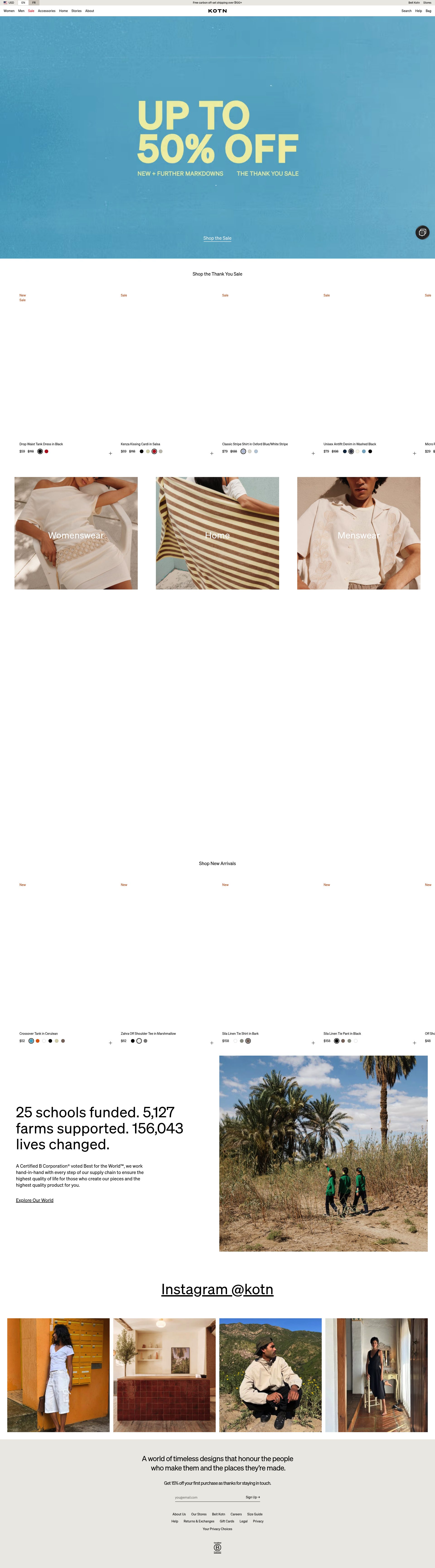
KOTN sells ethically produced essentials — primarily Egyptian cotton basics — and their Shopify store is one of the strongest examples of sustainability storytelling integrated into commerce rather than separated from it. Most brands with an ethical supply chain story relegate it to an "Our Story" page. KOTN puts supply chain transparency into product pages: the specific Egyptian collective the cotton came from, the number of families involved, and the certification body are all present at the SKU level. That specificity converts sceptical customers who have seen too many vague "sustainably made" claims.
Their visual design is minimal and intentional: sand tones, natural linen textures in the UI, and editorial photography that shows the products in lived-in contexts rather than clean studio settings. Product page copy is short and precise — fibre content, weight, and fit notes are given as facts, not embellished. The store navigation is structured around fabric and fit rather than a conventional clothing category tree, which suits a customer who is choosing between a 180gsm and 240gsm tee rather than between "men's tops" and "women's tops." KOTN demonstrates that a tight brand position, applied consistently, beats a broader offer presented without conviction.
7. Hims
Hims is a men's health and personal care brand that sells on Shopify and has solved a genuinely difficult UX problem: how do you sell healthcare-adjacent products — hair loss treatments, erectile dysfunction medication, skincare — in a way that is approachable, not clinical, and not embarrassing? Their answer is brand design. The store uses warm, humanistic illustration, conversational copy, and photography of real men across a range of ages and appearances. Nothing about the visual identity signals a pharmacy. The result is a product category that was historically difficult to purchase discreetly online becoming something customers refer friends to.
Product pages walk customers through a symptom-to-treatment path rather than a conventional product description. "If you're noticing X, here's how this works" is more effective than a clinical ingredient list in a category where customers arrive with anxiety rather than purchase intent. Subscriptions are integrated naturally — the monthly auto-refill is positioned as the default, with one-time purchase available but not foregrounded. That framing, combined with transparent pricing, converts a high proportion of first-time buyers into recurring customers. Hims is one of the most instructive Shopify stores for any brand selling in a category where trust and sensitivity must coexist.
8. The Ordinary
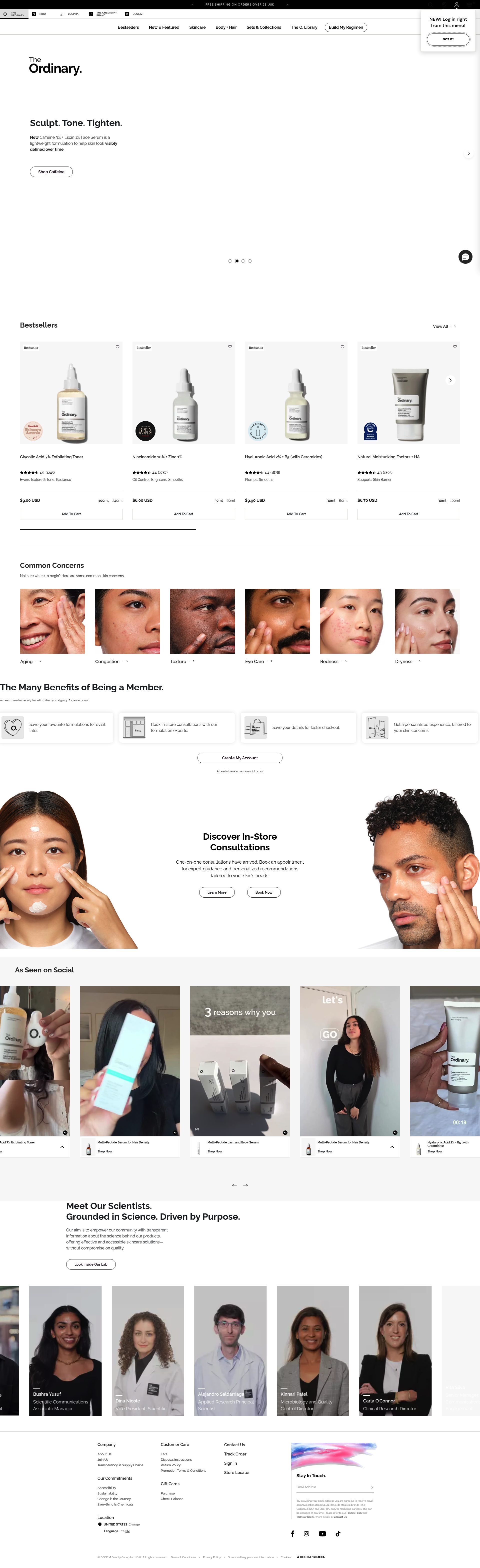
The Ordinary's Shopify store is the reference point for making a complex product catalogue navigable. They sell dozens of skincare actives — retinoids, acids, peptides, oils — to a customer base that ranges from complete beginners to formulation enthusiasts. Their solution is a dual navigation structure: you can shop by category (serums, moisturisers) or by concern (brightening, anti-ageing), and their regimen builder tool guides less confident customers to the right product combination based on a short set of questions. That tool prevents both decision paralysis and the over-purchasing that leads to returns.
Product pages are text-heavy by industry standards, which is correct for this brand. The full INCI name, percentage concentration, and conflict warnings (ingredients that should not be combined) are all present. For a brand where purchase decisions depend on technical knowledge, that depth is not a deterrent — it is the reason customers trust the brand over competitors with less transparent formulations. The store's visual identity is deliberately clinical: white, black, dense type, no lifestyle photography. That aesthetic signals scientific credibility and differentiates The Ordinary from the warm, aspirational presentation that dominates premium skincare. It is a deliberate design choice that amplifies the brand position rather than following category convention.
9. Bombas
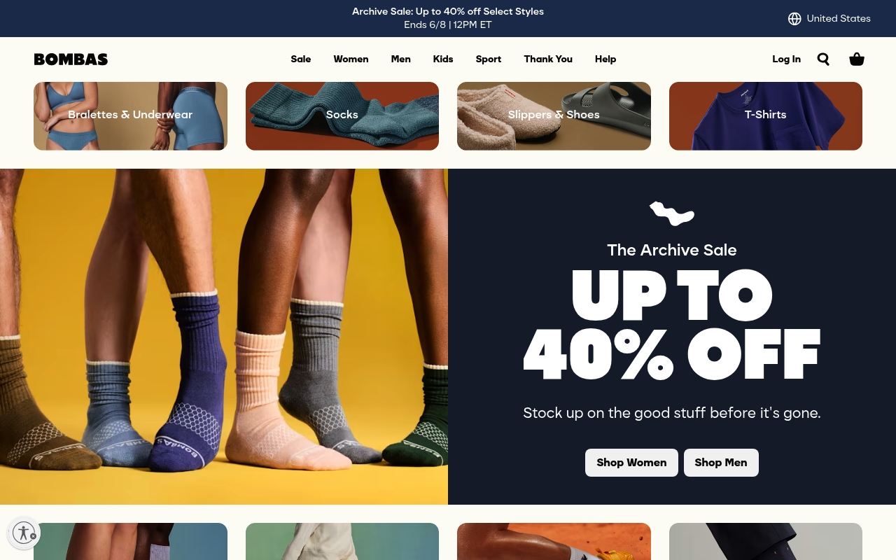
Bombas sell premium socks, underwear, and t-shirts on Shopify with a buy-one-give-one model embedded into the brand identity. Their store is a strong example of cause-driven commerce implemented without moral pressure. The donation mechanic — one item donated to a homeless shelter for every item purchased — is communicated clearly on the homepage and on product pages, but it is never used to push the customer toward guilt-driven purchasing. The tone is positive and matter-of-fact: here is what we make, here is what happens when you buy it. That restraint makes the cause feel credible rather than performative.
Product pages for socks handle a genuinely difficult variant structure — size, colour, length, and use case — with a filtering and selection system that does not overwhelm. Their "customer favourites" and "most gifted" labelling on collection pages uses real purchase data to guide discovery, which is a simple but effective use of social proof at the collection level rather than only at the product level. Bombas also demonstrates strong cross-sell logic: complementary product suggestions are specific (these socks pair with this t-shirt from the same collection) rather than generic ("you might also like"), which increases attach rates without feeling algorithmic.
10. Cupcakes and Cashmere
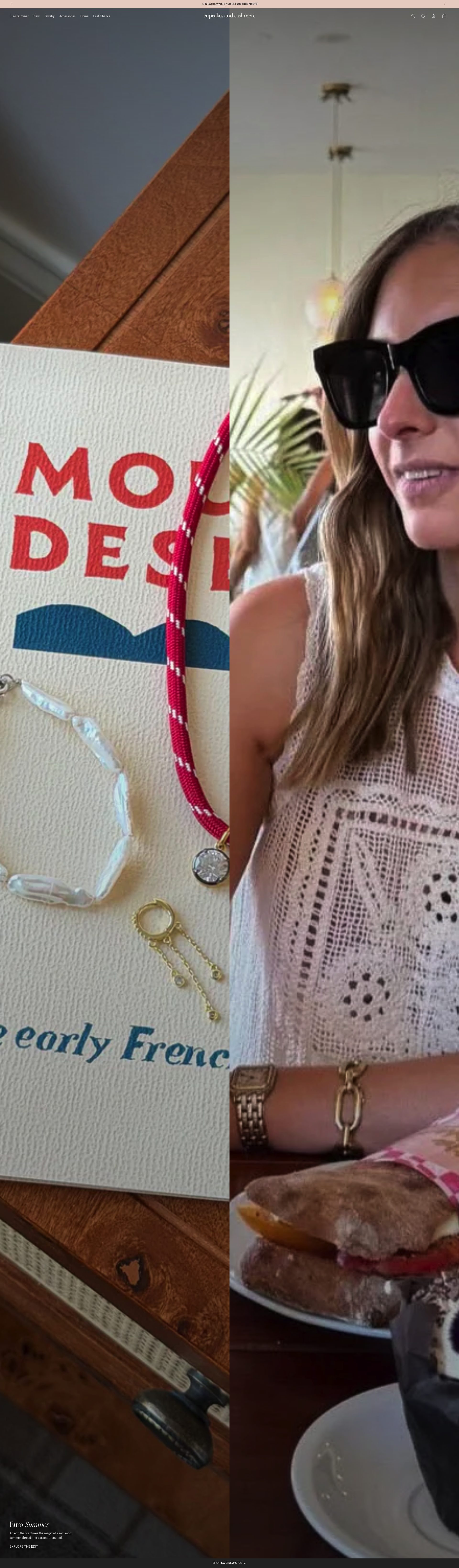
Cupcakes and Cashmere began as a lifestyle blog and built a Shopify clothing and accessories store that retains the editorial feel of its content roots. The store integrates lifestyle photography in a way that makes browsing feel like reading a magazine: products are shown in room settings, on styled outfits, and in seasonal contexts that communicate aspiration without detachment. That editorial approach is harder to sustain than studio-only photography but it converts browsers who arrive from content rather than search.
Navigation uses editorial naming — "The Feels", "Weekend Edit" — alongside conventional category labels, which suits an audience accustomed to editorial discovery. Product pages are concise but warm in tone, with fit notes written in first person and honest sizing guidance. The store's gift section is curated with the same editorial discipline as the main catalogue, which makes it genuinely useful rather than a dumping ground for clearance stock dressed up with a bow. Cupcakes and Cashmere shows that a content-first brand can translate its editorial identity into a commerce experience without compromising either the brand or the conversion mechanics.
Comparison Table
| Brand | Niche Focus | Price Point | Shopify Standout |
|---|---|---|---|
| Gymshark | Performance activewear | Mid | Drop landing pages, loyalty in checkout |
| Allbirds | Sustainable footwear | Mid-premium | Carbon footprint per PDP, material storytelling |
| Kylie Cosmetics | Beauty and cosmetics | Mid | Drop infrastructure, bundle builder |
| Heinz | Food and gift sets | Mid | Legacy brand DTC curation |
| Ruggable | Washable rugs | Mid | Room visualiser, customer room photos |
| KOTN | Ethical cotton basics | Mid-premium | Supply chain transparency at SKU level |
| Hims | Men's health and grooming | Mid | Sensitivity-led UX, subscription defaults |
| The Ordinary | Skincare actives | Accessible | Clinical design, technical depth, regimen builder |
| Bombas | Premium socks and basics | Mid | Cause integration, data-driven collection labels |
| Cupcakes and Cashmere | Lifestyle clothing | Mid | Editorial-to-commerce translation |
What These Stores Get Right
- Brand identity drives every design decision. The stores that stand out are not using a theme and filling it with content. They have made decisions about typography, photography, tone of voice, and information hierarchy that express a single coherent brand position. Every element earns its place because it reinforces something specific — Allbirds' restraint signals sustainability, The Ordinary's density signals science, Hims' warmth signals approachability. Aesthetic consistency at this level is not a design exercise. It is a commercial one.
- Product pages resolve the specific objections for their category. Ruggable adds room visualisation because the category question is "will this fit my space?" The Ordinary adds ingredient conflict warnings because the category question is "can I combine this safely?" Hims structures PDPs around symptoms because the category question is "do I actually need this?" The best-converting stores have identified the real question their customer is asking before adding to cart, and they answer it within the PDP.
- Navigation is built for the real customer journey, not the product catalogue structure. KOTN navigates by fabric and fit. The Ordinary navigates by skin concern. Cupcakes and Cashmere uses editorial naming alongside categories. These choices reflect how customers actually discover products, not how an internal product team organises SKUs. Getting navigation architecture right is one of the highest-leverage improvements most Shopify stores can make.
- Social proof is placed at the moment of hesitation, not only in a reviews section. Customer room photos in product pages (Ruggable), purchase-data-driven "most gifted" labels (Bombas), athlete endorsements in collection grids (Gymshark) — each of these brands puts credibility signals exactly where a customer is most likely to need reassurance, not where they are easiest to add in the theme editor.
- Subscriptions and loyalty are integrated into the purchase flow, not promoted separately. Gymshark surfaces loyalty points in the cart. Hims defaults to subscription pricing. Bombas cross-sells with specificity. The brands that build recurring revenue on Shopify treat repeat purchasing as a design problem, not a marketing campaign.
Related reading
- Best luxury Shopify stores
- Best beauty Shopify stores
- Best activewear Shopify stores
- Best Shopify themes in 2026
If your store's design is not working at the level these brands achieve, the gap is usually product page architecture and brand consistency across the theme. See our Shopify design service or get in touch to talk through what is possible.