
Quick summary
Drake's London sets the benchmark for product photography in this category, with macro close-ups of silk weave that do more conversion work than any copy could. The Tie Bar is the strongest pick for bundle-first selling, with a 'Complete the Look' mechanism that genuinely solves outfit coordination rather than just upselling. Bigi Cravatte justifies a premium price point better than most, with Como silk provenance and technical fabric description that earns the margin. For gift-driven purchases, The Cufflink Shop leads: occasion-based navigation and an inline engraving preview remove the two biggest barriers to committing on a personalised product.
Formal men's accessories are a deceptively difficult ecommerce category. A silk tie at £150 needs to earn that price online through product photography, materials copy, and sizing detail that a department store can handle with a glass case and an attentive sales assistant. The best Shopify stores in this niche have solved that problem: they build enough tactile confidence through the screen that the customer commits without touching the product.
1. Drake's London
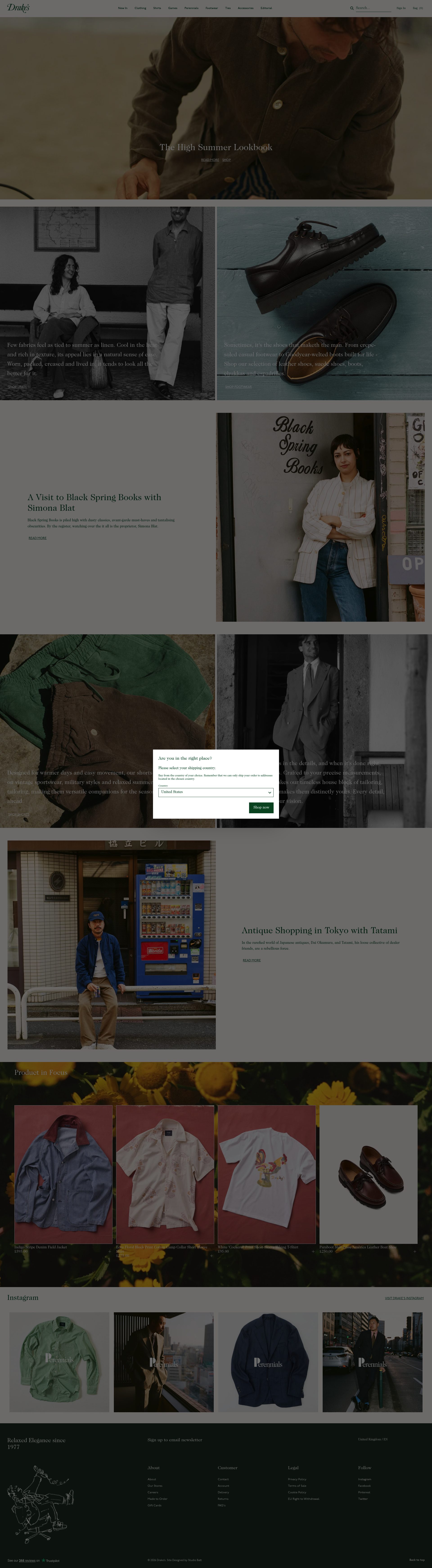
Drake's is the most photographically serious accessories store on Shopify. Their tie and pocket square PDPs use a layered approach: a flat lay shot, a lifestyle image on a model, and a macro close-up showing weave structure or print detail at a level most brands do not bother with. For a product where texture and weight are the entire value proposition, that macro shot does the work a customer's fingers would do in a physical shop.
Navigation reflects how a considered buyer actually shops: by cloth type (silk, wool, linen, cotton), by pattern (stripe, paisley, spot), and by occasion. That three-axis filter on accessories is rare and directly reduces the number of clicks between landing and finding the right product. Their collection pages also consistently surface the fabric origin and construction method as part of the product tile, not buried inside the PDP, which means buyers get relevant information before they even open a product.
Checkout is clean with no aggressive upsell interruptions, which is the right call for a luxury purchase. The brand's editorial content, particularly their "The Rake's Progress" journal, links back into the catalogue naturally, turning content into a low-friction product discovery channel.
2. The Tie Bar

The Tie Bar built their entire Shopify store around the bundle. Their "Complete the Look" system on every PDP is technically straightforward but executed better than most: when you open a tie, the page shows you a coordinated shirt colour, pocket square, and lapel pin with a single "Add All to Cart" action. That mechanism directly targets the customer's real problem, which is not buying one tie but assembling an outfit they can wear with confidence.
Pricing is transparent throughout: every product shows the individual price and the bundle saving without any ambiguity about what is included. The value calculation is done for the customer rather than left implicit, which removes a friction point that kills bundle conversions on less careful implementations. Their breadcrumb navigation and category taxonomy are also unusually thorough for an accessories brand, which pays off in search visibility as well as on-site navigation.
Their filter system allows sorting by width (narrow, standard, wide), which signals product range depth to a customer who knows what they are looking for and accelerates the path to purchase for repeat buyers.
3. Benson & Clegg
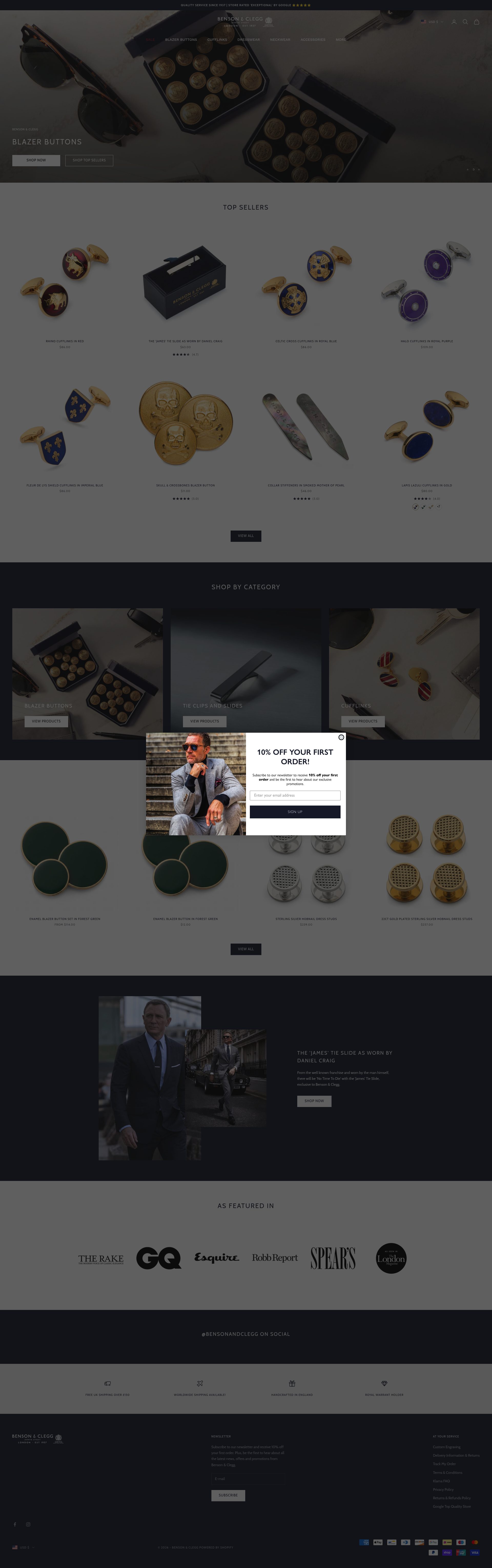
Benson & Clegg have traded as bespoke button and badge makers on Piccadilly since 1937, and their Shopify store carries that heritage without becoming a museum piece. Their product pages for regimental and club ties are structured around provenance: each tie lists the regiment or institution it represents, the correct knot guidance, and the occasions on which it may properly be worn. That specificity is not just editorial texture; it is conversion copy, because a customer buying a regimental tie has a specific eligibility question before they purchase.
The store handles a wide range of price points, from affordable ties to bespoke enamel buttons at several hundred pounds, and the PDP architecture scales across that range without feeling inconsistent. Premium products get more photography and longer copy; entry-level products are still presented cleanly. That proportional investment in product page depth is something many mixed-catalogue stores get wrong by either over-producing simple products or under-producing high-margin ones.
Their Royal Warrant positioning is surfaced prominently and consistently, which does real trust work in a market where buyers are assessing quality from a screen.
4. Charles Tyrwhitt
Charles Tyrwhitt runs on Shopify Plus and uses the platform's capabilities to execute a formal accessories offer at real scale. Their tie and cufflink pages are built around the "never full price" mechanic: a permanently active multi-buy discount (typically four ties for a fixed price) that creates a clear and visible value proposition on the collection page before a customer clicks through to any individual product. That price architecture drives average order value without requiring the customer to navigate to a bundle page.
Their cufflink PDPs handle a specific problem well: formal cufflinks photograph identically at thumbnail size, which makes category browsing frustrating. Tyrwhitt solves this by using product titles that lead with the distinguishing feature (the colour, motif, or finish) rather than the product type, and by using a zoom feature on PDPs that actually resolves the engraving or enamel detail that makes one pair distinct from another.
Cross-sell logic is strong: a tie page surfaces matching pocket squares, and a shirt page surfaces ties in coordinating colours, but the connections are visually validated with small swatch images rather than just text links.
5. Hawkins & Shepherd
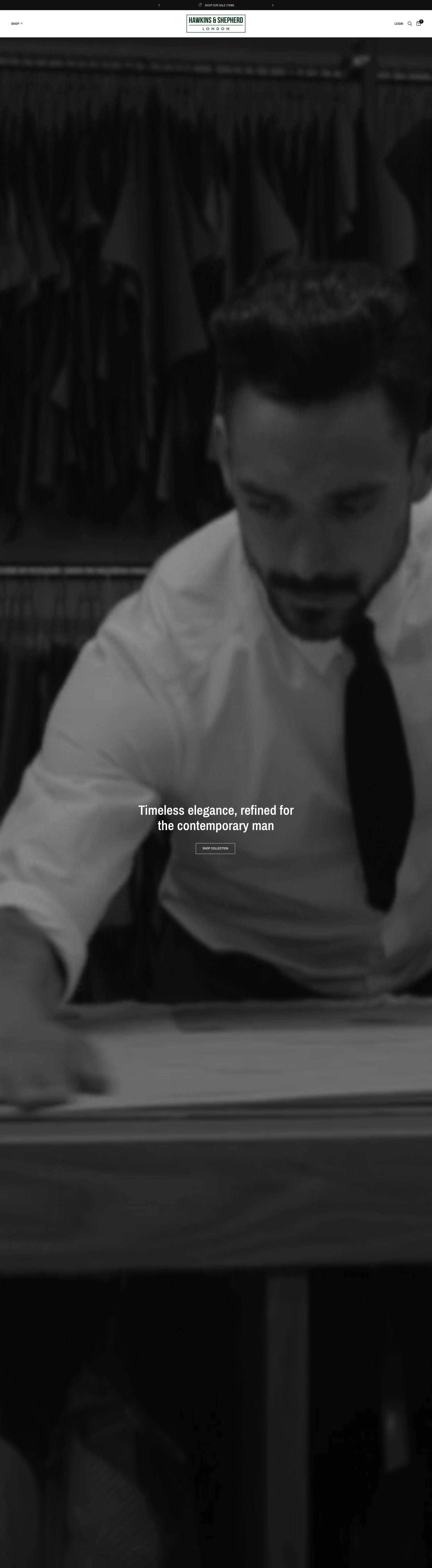
Hawkins & Shepherd are a UK shirtmaker with a formal accessories range that uses the brand's core proposition, precise fit, to differentiate even a commodity category like ties. Their PDP copy for ties consistently references the matching shirt collar styles and which tie widths work best with each, a cross-reference that is useful to the customer and naturally drives navigation toward their higher-margin shirtmaking business.
Their gift packaging is presented at the product level rather than only at checkout, which is a sensible call for a brand where a significant share of accessories purchases are gifts. Surfacing the branded gift box option on the PDP rather than as a last-minute checkout add-on means it is part of the purchase decision rather than an afterthought, and it increases the perceived value of the product itself.
Their size and fit guidance for ties, including blade width recommendations by chest size and height, is more detailed than most competitors. That specificity converts uncertain buyers and reduces returns on a category that rarely gets returned for fit reasons, meaning the guidance is primarily trust-building rather than operationally necessary.
6. The Cufflink Shop
The Cufflink Shop's store is built almost entirely around gift intent, and the information architecture reflects that clearly. Their navigation leads with occasion (Wedding, Father's Day, Birthday, Graduation) alongside product type, which means a gift buyer who knows the recipient's occasion but not the product category can navigate without friction. Most accessories stores invert this, prioritising the product taxonomy they understand over the occasion taxonomy the customer is using.
Personalisation is a primary conversion lever: engraving options are surfaced at the product level on most of their higher-margin ranges, with a clear per-character price shown inline rather than revealed as a hidden cost at checkout. That transparency removes the main objection to personalised purchases, which is uncertainty about the final cost.
Their product page structure for engraved cufflinks includes a preview tool that renders the customer's initials or text in the correct typeface and scale on a product mockup. That implementation is technically uncomplicated but conversion-effective: it replaces the imaginative leap a customer otherwise has to make with visual confirmation that the engraving will look right.
7. Bigi Cravatte
Bigi Cravatte are a Milanese silk tie manufacturer with a Shopify DTC presence that positions them directly against premium British and French competitors at a comparable price point. Their PDPs lead with the provenance story: Como silk, Italian production, family business since 1968. That origin narrative is not decorative; it is the primary justification for a price point that sits above the market average for equivalent-looking products from less known brands.
Their photography is technically excellent, with fabric close-ups rendered at a resolution where you can see the weave structure of the silk, and lifestyle images that show the tie at multiple knot sizes so the customer can assess how the blade width will look on their own build. The product description consistently uses technical silk terminology, which signals expertise to a buyer who has done their research and builds confidence with one who has not.
Their category page uses a filter by silk weight, which is an unusual and useful axis for a buyer who already owns lighter summer ties and is specifically looking for something with more body for winter.
8. Mrs Bow Tie
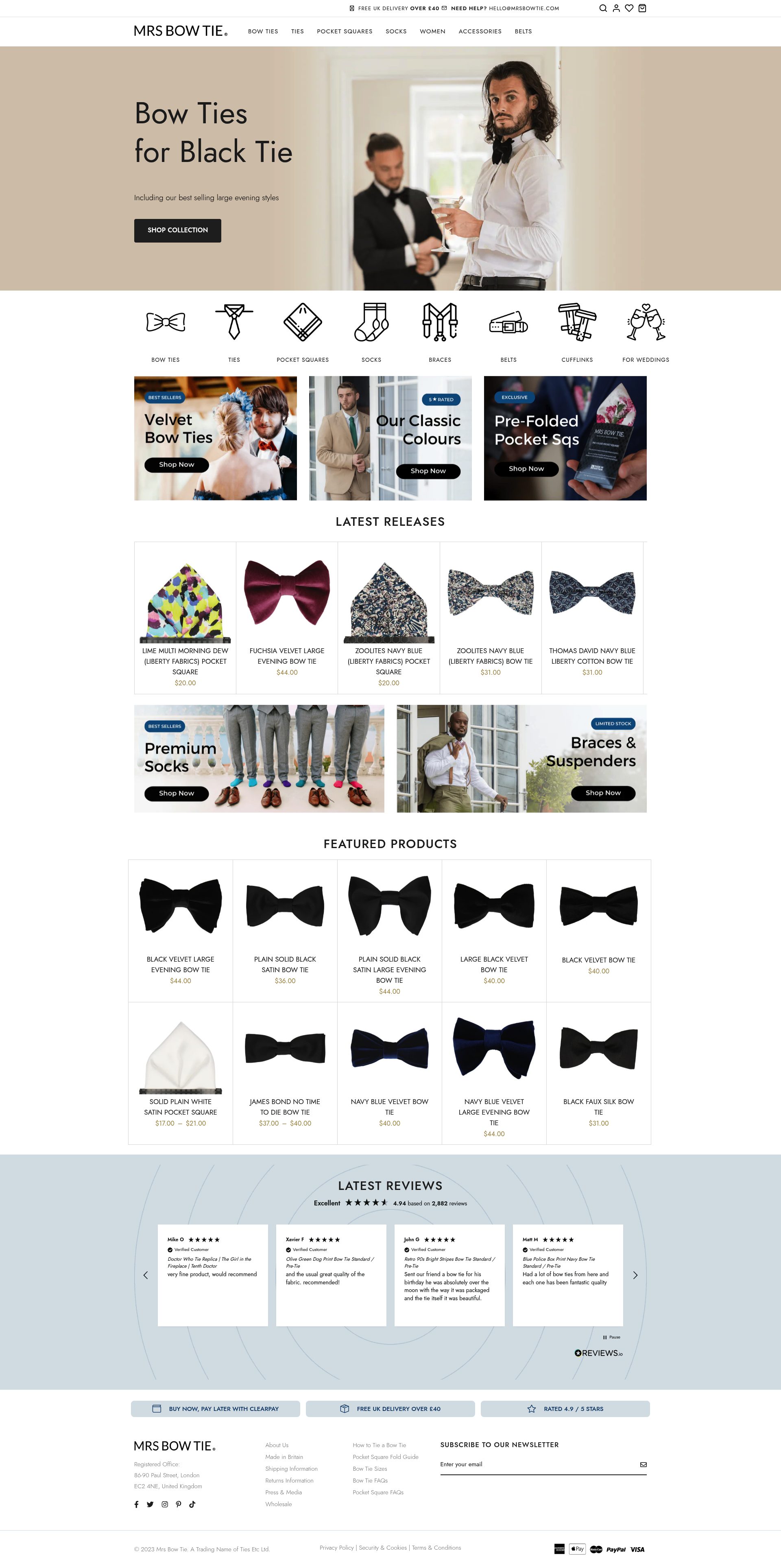
Mrs Bow Tie run a Shopify store built around a clear productisation of a traditionally difficult retail category: formal neckwear sold with enough size and tying guidance to remove the main purchase barrier, which is the customer's uncertainty about whether they can actually tie the thing. Their how-to guides are integrated at the product level, not siloed into a separate content section, so the instructional content is doing conversion work rather than just brand work.
Their self-tie versus pre-tied differentiation is handled well: each product clearly states which it is, with a brief explanation of the difference and why a customer might prefer each, rather than assuming the buyer already knows. That educational layer converts customers who are at an early stage of the purchase journey and might otherwise leave to do research rather than buy.
Bundle mechanics are strong: their complete bow tie outfit sets (bow tie, pocket square, lapel pin) are priced at a saving and presented visually as complete outfit solutions, which reduces decision paralysis and increases average order value.
9. Otaa

Otaa is an Australian accessories brand with a Shopify store that has earned international distribution by solving the pattern coordination problem better than most competitors. Their "Style Guide" system, accessible directly from collection pages, shows how a specific tie or pocket square works across four different shirt and suit combinations, giving the customer a visual answer to the "will this work for me" question before they commit.
Their category architecture is unusually granular: pocket squares are filterable by fold style, which is a level of specificity that indicates deep product knowledge and serves the experienced buyer directly. Ties are filterable by knot type, again a decision that converts the customer who knows what they want rather than trying to educate the undecided one.
Their subscription model for regular buyers, offering a curated monthly tie at a discount, is surfaced at the checkout rather than mid-browse, which is the right placement for a subscription offer in a category where purchase frequency is naturally low. Showing it at checkout captures the buyer who is already committed rather than interrupting a browse session.
10. Rampley & Co
Rampley & Co's Shopify store positions pocket squares as the primary product category rather than a supporting accessory, which is an unusual and commercially sound decision for a brand that has built genuine depth in the category. Their collection pages for pocket squares are organised by material (silk, wool, linen, cotton) and by fold style, which is a more useful taxonomy for a considered buyer than colour or pattern alone.
Their PDPs for pocket squares include a fold guide video embedded at the product level, showing six standard folds executed with that specific square. That is a practical implementation of content that directly addresses the most common pre-purchase objection: the customer not knowing how to display the product properly.
The brand's editorial voice is confident and specific, with copy that references British and Italian manufacturing heritage without resorting to the generic "craftsmanship" language that is endemic in this sector. Pricing is premium but transparent, with clear material and construction notes that justify the price point before the customer has to make that value judgement themselves.
If you sell ties, cufflinks, pocket squares, or formal accessories online and want to improve your Shopify store's conversion rate, product presentation, or average order value, SuttonCommerce can help with a focused Shopify design service — get in touch.
Frequently asked questions
Which Shopify stores are best for men's formal accessories?
Drake's London leads on product presentation and photography, The Tie Bar is strongest for outfit bundling, and Bigi Cravatte is the best option for Italian silk ties with a clear provenance story. For gift purchases specifically, The Cufflink Shop's occasion-led navigation and inline engraving preview make it the most conversion-focused of the group.
Do men's accessories stores perform well on Shopify?
Yes, but the category is demanding. Formal accessories rely heavily on tactile confidence — the customer needs to believe the silk weight and finish is worth the price without touching it. The best-performing stores solve this with macro photography, fabric origin copy, and detailed material specifications at the product tile level, not just buried in the PDP.
What is the most important conversion element on a men's accessories product page?
For ties and pocket squares, the close-up fabric image is the single highest-leverage element — it replaces the customer's hands. For cufflinks, it is zoom quality and product title clarity, since cufflinks are nearly identical at thumbnail size and buyers need the distinguishing detail surfaced early. For personalised products like engraved cufflinks, an inline preview tool that renders the customer's text at scale removes the final objection.
How do the best accessories stores handle bundle selling?
The Tie Bar does this better than any other store in this list. Their "Complete the Look" mechanism shows a coordinated tie, shirt colour, pocket square, and lapel pin on every PDP with a single "Add All to Cart" action. The key is that the saving is stated explicitly at the product level rather than only revealed at checkout, so the value calculation is done for the customer before they even decide whether to bundle.
Is it worth selling men's accessories on Shopify versus a marketplace?
For brands with a clear provenance or design story, yes. Marketplaces commoditise accessories by price; Shopify lets you control the full narrative — fabric origin, brand heritage, editorial content — which is what justifies a premium price point. Drake's, Bigi Cravatte, and Rampley & Co all demonstrate that DTC Shopify stores can compete effectively at the top end of the market when the product presentation is executed properly.