
Quick summary
Reflections Copenhagen is the strongest example in the category: a tightly curated luxury range where every design decision, pared-back copy, slow-motion video, full-bleed photography, reinforces a high-end positioning that justifies £600+ price points. Anthropologie does the best job of selling mirrors as lifestyle objects rather than furniture, using editorial room-set photography to close the emotional sale before the customer reads a single spec. The Lovely Wall Company is the most conversion-focused DTC pick, with a visual style selector on the homepage and a customer photo feature that handles the scale-and-fit objection head-on. Oliver Bonas is the benchmark for mid-market catalogue management at scale, combining consistent photography, smart cross-selling, and frictionless checkout mechanics across hundreds of SKUs.
Mirrors sit in an awkward category for ecommerce: they are large, fragile, heavily visual and often a considered purchase. The stores below have found ways to make that work in their favour, using smart merchandising, confident content and clean UX to turn what is usually a showroom decision into an online conversion. Here are 10 of the best mirror Shopify stores worth studying in 2026.
1. Anthropologie
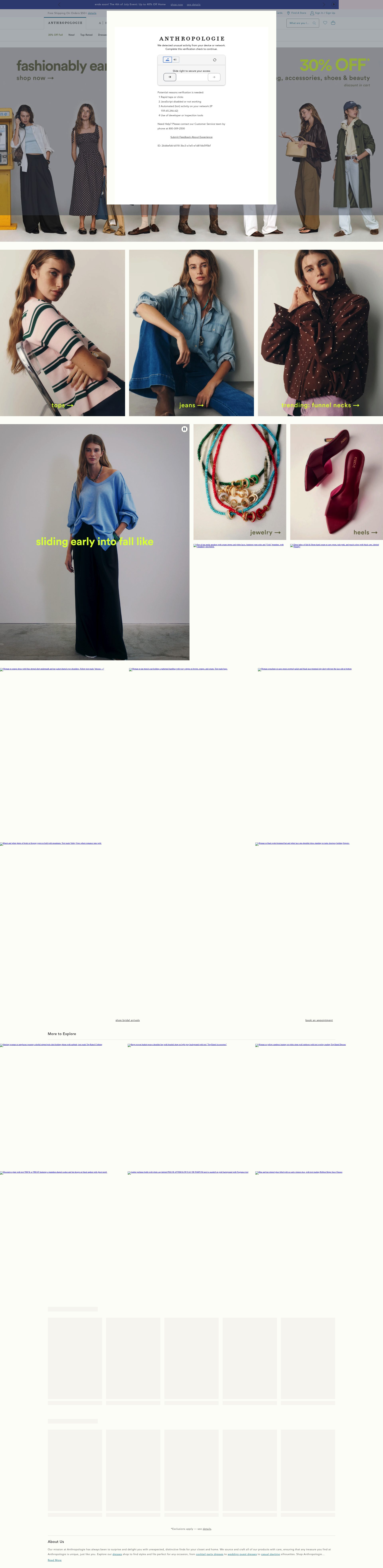
Anthropologie is a masterclass in selling mirrors as lifestyle objects rather than functional furniture. The homepage and category pages use richly styled interiors photography where the mirror is always the focal point, never just a product on a white background. That editorial approach does the conversion work that product specs cannot: it tells the customer exactly how the piece will feel in a room.
Their product pages are particularly strong on upsell mechanics. Room-set photography, a "Complete the Look" module and a curated "You May Also Like" rail all push average order value upward without cluttering the page. The sizing information is handled well too, with real-world scale callouts alongside standard dimensions, which reduces the single biggest objection in the category.
2. Desenio
Desenio built a substantial business on affordable Scandinavian-style wall art, and their mirrors section shows the same commercial discipline. The filtering system is unusually granular: customers can sort by shape, frame colour, size and room type, which matters in a category where visual fit is everything. Most mirror retailers underinvest in browse-mode UX, and Desenio is not one of them.
The site runs a consistent promotional mechanic, a visible percentage-off banner refreshed regularly, that creates urgency without resorting to countdown timers. For a product with high visual competition, driving a decision quickly is the right instinct. Their bundle and gallery wall features cross-sell mirrors with art prints in a way that increases basket size and solves a real styling problem for the customer.
3. The Lovely Wall Company

The Lovely Wall Company is a UK DTC brand focused on wall-mounted statement mirrors, and the Shopify store is built around one clear conversion goal: get the customer to pick a shape and commit. The homepage opens with a visual style selector rather than a traditional hero image, which shortens the path to product for buyers who already know roughly what they want.
Product pages feature customer-uploaded room photos alongside studio shots, which is a smart trust-building decision in a category where scale and colour accuracy are constant concerns. The brand also runs a sample service for frame finishes, surfaced clearly on product pages, which removes a key objection for higher-priced pieces. That kind of pre-purchase reassurance has a measurable impact on conversion at mid-to-premium price points.
4. Umbra
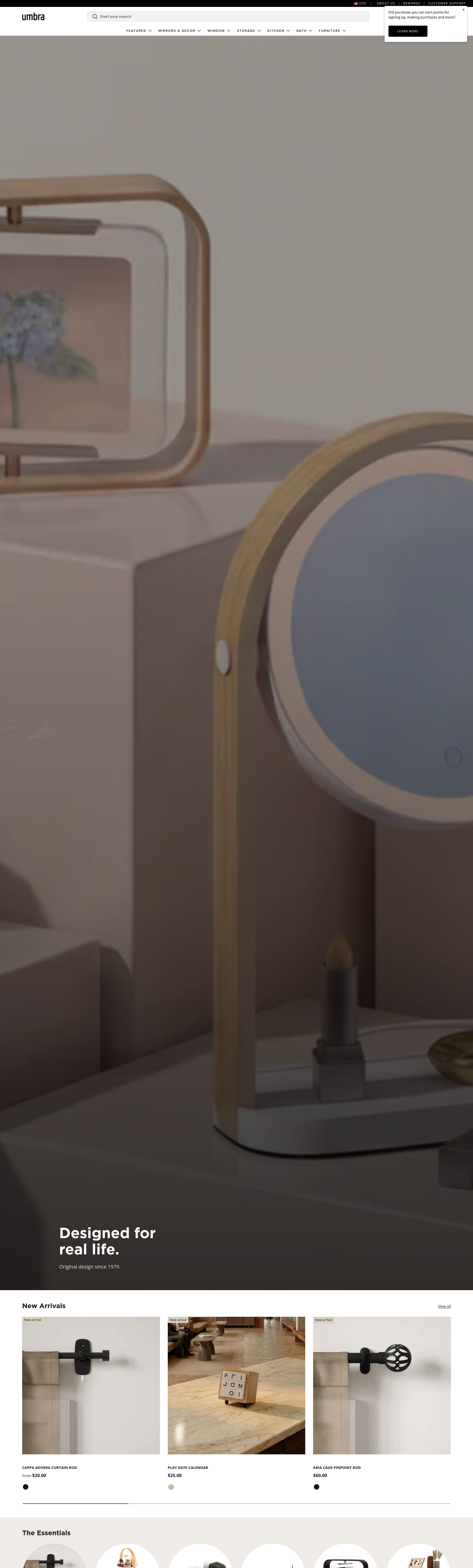
Umbra is a Canadian design brand with a strong Shopify presence across mirrors and decorative homeware. What the store does well commercially is category architecture: mirrors are broken into clear sub-types (full-length, wall, accent, bathroom) rather than one undifferentiated listing, which improves both navigation and SEO. Each sub-type has its own editorial content block that helps customers self-select.
The product pages lean on design storytelling more than most homeware brands. The copy names the designer, explains the concept behind the product and ties form to function in concrete terms. That positions Umbra in the design-conscious buyer's consideration set, not just the price comparison shopper's. Their international shipping and multi-currency setup is also cleanly executed for a brand selling across North America, Europe and beyond.
5. Reflections Copenhagen
Reflections Copenhagen is a premium Danish mirror brand targeting the luxury interior design market, and the Shopify store communicates that positioning from the first scroll. The homepage uses slow-motion video of light catching mirror surfaces, product pages are pared back to full-bleed photography and minimal copy, and the colour palette never deviates from neutrals and black. Every design decision signals that this is not a mass-market product.
The site handles the challenge of a small, tightly curated range well. Rather than filling space with content, it focuses attention on each piece as an object worth considering carefully. Enquiry CTAs are present throughout without feeling pushy, which is the right approach for products where a £600+ price point often requires a conversation before the sale closes. Their trade and interior designer programme is also well surfaced, opening a B2B revenue stream the site supports without needing a separate portal.
6. Oliver Bonas
Oliver Bonas runs one of the most commercially refined mid-market lifestyle stores on Shopify, and the mirrors category benefits from the same operational discipline as the rest of the site. Navigation is intuitive, stock availability is surfaced clearly on product pages, and the photography maintains a consistent brand aesthetic across hundreds of SKUs. That kind of catalogue coherence is genuinely hard to achieve at scale.
Their cross-selling is particularly effective. Mirror product pages surface complementary wall art, shelving and lighting in a "Style It With" module that stays visually on-brand. Basket mechanics include persistent cart, clear delivery thresholds and a well-executed free delivery nudge, all of which reduce abandonment at the checkout stage. Oliver Bonas is a useful benchmark for any homeware brand trying to scale Shopify without losing editorial control.
7. Cox & Cox
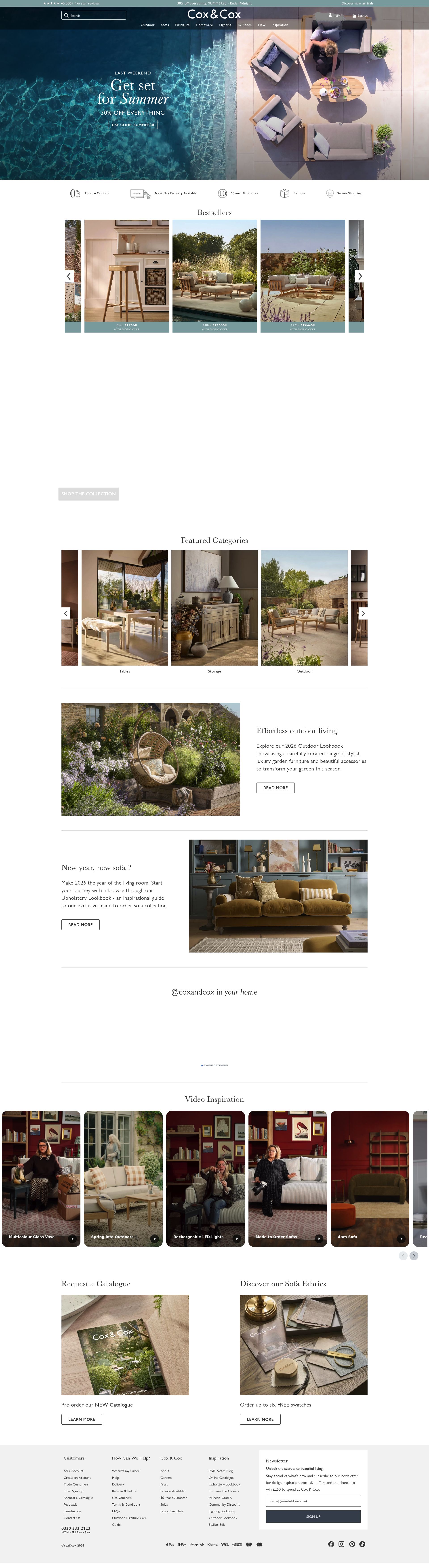
Cox & Cox is a UK lifestyle brand that has consistently invested in photography and content as the primary conversion tools on its Shopify store. The mirror category pages lead with room-set images styled to a very specific domestic aesthetic: warm tones, natural textures, lived-in but aspirational. That curation attracts a buyer who has already decided what kind of home they want, which shortens the consideration phase.
Their delivery and returns messaging for large items is handled unusually well. Surcharge information is surfaced at the product level rather than buried in the checkout, which builds trust and reduces cart abandonment on higher-ticket pieces. The editorial blog, regularly updated with styling guides and room reveals, supports organic traffic and keeps the brand present for customers in a longer research phase.
8. Made.com
Made.com relaunched as a leaner Shopify-powered operation and the mirrors section is a good example of how a brand can use product data to do conversion work. Each listing includes a clear size guide with room-scale diagrams, weight specifications and a "hanging guide" expandable section that addresses the practical concerns buyers have before purchasing a larger piece. That focus on post-purchase confidence reduces returns and builds trust.
The site merchandises its mirror range by style identity, contemporary, minimalist, maximalist, rather than purely by dimension, which matches how most buyers actually approach the decision. The wishlist function is prominently placed and feeds into a well-executed email re-engagement flow, capturing intent from browsers who are not ready to buy immediately but have already signalled strong interest.
9. Neptune
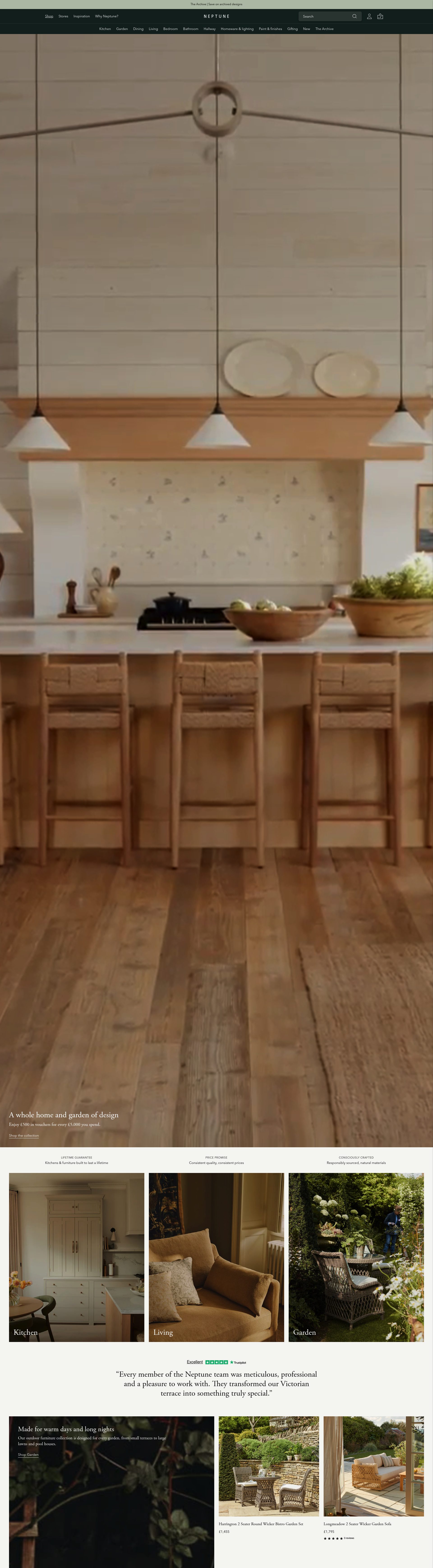
Neptune is a premium UK kitchen and home brand that uses Shopify to support a primarily showroom-led customer journey, and the mirrors section reflects that positioning. Product pages are unhurried and rich with detail: material sourcing, craft descriptions and interior styling context sit alongside clean product photography. The site is designed for a customer who wants to be informed, not rushed.
The brand's content strategy around mirrors is particularly well-executed. Styling guides, room photography and material explainers are woven into the browse experience rather than separated into a blog, which means editorial content drives product consideration at the point of intent. For a brand at Neptune's price point, that kind of content investment pays off directly in conversion quality even if not in volume.
10. The White Company
The White Company is another Shopify benchmark for aspirational homeware, and its mirror offering sits within a tightly controlled brand context that does a lot of the selling. The all-neutral palette, consistent photography direction and premium packaging messaging communicate quality before a customer reaches the specification tab. That ambient brand trust is a genuine conversion lever, particularly for buyers considering a gift purchase.
The product page layout surfaces delivery timescales, returns policy and customer service access points early and clearly, which reduces friction on a category where practical concerns (size, installation, damage on delivery) are frequent objections. Their loyalty programme integrates cleanly with the shopping experience, and the "Add to Room" virtual placement tool, where available, directly addresses the scale-visualisation challenge that makes mirrors a harder online sell.
A strong Shopify store turns a considered purchase like a mirror into a confident online decision. If your homeware or interior design brand needs a Shopify store built for conversion, take a look at our Shopify design services or get in touch to talk through your project.
Frequently asked questions
Which Shopify stores sell the best mirrors online in the UK?
Reflections Copenhagen leads at the luxury end, with Oliver Bonas and Cox & Cox covering the mid-market well. For statement DTC mirrors, The Lovely Wall Company is the strongest UK-native option, with a homepage built specifically around helping customers pick a shape and commit to a purchase.
How do the best mirror stores handle the size and scale problem?
The top stores tackle this in different ways. Made.com uses room-scale diagrams and hanging guides on product pages. The Lovely Wall Company surfaces customer-uploaded room photos. Anthropologie adds real-world scale callouts alongside standard dimensions. The White Company offers a virtual room-placement tool. All of these reduce the single biggest objection in the category before the customer reaches checkout.
What makes a Shopify store convert well for mirrors specifically?
Mirrors are a considered purchase where the emotional and practical objections are high: will it fit, will it look right, can it be hung safely? The stores that convert best lead with lifestyle photography rather than white-background product shots, surface delivery surcharges and returns policies at the product level rather than in the checkout, and use cross-selling modules to help customers complete a room look rather than just buy a single item.
Are these mirror stores using Shopify Plus?
Most of the larger brands in this list, including Anthropologie, Oliver Bonas, Made.com, and The White Company, run on Shopify Plus, which gives them access to checkout customisation, multi-currency, and advanced wholesale or trade functionality. Smaller DTC brands like The Lovely Wall Company and Reflections Copenhagen use standard Shopify tiers but still achieve strong conversion through focused UX rather than platform features.
How do premium mirror brands justify high price points on Shopify?
Reflections Copenhagen and Neptune are the clearest examples here. Both use design storytelling, naming materials, designers, and craft processes, rather than leading with discounts or urgency tactics. Neptune integrates editorial content directly into the browse experience so customers encounter styling context at the point of product consideration. Reflections Copenhagen uses enquiry CTAs throughout the site, which is the right approach when a price point routinely requires a conversation before the sale closes.