

Quick summary
Birkenstock leads the category with footbed education built directly into PDPs and filtering by material, activity, and width that handles a sprawling catalogue without friction. Ancient Greek Sandals is the strongest premium pick, using provenance storytelling and made-to-order mechanics to justify high price points before the customer even sees them. Vionic is the standout for problem-led selling, with podiatrist endorsements and biomechanical diagrams that convert sceptical customers with foot health needs. Sseko Designs is the most inventive in the group, running a strap-and-base configurator that lifts average order value while reducing abandonment.
Sandals are a category where brand identity and product clarity have to work together. Customers want to understand fit, sole construction, and material before they buy, and the stores that convert best make those answers easy to find. These ten Shopify merchants have built stores that handle that brief well, each in a way that reflects their market position.
1. Birkenstock
Birkenstock's Shopify store is built around a product that needs no reinvention but a great deal of explanation. Their footbed technology, which is central to the brand's health positioning, is given dedicated space on product pages rather than buried in a spec table. The result is a PDP that functions as both a buying page and a product education resource. Fit is a consistent theme throughout: width options (regular and narrow) are surfaced clearly, and a persistent sizing guide reduces hesitation for first-time buyers.
Their navigation handles a sprawling catalogue intelligently. Filtering by style, material, footbed, and activity type lets a customer who knows what they want reach it in two clicks, while editorial collections serve customers who are browsing. The shop-in-shop structure for collaborations with designers such as Manolo Blahnik and Stüssy keeps those ranges distinct without fragmenting the core catalogue.
2. Ancient Greek Sandals
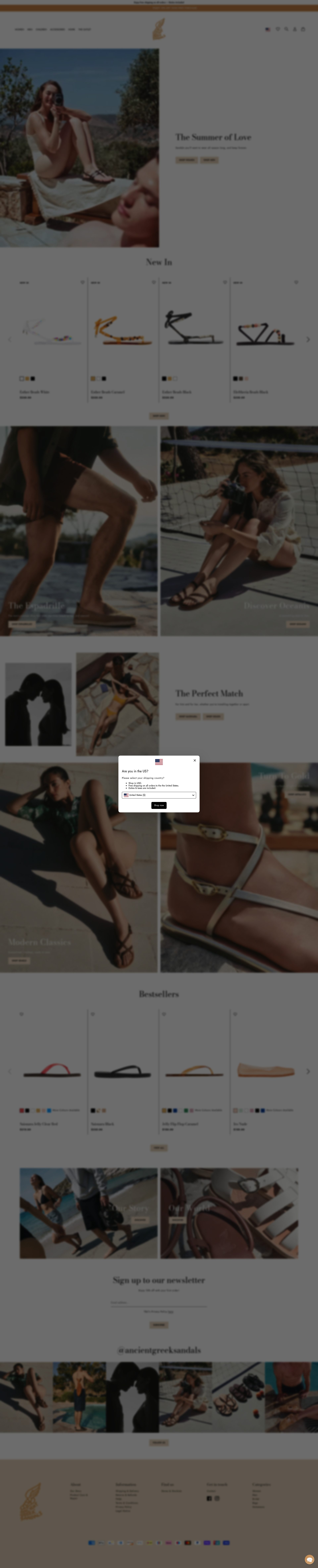
Ancient Greek Sandals positions handmade provenance as its primary value driver, and the store design supports this at every step. Product pages open with a brief description of the construction technique and the artisans involved, before moving to sizing and purchase options. That ordering is deliberate: it establishes why the price is justified before the customer sees the price. Product photography is clean and detailed, with close-up shots of the leather stitching and hardware that reinforce the craft narrative.
The brand uses a made-to-order option for select styles, which is a strong margin and inventory management play. Customers accept longer lead times for products they believe are made specifically for them, and the store communicates this expectation clearly rather than treating it as a friction point. Wishlisting and back-in-stock notifications are integrated throughout, capturing intent from customers who browse before they commit.
3. Tkees
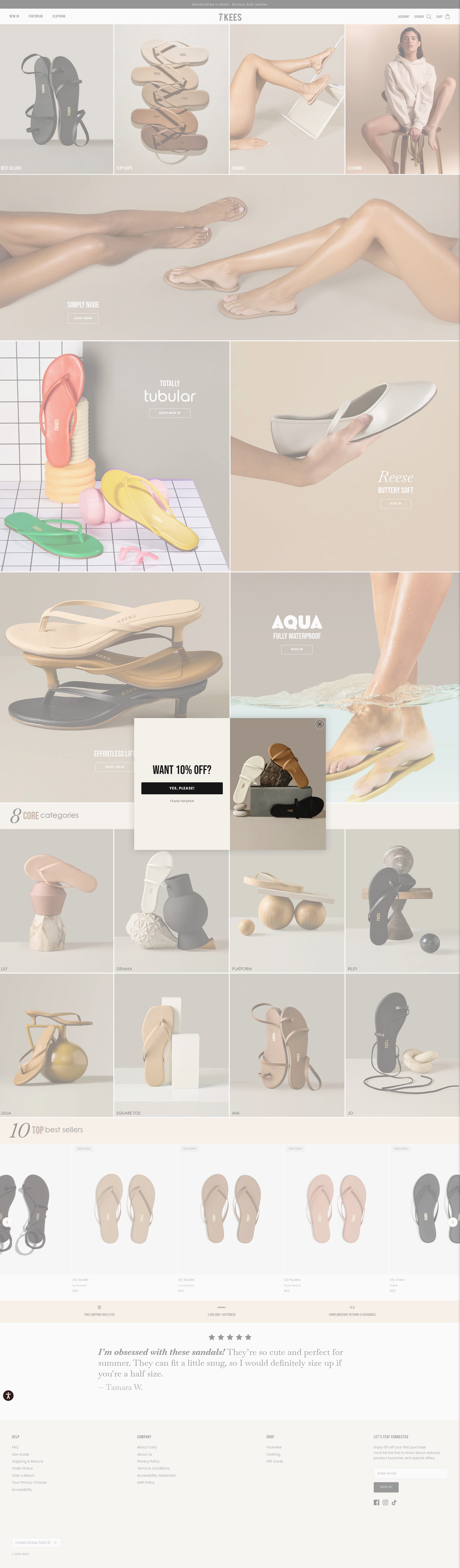
Tkees built its store around colour and simplicity. Their flat sandals come in a wide range of shades, and the collection pages are organised by colour family rather than style name, which is the right choice when the primary purchase decision is "which shade works for me." Swatches are large enough to be useful on mobile, and the photography uses consistent, neutral backgrounds so colour accuracy is reliable across the range.
Their product pages are deliberately minimal: a short description, the key materials, and a clear size guide. There is no information overload. For a product category where the buying decision is quick and emotionally led, this restraint converts better than exhaustive copy. Repeat purchase is supported through an account system that surfaces previous orders and makes reordering a single action.
4. Havaianas
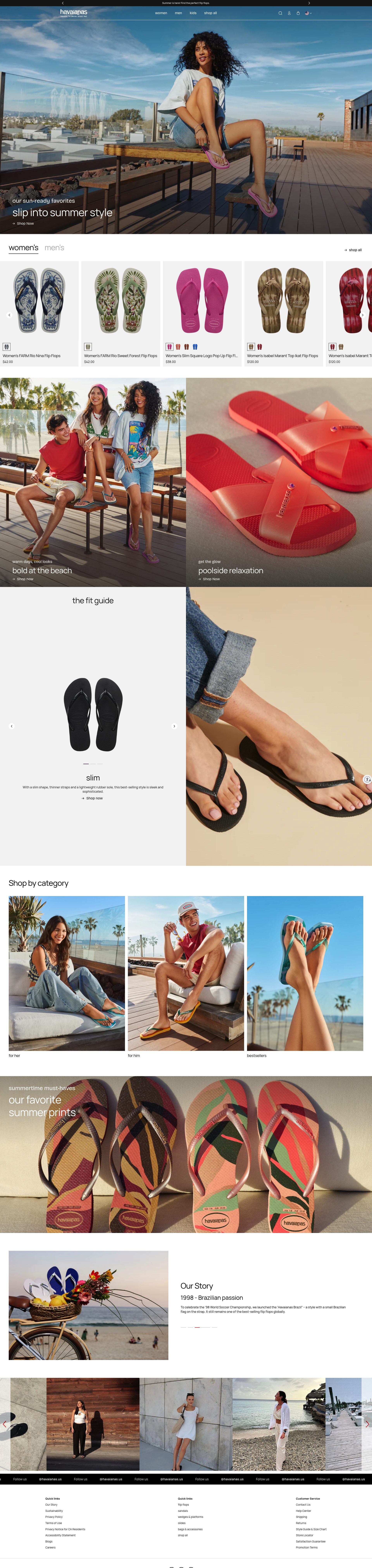
Havaianas runs a Shopify Plus store that manages high-volume seasonal demand, particularly around summer launches and limited-edition collaborations. The store handles this well: pre-launch waitlists are built into the product page for upcoming drops, and sold-out variants are marked clearly but kept visible to sustain demand signals. The gifting flow is strong, with gift wrapping, personalisation options, and a dedicated gift section that surfaces during peak periods.
Their international store routing from the UK domain is handled without friction, which matters for a brand with significant tourist and gift purchase behaviour. The loyalty programme is integrated into the post-purchase flow, with points balances surfaced in order confirmation emails and on the account page. That touchpoint timing, immediately after a purchase when satisfaction is high, is when loyalty enrolment converts best.
5. Vionic

Vionic's store is built around a specific customer problem: foot pain, plantar fasciitis, and the need for orthotic support without sacrificing style. Their category structure reflects this, with "Plantar Fasciitis Relief" and "Wide Width" as primary navigation options alongside style categories. That problem-first navigation serves customers who arrive with a specific need and builds credibility faster than a generic footwear layout would.
Product pages include podiatrist endorsements, biomechanical explanations of the FMT (Firm Motion Technology) footbed, and before-and-after pressure mapping diagrams. This is evidence-led selling at a level that matches the scepticism of a customer who has already tried multiple brands without relief. Their subscription programme for insoles, separate from the sandal range, adds a recurring revenue stream that the footwear category alone cannot deliver.
6. OluKai
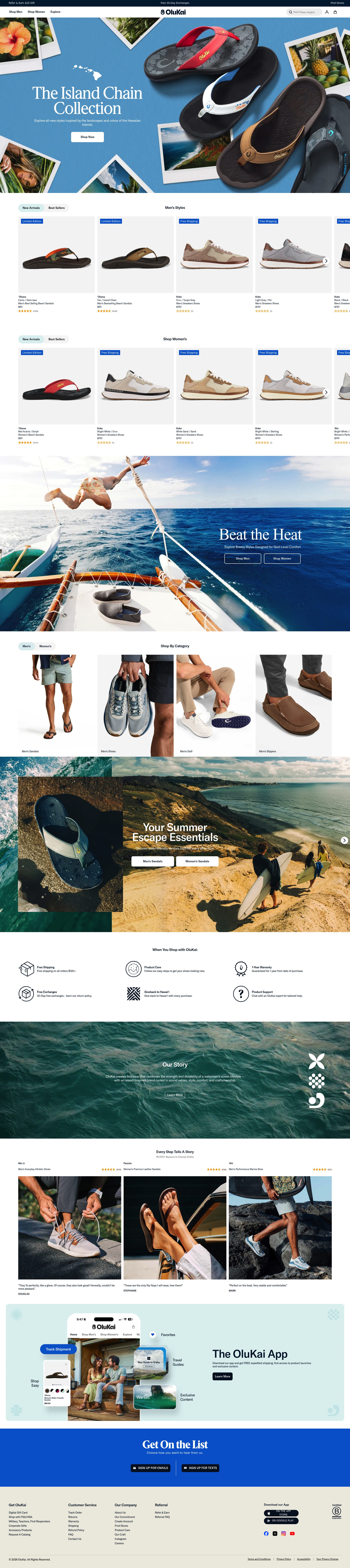
OluKai's Shopify Plus store translates a strong brand story, rooted in Hawaiian craftsmanship and ocean culture, into a purchase experience that never feels like it is trying too hard. The "Aloha Friday" content series and the brand's community and environmental commitments are woven into the store as editorial, not as compliance-box-ticking. Product pages balance that storytelling with specific technical detail: wet-grip outsole ratings, drop-in heel heel construction for easy on and off, and material provenance for the leather ranges.
Their upsell strategy is built around complementary products: a sandal PDP will surface the matching care kit and a sock bundle where relevant, with the logic explained (these are designed together) rather than presented as a generic "frequently bought with" module. That contextual framing lifts attach rate without the recommendation feeling algorithmic.
7. Gandys
Gandys is a UK DTC brand with a clear founding story: two brothers who started the company after losing their parents in the 2004 Indian Ocean tsunami, with a portion of every sale funding children's projects. That story is carried through the store without sentimentality, referenced in the "About" section and in a persistent footer note rather than dominating every page. The balance is right: customers can discover the mission, but it does not override the product experience.
Their sandal range is positioned as adventure-ready and travel-appropriate, and the product photography reflects this with location shoots rather than studio images. Sizing is straightforward, and the product pages include a "ships in 2-3 days" indicator that gives urgency without manufactured pressure. The email capture on exit intent is tied to the mission ("Support our cause, get 10% off") which converts better than a generic discount ask.
8. Sensi Studio

Sensi Studio's store is a strong example of luxury DTC positioning in footwear. Their handwoven Colombian sandals are priced at the premium end of the market, and the store justifies this through material storytelling: the iraca palm weaving technique, the artisan communities involved, and the durability data (hand-woven vegetable-dyed fibres that outlast machine-made alternatives) are all explained clearly. Photography is rich and editorial, with colourful location imagery that places the product in context without obscuring the product detail.
Their size guide is unusually thorough, which is essential for a brand selling internationally where sizing conventions differ. Customer reviews are displayed with country of origin noted, which is a subtle credibility signal for an internationally sourced product. The checkout flow offers international DDP (Delivered Duty Paid) pricing, removing a friction point that kills conversion for premium international brands.
9. Reef
Reef's store is built for a broad, casual audience: surfers, beach-goers, and outdoor enthusiasts who want durable sandals at an accessible price. The navigation is structured by activity (beach, water, casual) and by technology (cushion, arch support, grip), which serves a customer who is choosing by use case rather than by model name. That structure reduces the time between landing and finding the right product.
Their size exchange policy is clear and prominent: free size exchanges on first orders are surfaced on product pages rather than only in the footer. For a brand where fit confidence is a purchase barrier, removing the exchange friction at the point of decision is a meaningful conversion driver. Their ambassador programme, featuring surfers and outdoor athletes, feeds lifestyle content into collection pages without requiring a separate editorial build.
10. Sseko Designs
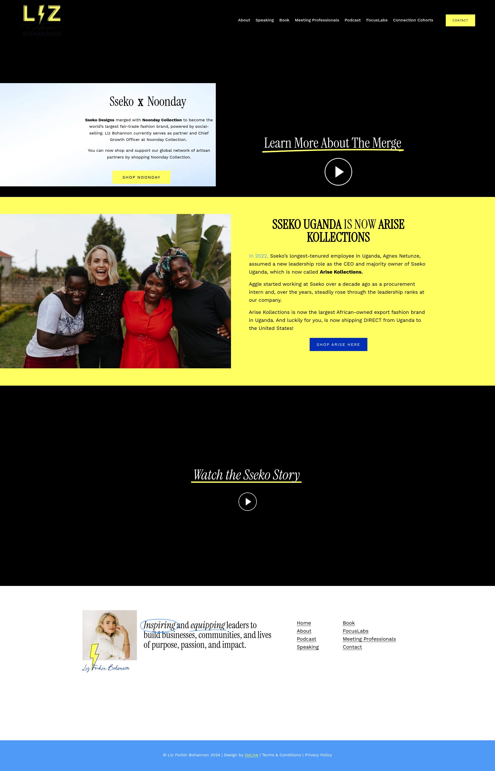
Sseko Designs runs a mission-led Shopify store with an unusual mechanic: straps and bases are sold separately, allowing customers to build their own sandal combinations. That configurator approach creates both a higher average order value and a more engaged purchase process. Customers who have invested decision-making time in configuring a product are less likely to abandon and less likely to return.
Their social mission, providing employment and education opportunities for women in Uganda, is embedded throughout the store as specific impact data: number of women employed, scholarships funded, hours of training delivered. Specific numbers convert better than vague mission statements, because they are verifiable. Their affiliate and ambassador programme, which includes a significant community of micro-influencers, drives organic acquisition that would otherwise require paid spend to replicate.
If your Shopify store is not converting at the level these brands achieve, the gap is usually design, product page clarity, or trust signals. See our Shopify design service or get in touch to discuss what is possible for your store.
Frequently asked questions
Which sandal brands use Shopify?
Birkenstock, Ancient Greek Sandals, Tkees, Havaianas, Vionic, OluKai, Gandys, Sensi Studio, Reef, and Sseko Designs all run on Shopify or Shopify Plus. Several of the larger brands, including Birkenstock, Havaianas, and OluKai, use Shopify Plus to handle high-volume seasonal demand and complex international routing.
What makes a high-converting sandal product page?
The highest-converting sandal PDPs answer three questions before the customer has to look for them: what the sole and footbed actually do, how sizing works (including width options), and what the return or exchange policy is. Brands like Vionic go further with biomechanical diagrams and podiatrist endorsements that convert customers who have already tried and been disappointed by other brands.
How do premium sandal brands justify high prices on their Shopify stores?
The most effective approach is leading with construction and provenance before showing the price. Ancient Greek Sandals opens product pages with details about the handmaking technique and the artisans involved. Sensi Studio explains the iraca palm weaving process and cites durability data. Both establish value before the customer sees a number, which reduces price resistance.
How do sandal brands handle seasonal demand spikes on Shopify?
Havaianas uses pre-launch waitlists built directly into product pages for upcoming drops, keeping sold-out variants visible to sustain demand signals. Reef surfaces its size exchange policy prominently during peak periods to reduce return friction. The common thread is surfacing key decision-reducing information at the point of purchase rather than in the footer.
What loyalty and repeat purchase tactics work best for sandal stores?
Sandals have a natural repurchase cycle tied to seasons and wear, which makes loyalty timing important. Havaianas integrates loyalty point balances into order confirmation emails, when post-purchase satisfaction is highest. Vionic adds an insole subscription programme separate from its sandal range to create recurring revenue the footwear category alone cannot deliver. Tkees builds repeat purchase into the account system by surfacing previous orders and making reordering a single action.